Light Painting

Going Gradual: A Guide to Low-level Landscape Lighting

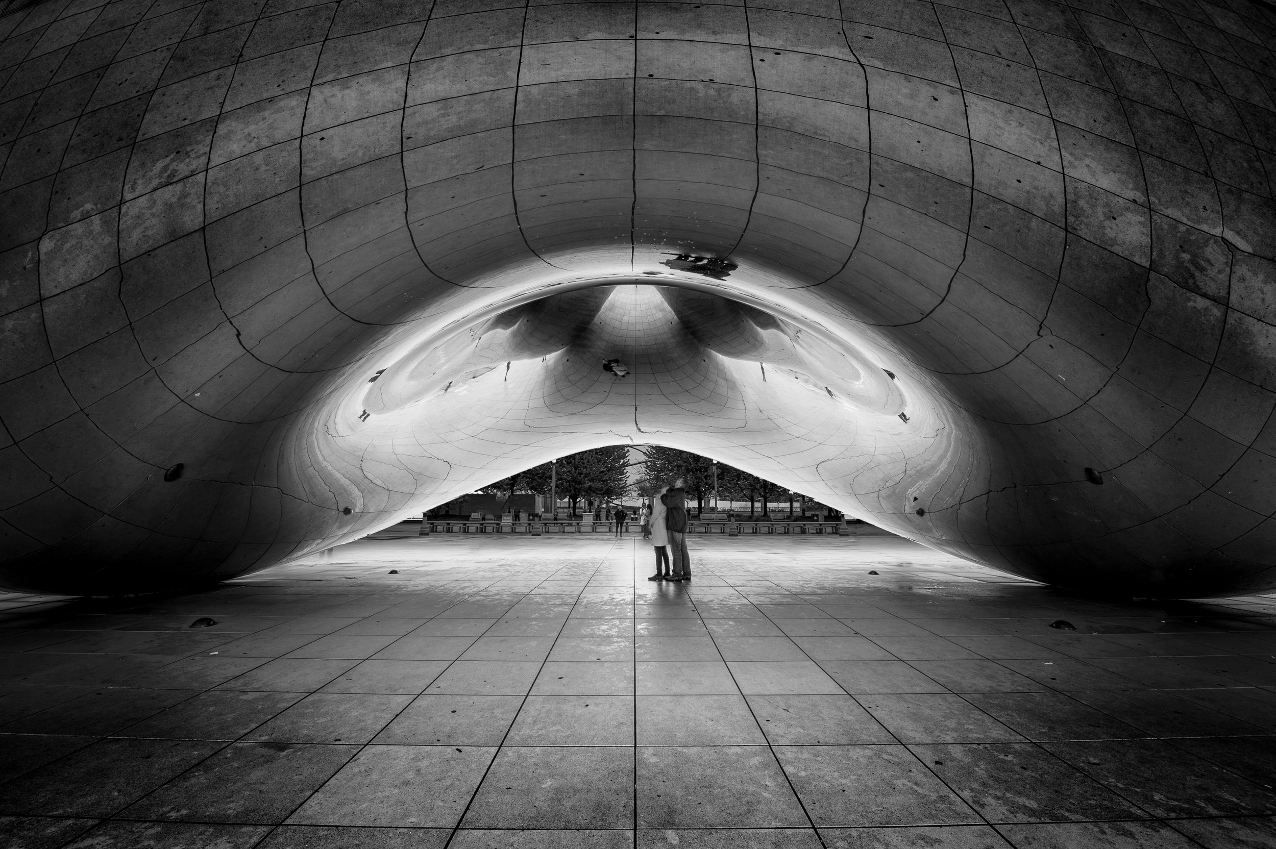
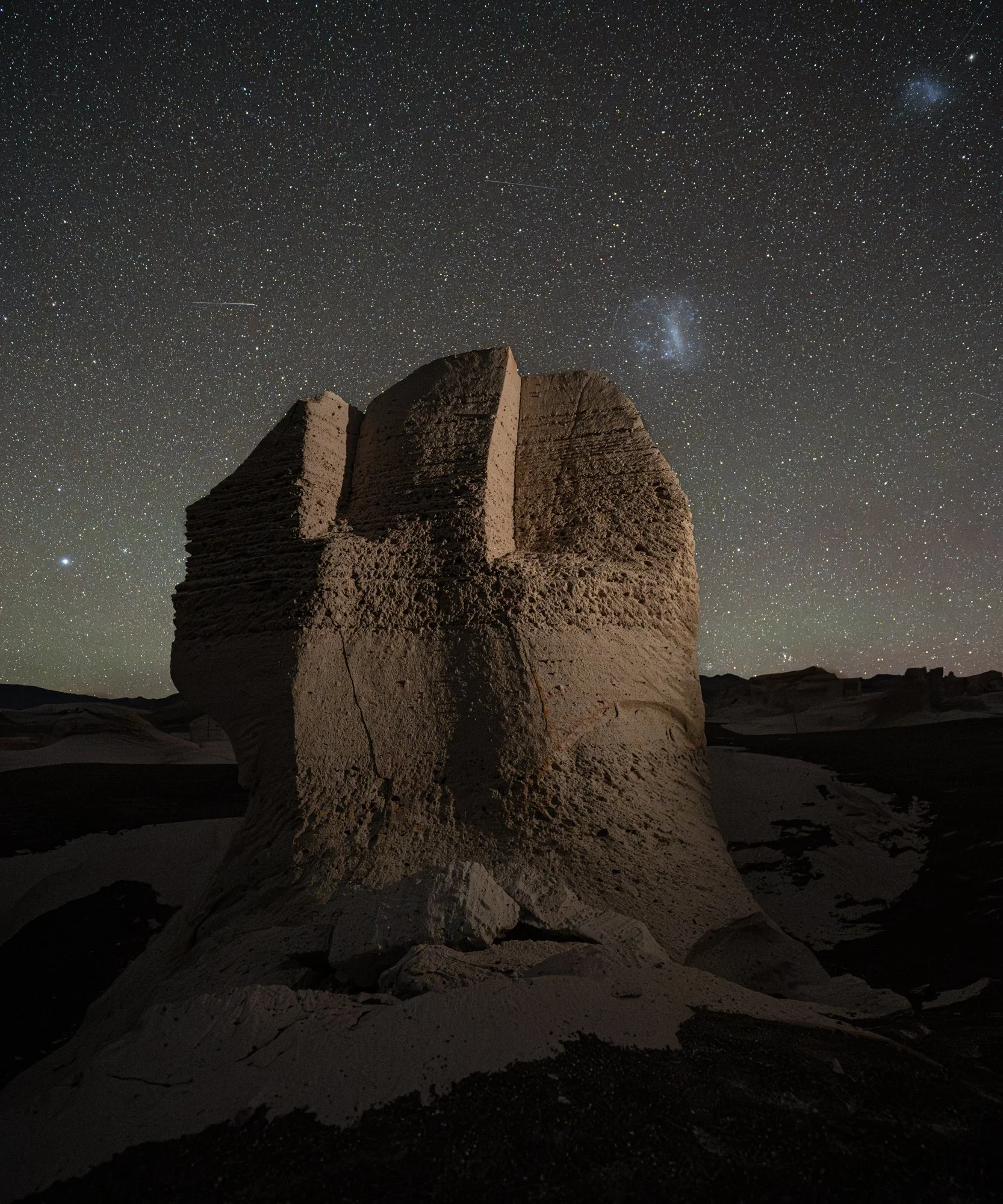
Pemaquid Point Lighthouse. One Luxli Viola light, mounted on a stand out of the frame, camera-left. This image could have been made with traditional light painting, but walking on the wildly uneven rock below Pemaquid Point Lighthouse with only a sliver of moonlight wasnโ€™t fun. Taking the easy way out by working with a stationary light seemed the prudent thing to do. I wanted to show the texture of the rock without distracting from the reflection in the foreground. ยท Nikon D750 with a Sigma 24mm f/1.4 Art lens. 386 seconds, f/4, ISO 1600.

Any regular reader of our blog will know that all five of us use the Luxli Viola as an added light source in many of our images. In this weekโ€™s post, Iโ€™ll be discussing using a Luxli or similar light source versus a flashlight, and more specifically explaining the difference between light painting and the newer technique called Low-level Landscape Lighting, or LLL.

โ€œLight paintingโ€ has become an umbrella term that many people use to describe any addition of light to a night photograph. In practice, light painting is simply using a hand-held light source that is usually moving to illuminate part or all of a scene during a long exposure. Itโ€™s a time-tested technique that has been employed by photographers for decades. Itโ€™s fun, itโ€™s versatile and itโ€™s effective. I still use it more often than any other technique in my own work.

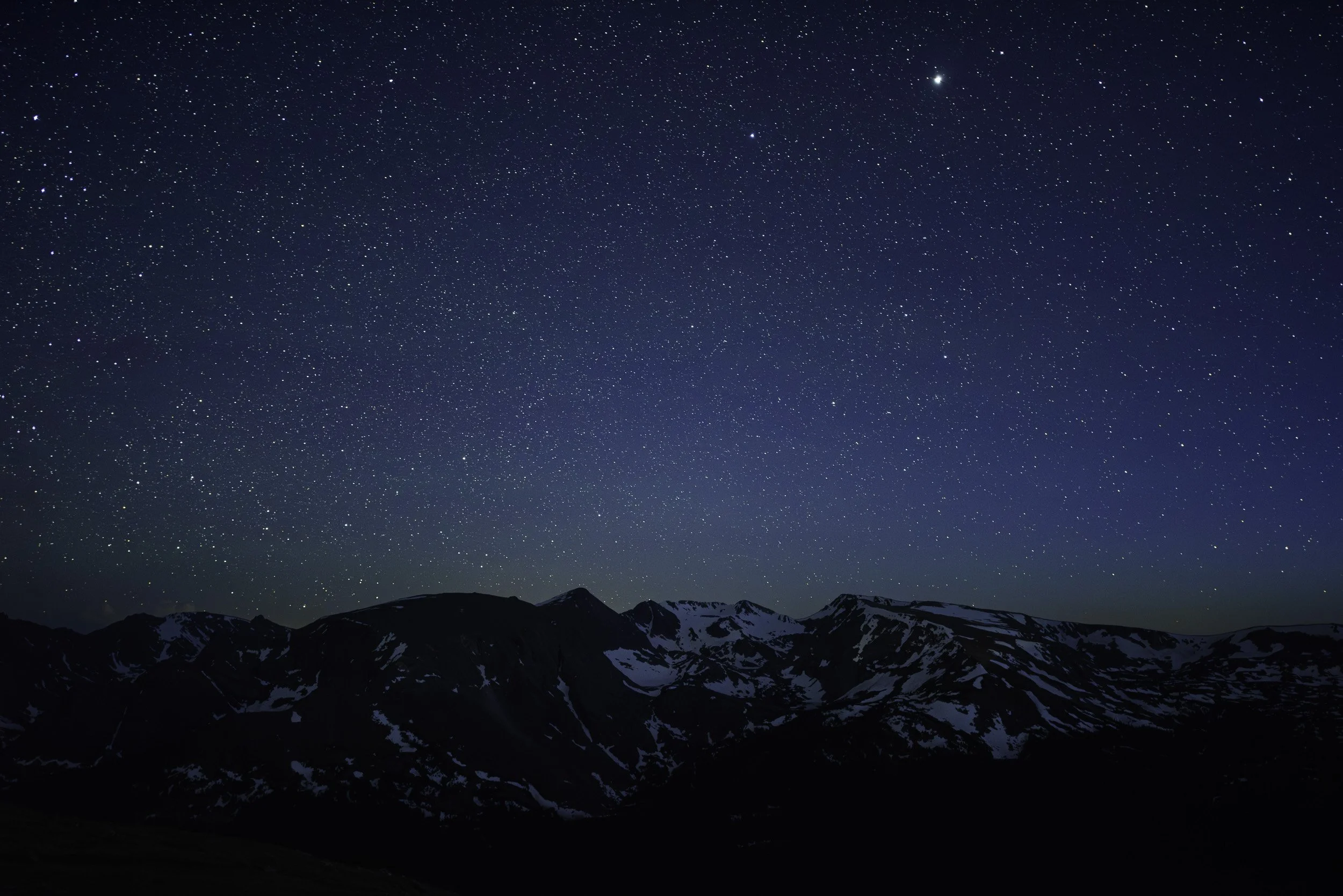
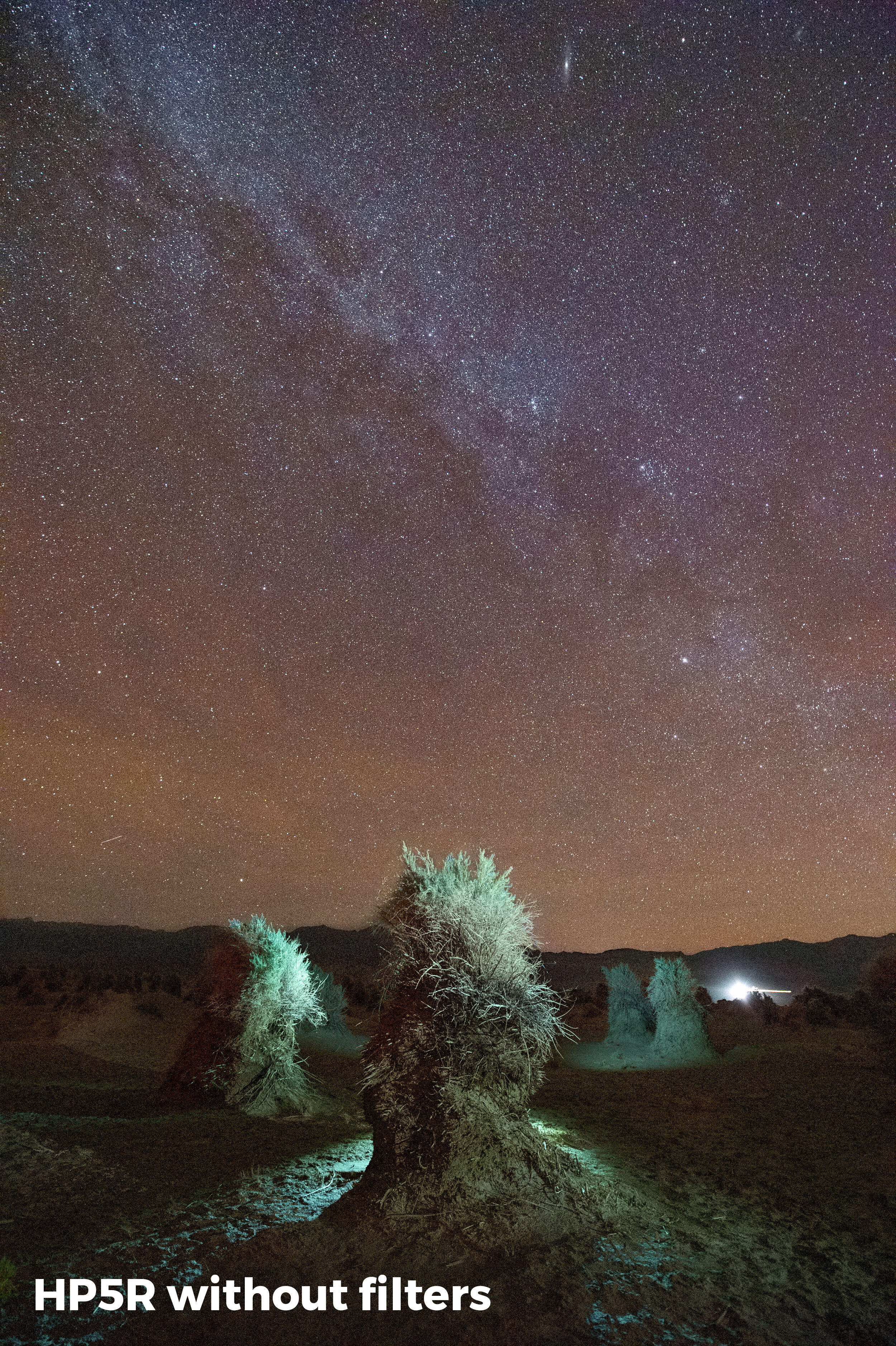
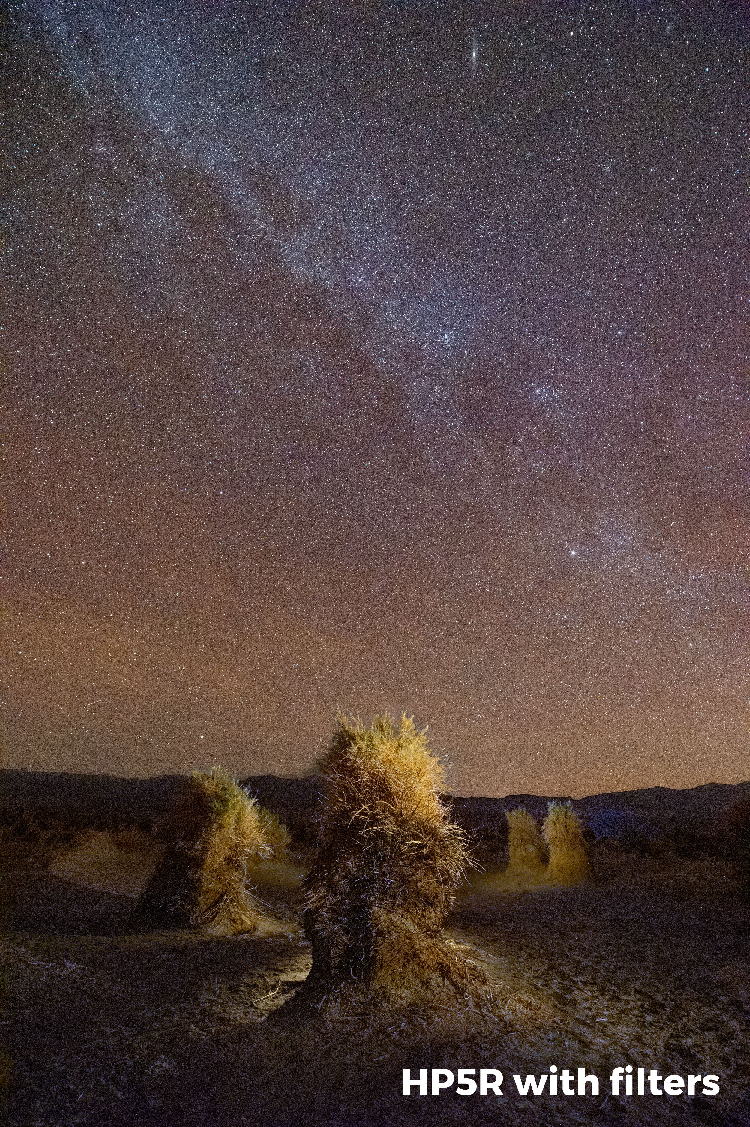
Alabama Hills. In order to get the depth of field required for this image at 22mm, I needed to stop down to f/7.1. I also wanted to keep the shutter speed as short as possible to make sure that the stars would not trail. Moonlight and ISO 6400 allowed for an exposure time of just 4 seconds, which isnโ€™t much time to run around with a flashlght, so LLL was my best option for lighting. ยท Nikon Z 6 with a Tamron 15-30mm f/2.8 lens. 4 seconds, f/7.1, ISO 6400.

LLL is a technique that was developed and evolved concurrently with astro-landscape photography over the past eight years. As opposed to traditional light painting, LLL utilizes very dim constant light sources that are usually maintained in a fixed position during the entire exposure, or possibly even for an entire night. LED panels that feature adjustable brightness and color temperatureโ€”such as the Luxli Violaโ€”mounted on a tripod or light stand are the most common light source used for LLL, but any dim light can be used.

The goal of LLL is generally to leave the light on during an entire exposure in order to match the brightness of the foreground in an astro-landscape scene with the brightness of the sky, thus creating a realistic-looking image that requires minimal post-processing.

Advantages of LLL

Why go through all that instead of wielding a flashlight for a few seconds? LLL presents a few advantages.

Again and Again

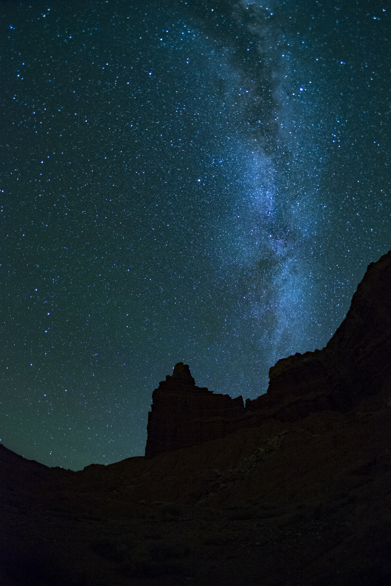
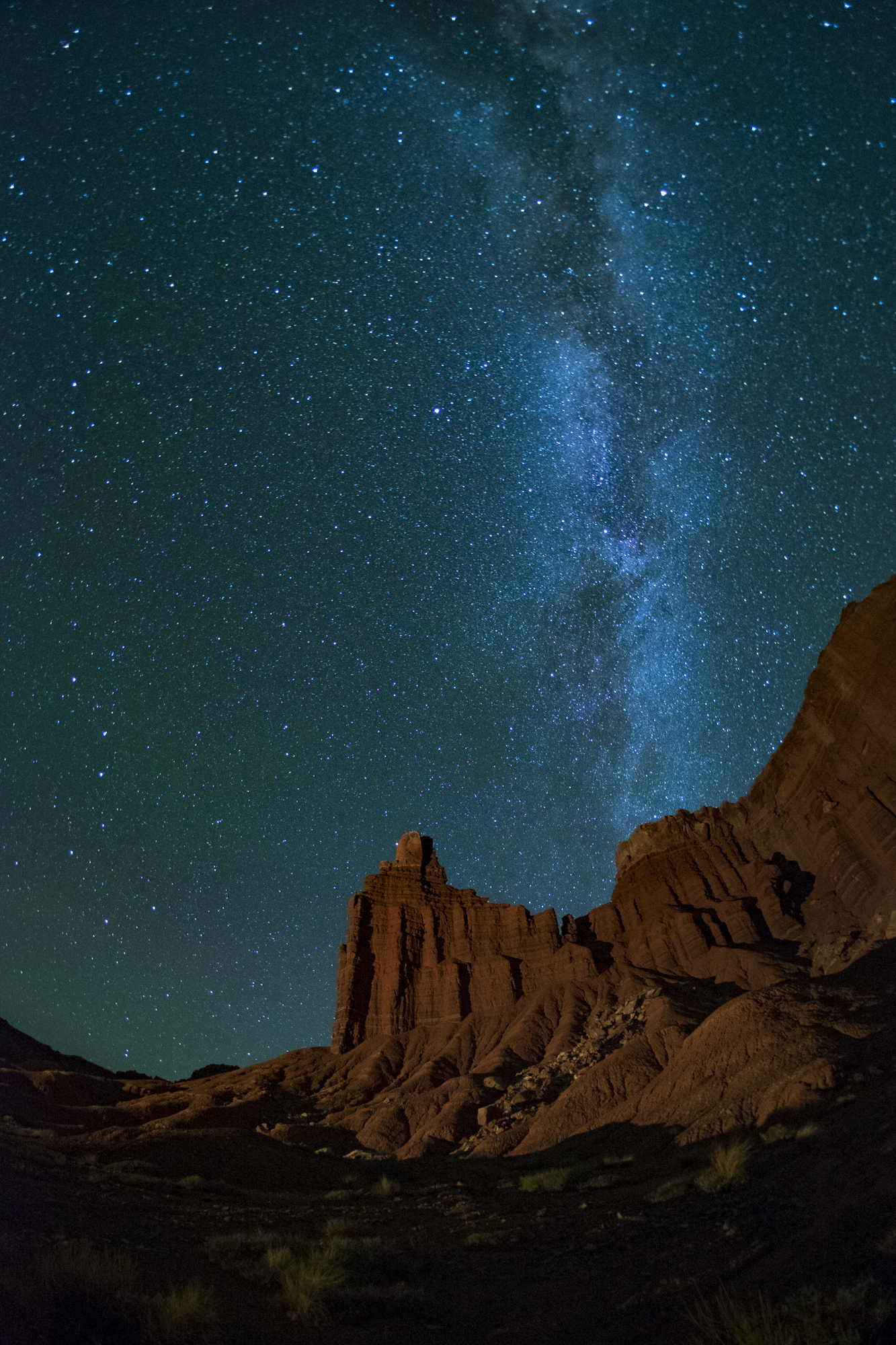
One big advantage is repeatability. Because the light is fixed, it will be the same from one image to the next, unlike light painting where it can be very difficult to repeat complex lighting from one frame to the next.

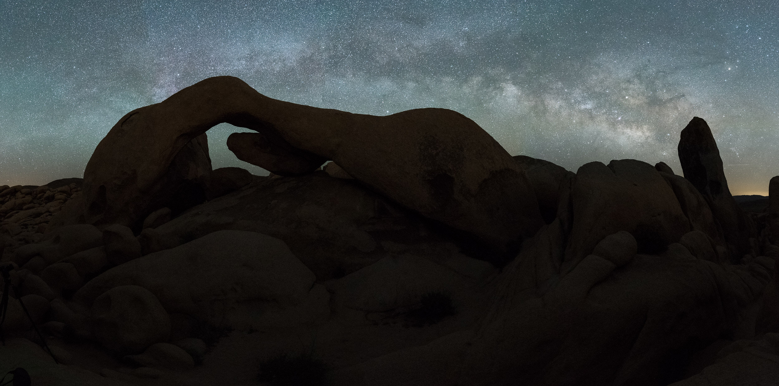
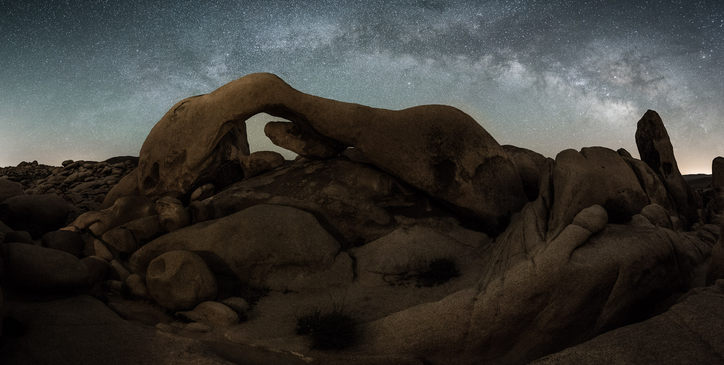
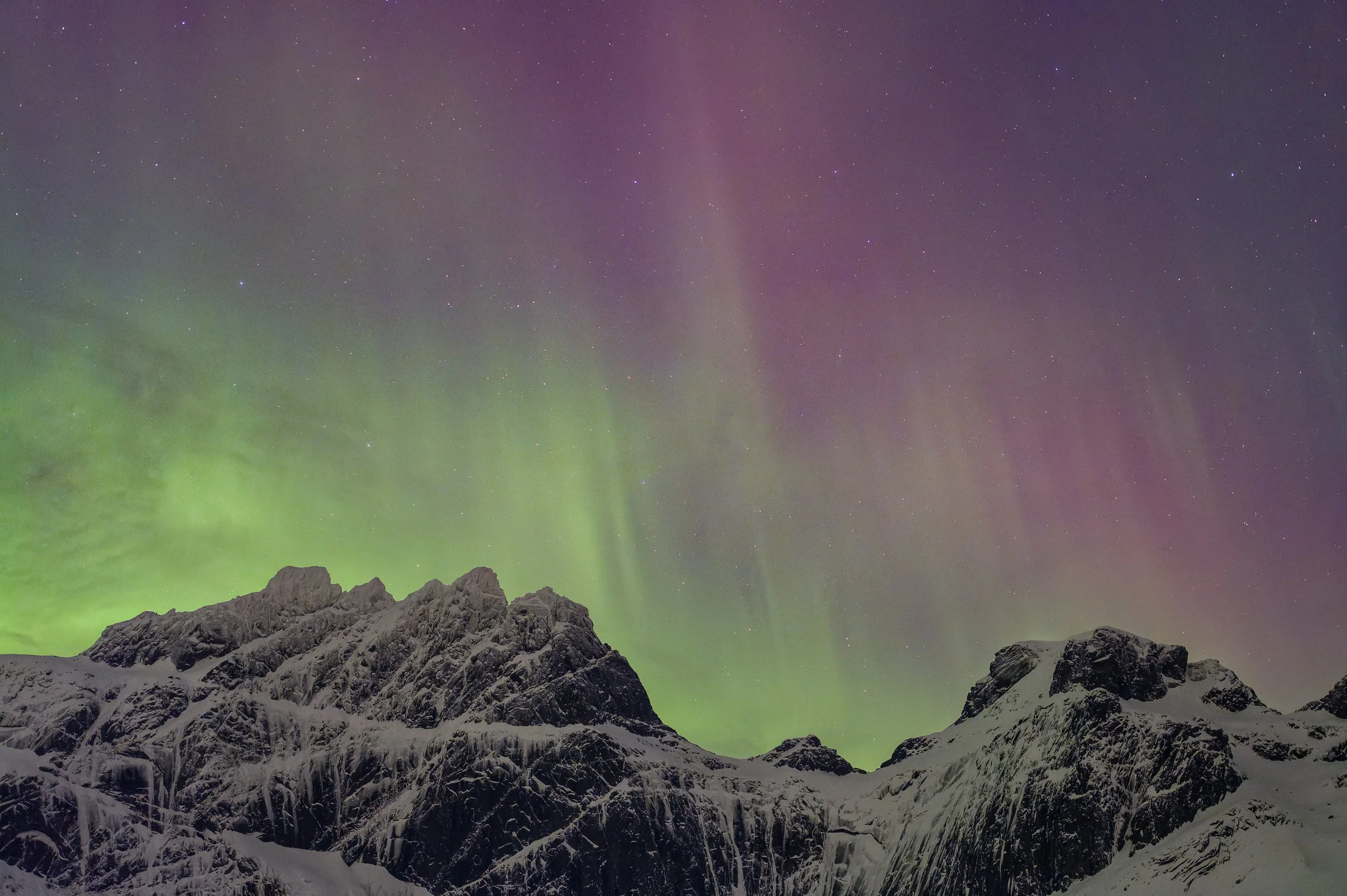
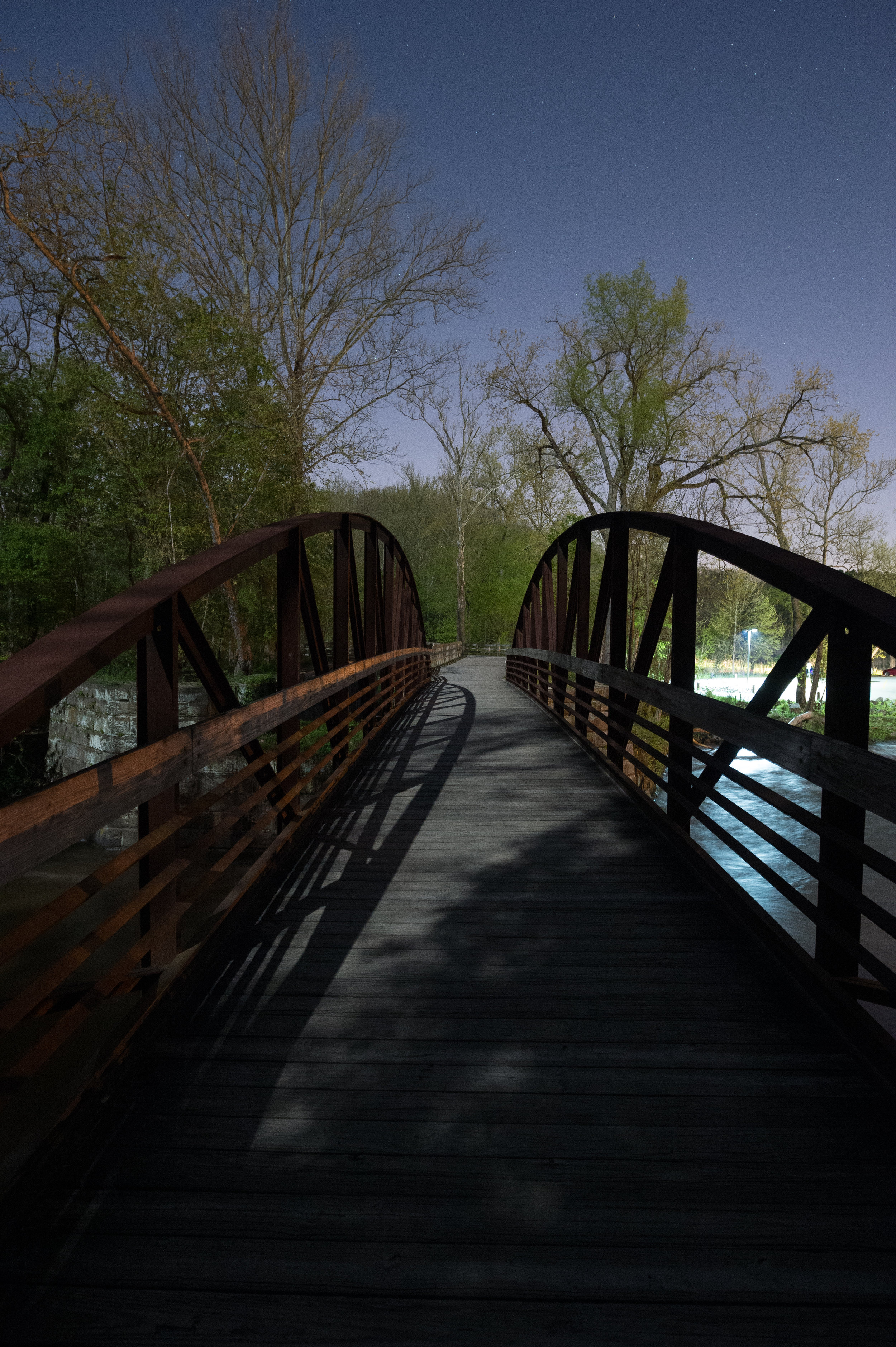
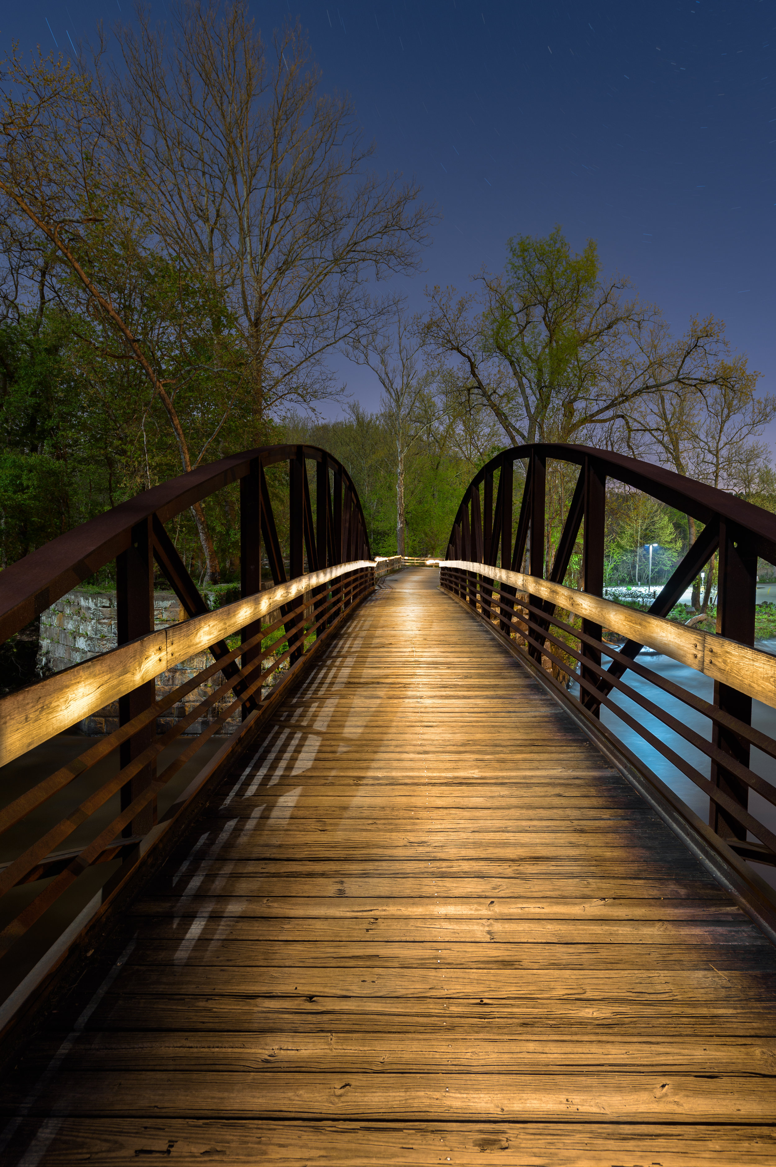
Arch Rock Panorama with Milky Way, Joshua Tree National Park. This before-and-after example shows how LLL can be used to create completely natural looking lighting in astro-landscape images. When making a panorama, having consistent lighting for each frame is critical. I made this image during a workshop collaborating with many of the participants. By using three Luxli Violas in fixed positions at the lowest brightness setting, everyone in the group was able to nail this difficult shot. ยท Nikon D750 with a Tamron 15-30mm f/2.8 lens. 20 seconds, f/3.2, ISO 6400.

Time Constraints

Night photographers are these days faced with two additional challenges when photographing by starlight, and the LLL technique helps with both of them.

The first problem is one of a technical nature. Astro-landscape exposures typically range from 15 to 30 seconds, which does not leave much time for light painting, especially if a scene is large, treacherous or complex. Imagine trying to light from three or four different positions during a 20-second exposure while navigating uneven rocky ground by starlight!

Itโ€™s possible to light various parts of a scene in different exposures and combine them in post-processing to form a final image, but that technique requires a substantial amount of time at the computer in Photoshop, and some people (such as myself) prefer to do the work in the field.

Space Constraints

The second problem has more to do with people than photography. With increased numbers of photographers and non-photographers alike out enjoying nature and our national parks at night, large numbers of bright flashlights being waved around willy-nilly has ruined numerous masterpieces. National Parks at Night has always stressed communication and collaboration during our workshops to enable groups of people to photograph together without getting in one anotherโ€™s way, but not everyone is as considerate as our awesome workshop participants!

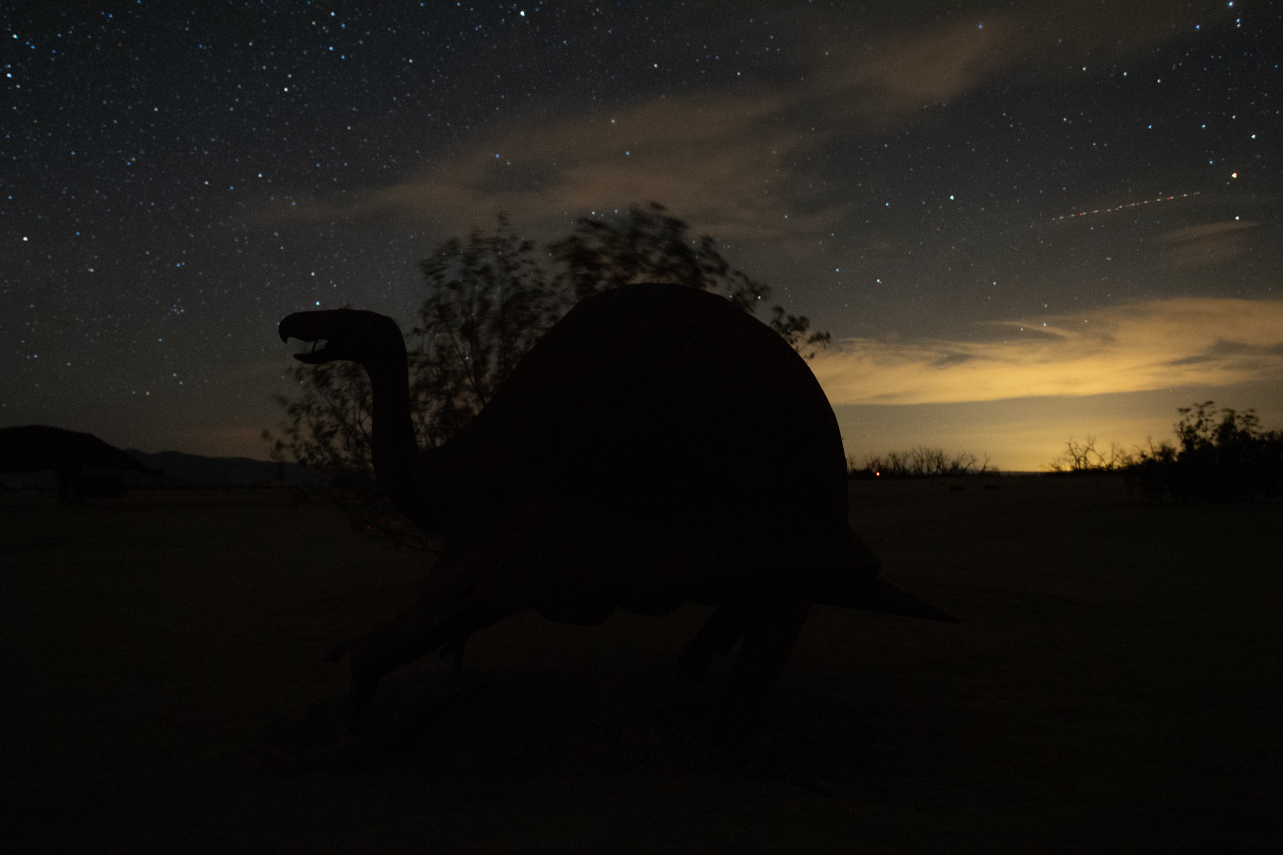
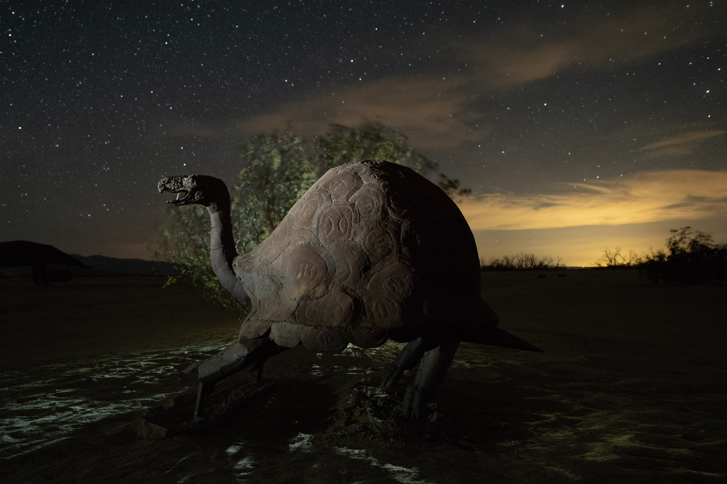
The Rattle Dragon, Borrego Springs. Nine stacked frames, each shot at 3 minutes, f/8, ISO 320. Ricardo Brecedaโ€˜s amazing 350-foot serpent in the Anza Borrego desert photographed with three Luxli Viola lights on stands to illuminate the sculpture. I could have used traditional light painting techniques for this image, but lighting such a large creature from different angles was more easily achieved with fixed-position LLL. ยท Nikon D780 with a Nikon 24-120mm f/4 lens.

Many people who use LLL are striving for images that donโ€™t look like any light has been added to their images. Their goal is to add just enough light to balance the foreground exposure with the sky and call it done.

For me, old habits are hard to break. Although I use and love my Luxlis on almost every night shoot, my own technique is more of a hybrid of LLL and light painting. Iโ€™ve been known to mount a Luxli on a boom arm and hold it over my head while walking along a clifftop or under redwood trees. In other situations I might use a Luxli mounted on a stand, or propped against a rock to light part of a scene, and light the rest of the image with a flashlight. As much of my work is done where the human-made and natural environment intersect, Iโ€™m not necessarily trying to make my images look completely natural. I try to make them look more interesting with interesting light.

Regardless of the technique you use to light your night shots, the goal is the sameโ€“โ€“either to add emphasis and draw the viewerโ€™s attention to a particular part of a photograph, or to fill in dark and underexposed areas to make for a better exposure.

LLL Gear

If you are ready to jump in and give LLL a try, you could rest your light source on a nearby rock or tree branch, or you could start with just one panel light on a second tripodโ€”but more than likely youโ€™ll soon end up with two or three lights and accompanying stands. The Impact LS-RL7 Reverse Legs Light Stand is a good option, as is the Manfrotto MS0490A Nanopole. And if you want the lightest of stands, the Nanopole comes in a Carbon Fiber version that weighs in in at a tidy 1.8 pounds.

I mentioned the Luxli Viola at the beginning of this article as NPANโ€™s LED panel of choice. It is one of the more expensive LED panel lights available, but the quality of the light, the variability of color temperature (as well as the ability to create almost any color you can imagine) and the useful app that allows for remote control of one or multiple Luxlis all make it more than worth the cost. The Viola also comes with a mini ball head that makes aiming the light right where you want it much easier.

The Luxli Viola, the LLL tool of choice for all the NPAN instructors in most situations.

A couple of budget options to get you started are tea lights from a dollar store or diffuse inflatable camping lights, but you probably wonโ€™t get good color from them.

LLL Tips

So, how do you light the landscape with low-level light? The basic concepts of LLL and traditional light painting are similar. The primary difference is that your light or lights are stationary, and usually much dimmer than light painting tools. Here are a few guidelines:

  • Light from 45 to 180 degrees from the camera, never from the camera position.

  • Compose, then focus, then determine your base exposure, then add light where needed.

  • Make test exposures, review the results, make adjustments.

  • Move the light, be mindful of shadows, adjust the intensity as needed.

  • If you are using a Luxli or other variable color tool, match or contrast the color of your light to the overall scene.

  • If using a Luxli, consider pairing it with their free Composer app, which allows you remotely change the intensity, color temperature and hue, rather than having to walk back and forth between the light and the camera to make changes.

  • Work with a partner, or even in a small group, sharing the lighting and the work.
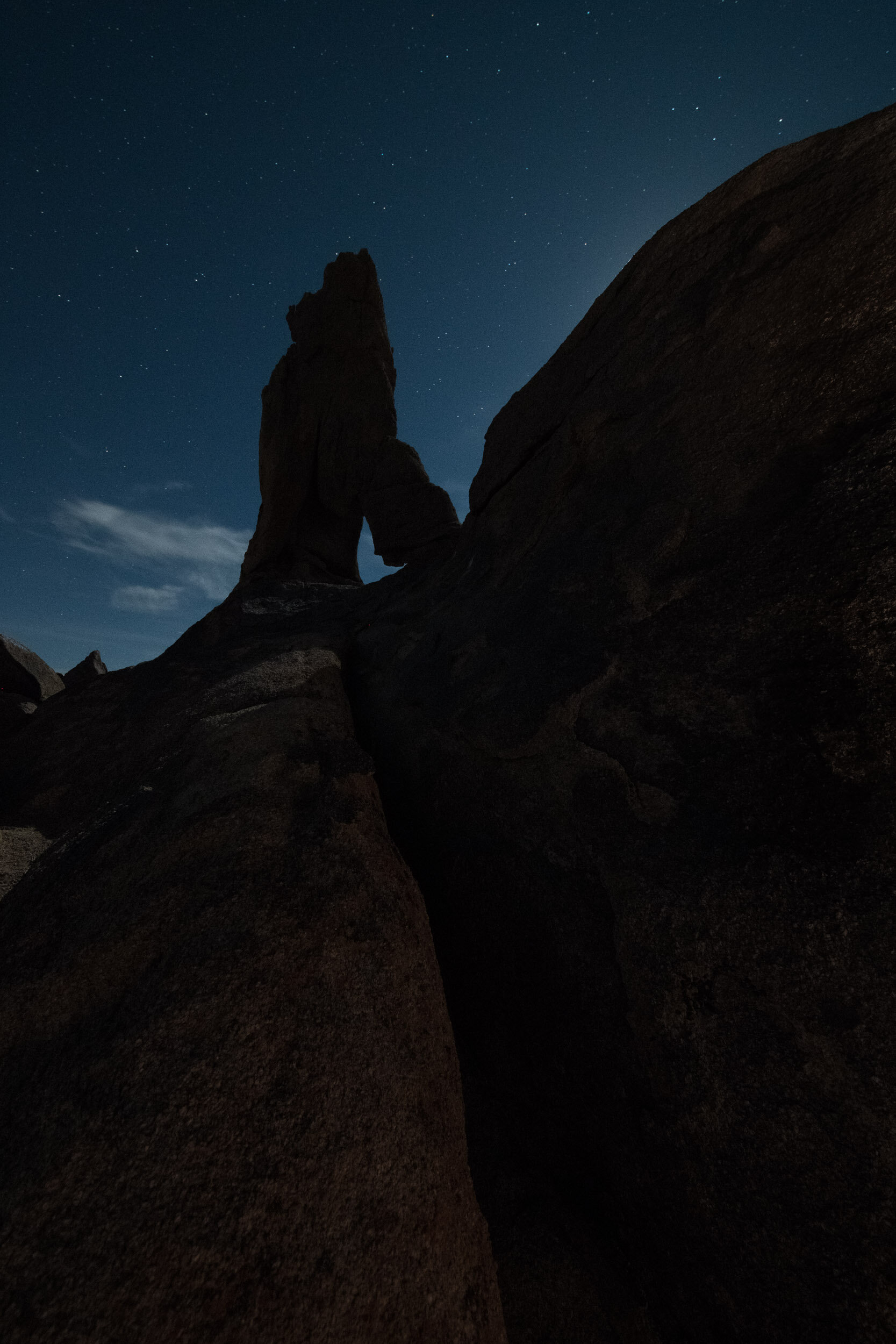
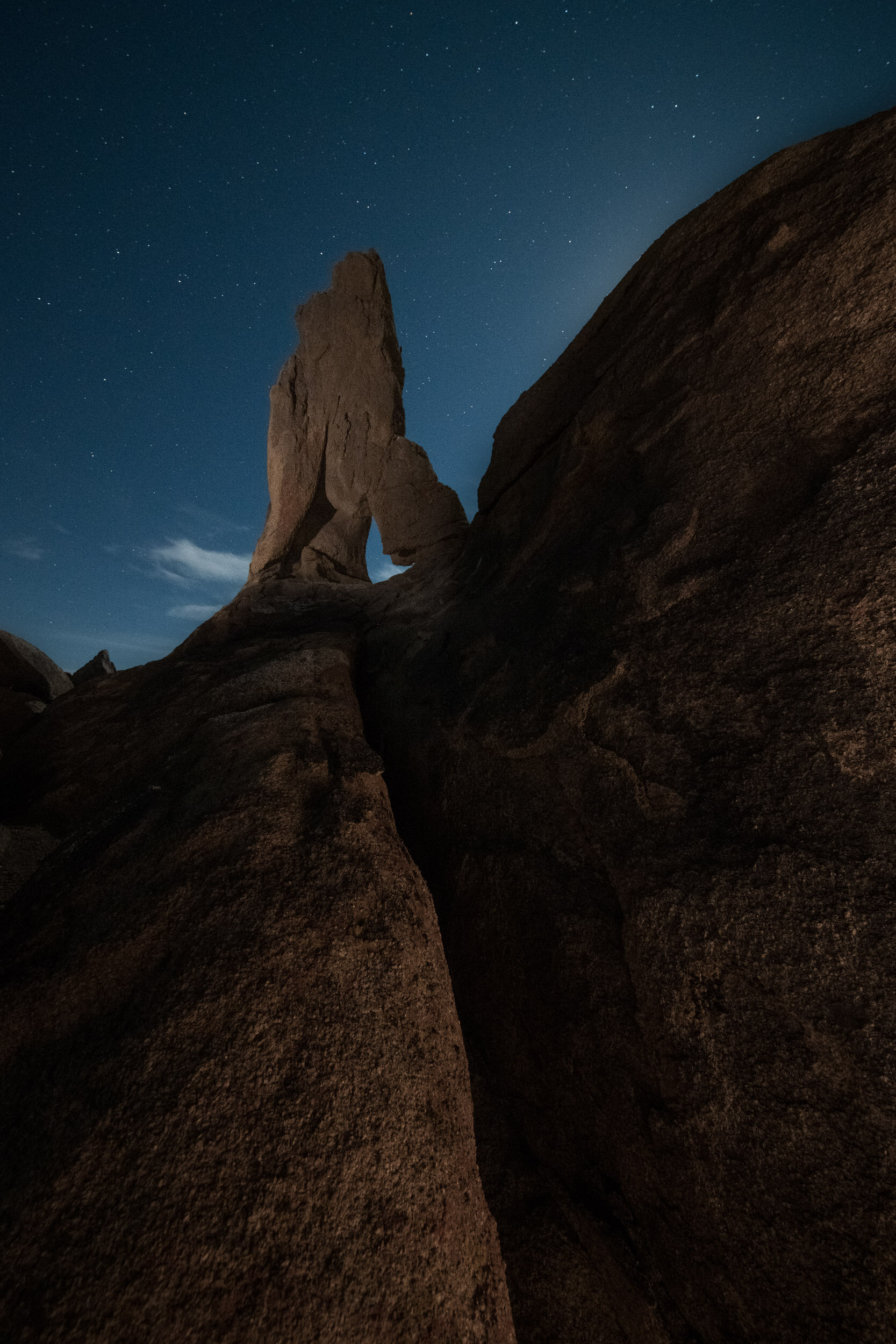
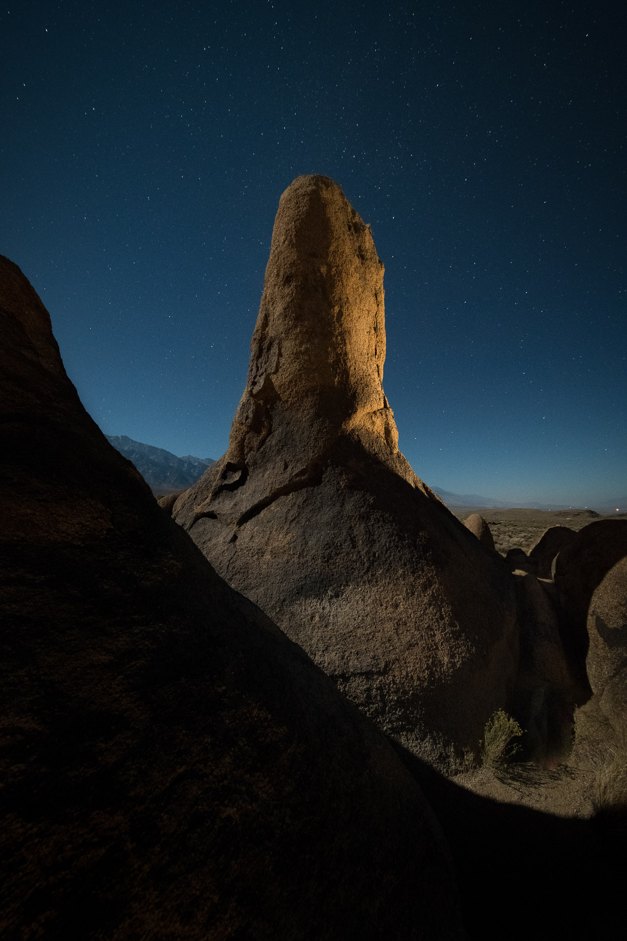
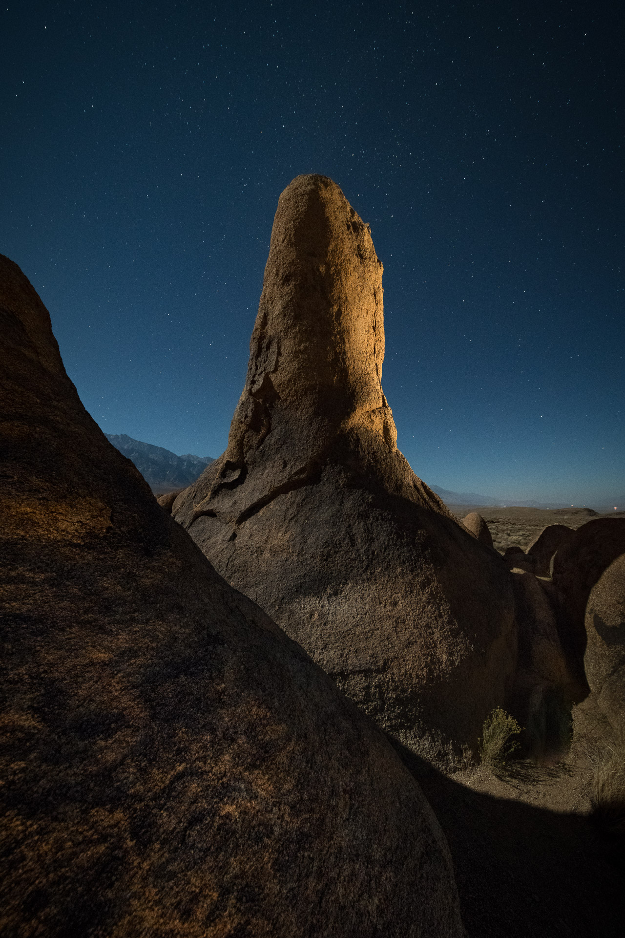
Lady Boot Arch, Alabama Hills. Hereโ€™s another before and after example. The full-ish moon was rising behind the rock on the right. I was more in the mood for star points than trails, so I needed to keep the exposure short. The landscape was full of narrow crevices that seemingly were designed for twisting ankles and banging knees. I used light painting on a different version of this image that night, running like a nutcase between the formations during the short exposure, but that wasnโ€™t an option for this shot. One light was on a stand high to camera-right, and another was leaning against a rock to the left of the arch. ยท Nikon D780 with an Irix 11 mm f/4 lens. 25 seconds, f/8, ISO 3200.

Wrapping Up

Regardless of the tools you use, Low-level Landscape Lighting is an essential technique to have in your night photography toolbox.

If youโ€™re inspired to get out and try this, or if youโ€™ve done it before, weโ€™d love to see your images. Share your images in the comments section or on our Facebook page, or post them on Instagram and tag us (@nationalparksatnight).

Lance Keimig is a partner and workshop leader with National Parks at Night. He has been photographing at night for 35 years, and is the author of Night Photography and Light Painting: Finding Your Way in the Dark (Focal Press, 2015). Learn more about his images and workshops at www.thenightskye.com.

UPCOMING WORKSHOPS FROM NATIONAL PARKS AT NIGHT

To Contrast or Complement: How to Use Color in Light Painting

Color and Color Photography

Iโ€™ve always thought that if you are going to be a color photographer, then you should understand color.

At least thatโ€™s what I thought after I learned about color. For the first several years of my photography career I was regrettably ignorant to the importance and impact of the colors we use in our images. Iโ€™ve come to find out this is not at all uncommon. Many photographers who produce color images are as equally unaware of colorโ€™s characteristics.

I can hear the naysayers already. What color? There is very little color at night. True. Sort of. While there is not an abundance of natural color at night, we do have the opportunity to add our own, with light painting. And we can do that with greater effect if we understand and use the concepts of how the color of light affects perception.

Color psychology

Whether we know it or not, color has a big impact on our lives. From the color of our house to the clothes we wear, color is a quiet indicator of who we are and what we like. You look great in that color, are you a Summer? I am a Winter.

We use it to help fit our mood, or even to enhance it. It may determine the car we drive off the lot or the image of ourselves we want to project. With this level of integration with our daily lives, itโ€™s amazing we donโ€™t give color a higher priority in our image-making processes. We tend to think the color thatโ€™s present (in the words of the kids these days) is what is.

pencils.jpg

Thereโ€™s been barrels of ink written about how we respond emotionally to color, especially when it comes to marketing. We see orange as cheerful, red as exciting, green as peaceful and blue as trustworthy. While there may be grains of truth in this, our personal experiences, not to mention the context the color is being used, render these classifications as no more than points of interest when it comes to photography.

For example, blue may project โ€œtrustworthinessโ€ in a logo, but thatโ€™s not the word that comes to mind when viewing a night sky. The green of the forest can be perceived as relaxing, but may not have the same effect when projected onto a night scene with a flashlight.

While I think color psychology is interesting, I believe its connection to photography is minimal. When you take a picture of an orange, your viewer is more likely to think of a citrus slice or juice rather than an active emotional state.

What I do believe is important for the photographer, however, is color dissonance and color harmony. These terms describe the effect of pairs or groupings of color.

Color Dissonance

Color dissonance can be loosely described as a color scheme that uses complementary colors, which are ones that are opposite of each other on the color wheel. In Figures 1 through 3 you can see the color wheel used for light (Additive Color Model). With this model, the primary colors are red, green and blue (RGBโ€”sound familiar?); the respective secondary colors are cyan, magenta and yellow.

Figure 1. Additive color wheel.

Figure 2. Primary and secondary colors.

Figure 3. The complementary colors of yellow and blue.

When using complementary colors together, you are creating a color scheme that is punchy. It decreases color unity and increases color contrast.

Color Harmony

Color harmony can be loosely described as a color scheme that uses analogous colors. These are colors that are near to each other on the color wheel. Figure 4 shows the analogous colors of yellow, orange and red.

Figure 4. Analogous colors.


When using analogous colors together, you are creating a color scheme that is less punchy. It increases color unity and decreases color contrast.

Strategies for Using Color

Youโ€™ll hear that warm colors such as yellow, orange and red are more active, more excitingโ€”and that cooler colors such purple, blue and green are somewhat calming, less active. I believe there is something to that. However, night photographers rarely think of changing the entire color cast of an image to project a feeling. Whatโ€™s more likely is that weโ€™ll find ourselves in either a warm-color or cool-color situation in the field. For example, we may be shooting in the warmer light of a city (Figure 5), or in the cooler conditions of a wilderness landscape where light pollution is not present (Figure 6).

Figure 5. The warmer colors of an urban environment. Washington, D.C. Nikon D700 with Nikon 35mm f/2 lens. 30 seconds, f/16, ISO 200.

Figure 6. Cooler colors found in the absence of artificial light. Glacier National Park. Nikon D4s with a Nikon 14-24mm f/2.8 lens. 30 seconds, f/9, ISO 3200.

Itโ€™s within these common situations that we can begin to consider color, and to perhaps even create a color strategy. Sometimes we can affect the overall color dissonance or harmony, sometimes we canโ€™t, but itโ€™s good to know the effects of both approaches so that we can use them creatively when possible.

Figure 7 demonstrates the familiar contrast between the cool night sky and the warmth of artificial lights, and is a perfect example of how we donโ€™t always have the ability to control the color contrast in the scene. If I had changed the white balance to try to change one color cast, that would have affected the other color cast too. In a scene like this, we are stuck with the naturally occurring color contrast.

Figure 7. Cool night sky with warm artificial lights. San Francisco. Canon EOS-1Ds with a Sigma 70-200mm f/2.8 lens. 20 seconds, f/16, ISO 100.

Other situations, however, may provide us with more power to control the overall effect of colorโ€”in particular, when we are adding our own light to the scene.

For the image in Figure 8, I chose to light paint a pale blue truck with an unfiltered Coast HP5R flashlight. I shot this image on a full-moon night with the cameraโ€™s white balance set to 4000 K. The cooler white balance kept the sky looking more blue (a warmer white balance of Daylight/Direct Sun/5500 K would have rendered the sky somewhat colorless). This cooler white balance also influenced the color of the flashlight. Here, the HP5R (like many other LED flashlights) has a slight blue cast. The cooler white balance, then, has pushed the color of my flashlight even more blue. Couple that with the blue sky and you get classic color harmony.

Figure 8. Influencing the scene toward color harmony. Nelson Ghost Town, Nevada. Nikon D4 with a Nikon 35mm f/2 lens, light painted with a Coast HP5R flashlight. 4 minutes, f/9, ISO 100.

Compare Figures 7 and 8. In Figure 7 we are seeing color contrast (dissonance), and in Figure 8, color harmony. While looking at each, notice how your eye moves. The movement is more abrupt with color contrast and a bit less when thereโ€™s color harmony.

So when you consider the possible changes you can make to color in a scene, consider dissonance versus harmony. Simply put, do you want to create an image thatโ€™s visually active and has punch (more color contrastโ€”dissonance) or an image that is tranquil (less contrastโ€”color harmony)?

The trick is to decide where you want the viewer to focus. If the colors are really punchy, the viewer may pay more attention to the difference in color. If the colors are similar to one another, the imaginary line drawn between the colors may be less apparent. There is no right or wrong. Itโ€™s just a matter of how you want people to move through your photograph and where you want their focus to be. That decision can be directed by your personal style, or by the subject matter.

Letโ€™s look at a couple of case studies.

Color Dissonance

Figure 9 is an image I made at Battery Spencer on our 2019 San Francisco workshop. It was an exciting night due to the dense fog rolling in from the sea. The fog was glowing with the dominant color of the cityโ€™s sodium vapor lights.

In most circumstances I would have lowered the Kelvin temperature on my camera to neutralize this heavy orange cast. In this case I decided to stick with a Direct Sun (5500 K) white balance setting to render the city light as it was. This gave the ambient scene an otherworldly sort of look.

Then I added in my light painting. With the cameraโ€™s white balance set to Direct Sun, I knew my Coast HP7R would render as neutral, tending toward blue. But I wanted more color dissonanceโ€”more action, more excitement created by color contrast. So I put a pale blue gel over the flashlight to push the color further toward blue.

The result? A blue spotlight creating a star through the orange fog that highlights a silhouette. Color contrast. Color dissonance.

Figure 9. Creating color contrast. San Francisco. Nikon Z 6 with a Nikon Z 24-70mm f/4 lens, light painted with a Coast HP7R flashlight. 15 seconds, f/4, ISO 800.

Color Harmony

For the image in Figure 10, I went for the complete opposite: color unity. I made this at Grafton Ghost town during our Zion National Park workshop in 2016. I wanted to create a cool color harmony that would provoke a somewhat spooky feeling.

The landscape was being illuminated by a full moon. I set my white balance to 4000 K. Images made under a full moon can often look like they were shot in daylight, so lowering the white balance to 4000 K helps keep the impression of a night scene.

A setting of 4000 K renders my Coast HP5R only somewhat blue, and again I wanted more blue, to match the coolness of the ambient light. So I added a light blue gel to the front of the flashlight to increase the depth of blue, which helped retain color harmony throughout the image.

Figure 10. Creating color harmony. Grafton Ghost Town, Utah. Nikon D700 with a Nikon 24mm f/2.8 lens, light painted with a Coast HP5R flashlight. 1 minute, f/9, ISO 200.

Pulling it All Together

Color is an important feature in all of our imagery, day or night. While we donโ€™t always have control over the color in a scene, given the opportunity, we should influence it to the best of our ability.

Here are the key considerations to choosing the color of your light painting in the field:

  1. White balance influences the overall color cast. This means it will affect all colors equally. Set the white balance to anchor the color of your ambient light (sky, fog, moonlight, etc.). This step should be done first, as it sets the stage for any color you may add into the scene.

  2. Consider the color of your flashlight or light panel and how your white balance will affect its color.

  3. Consider how you want your viewer to see the image. Should their eyes bounce back and forth between illuminated subjects (dissonance) or should they move gently through the image (harmony)?

  4. Alter the color of your light painting tool to affect either dissonance or harmony. In the case of a Luxli Cello or Viola, you can simply dial in the color temperature to contrast or unite the colors of the scene. If you are using a flashlight, first determine its actual color (see earlier blog posts on correcting the color of your flashlight), then alter the color of the light by using gels.

Wrapping Up

The next time youโ€™re light painting, keep in mind the concepts of color contrast and color harmony. Then experiment with each to create different images with different kinds of impact. This exercise will create an expertise in applying these concepts to great affect, guaranteeing that youโ€™ll level up your night photography.

Weโ€™d love to see what you do! Post your images in the comments, share on our Facebook page, or tag us (@nationalparksatnight) on Instagram.

Tim Cooper is a partner and workshop leader with National Parks at Night. Learn more techniques from his book The Magic of Light Painting, available from Peachpit.

UPCOMING WORKSHOPS FROM NATIONAL PARKS AT NIGHT

Level Up With Light Painting: Correcting the Color of Your Flashlight (Part III)

In 2017 I wrote a two-part blog post titled โ€œLevel Up With Light Painting: Correcting the Color of Your Flashlight,โ€ which discussed the color biases of flashlights and how to filter them to neutralize that color when shooting at different white balance settings.

In the first part I talked about the pros and cons of LED flashlights, color theory, white balance, testing your flashlightโ€™s color and how to fashion your own custom filters. This all revolved shooting at Daylight white balance.

In the second part I followed up with how to filter Coast HP7R and HP5R flashlights to provide a neutral color when the white balance is set to 3200 K. This is a common setting for shooting in urban areas at night, as most streetlights and other city lights are rendered overly orange when white balance is set to Daylight.

In both of those posts I used a decidedly unscientific method of performing the color tests. While the results were close to accurate, this past summer I decided to look for more precision, so I set about running color tests with the aforementioned flashlights (my favorite two to use). Now I can paint with neutral light at any white balance.

The Color Tests

For this I needed a color meter. Admittedly, color meters are expensive and not generally used by the average photographer. They are, however, an invaluable tool in commercial/advertising photography and in the film industry. Since I donโ€™t own one, the generous folks at MAC Group arranged to loan me a Sekonic C-800 SpectroMaster. (Thank you, MAC Group! Your gracious loan benefits us all.)

My goal for the tests was to determine the proper filtration for the HP7R and HP5R with a camera set to the white balances most often used for night photography. (For a rundown on these, see Mattโ€™s post โ€œHow to Choose the Right White Balance for Night Skiesโ€ and my post โ€œMaking the Move to Manual White Balance.โ€) I tested each of nine white balance settings (5500, 5000, 4800, 4500, 4200, 4000, 3850, 3500 and 3200 K), with each flashlight set at both high and low power. I then determined which Lee Filters gels would neutralize the color while also adding a little warmth to the light.

Then we put all the results into a guide to assist other night photographers who would like to remove unwanted color casts from their Coast lights. You can download the guide by clicking here or on the image below.

Click image to download

While the chart is extensive, I would suggest not getting too wrapped preparing for all the optionsโ€”itโ€™s unlikely that youโ€™ll be shooting at nine different white balances. For my kit, I created filters for 3850 K and 3200 K for each of my flashlights. This gives me enough flexibility for most situations I encounter.

When shooting on a white balance setting of Daylight, I use my 3850 K filter combination to add slight warmth to my flashlight. When setting my cameraโ€™s white balance to 3850 K, I use the 3850 K filter combo for a neutral light or the 3200 K filter combo for a warmer effect. Likewise, when using the 3200 K filter with the cameraโ€™s white balance set at 3200 K (i.e. Tungsten), the flashlight provides a nice neutral color.

Putting it into Practice

Letโ€™s look at an example of this in action.

My favorite white balance for capturing the Milky Way is 3850 K. Why? Because when shooting night skies using Daylight (about 5500 K), even in dark sky environments itโ€™s not uncommon for the resulting image to have an orange cast to it. Using 3850 K creates a cooler, more natural look to the sky while maintaining some warmth in the colors of the galaxy.

In Figure 1 you can see the result of shooting the Milky Way in Death Valley National Park with my white balance set to Daylight compared to 3850 K. The latter better represents how I want the night sky and the Milky Way to appear in a photo.

Figure 1. The color difference between shooting the Milky Way at a Daylight white balance versus 3800 K.

If shooting the Milky Way is all I wanted to accomplish, setting my white balance to 3850 K would provide great results. But for those who know me, you know I love light painting!

At Death Valleyโ€™s Devils Cornfield, I captured the first image (left) in Figure 2 with a white balance setting of 3850 K. For the light painting I used the low-power setting on my Coast HP5R. Notice the overly blue/green effect that the unfiltered flashlight created?

To get my added light to accurately render the colors of the scene, I filtered the flashlight to look good at that white balance of 3850 K. According to my test results, that meant I needed a combination of 1/2 CTO + 1/8 CTO + 1/4 Minus Green.

That fixed the incorrect color cast, but I really wanted my flashlight to put out a slightly warmer rather than neutral color, because I like the visual effect of warm light. So instead of using the filter combo for 3850 K, I used the combo for a 3200 K setting: 3/4 CTO + 1/8 CTO + 1/4 Minus Green + 1/8 Minus Green. That gave me exactly the color I was hoping for (Figure 2, right).

Figure 2. Devils Cornfield, Death Valley National Park. Nikon D4s with a Nikon 14-24mm f/2.8 lens. 20 seconds, f/4, ISO 6400, with a white balance of 3850 K. Light painted with a Coast HP5R unfiltered (left), and filtered (right) with Lee 3/4 CTO + 1/8 CTO + 1/4 Minus Green + 1/8 Minus Green gels.

One last point: It can be a bit tedious to hold filter gels in front of a flashlight while running around in the dark. The solution? I create a โ€œdiscโ€ filter that attaches right to the front of the flashlight. To see how I do this, look back on Part I of this series.

Tim Cooper is a partner and workshop leader with National Parks at Night. Learn more techniques from his book The Magic of Light Painting, available from Peachpit.

UPCOMING WORKSHOPS FROM NATIONAL PARKS AT NIGHT

Filling in the Shadows: Light Painting Before and After

Light painting is and can be many things. It can control the viewerโ€™s eye. It can be a catalyst for creativity. It can bring life into the shadows of a composition. It can add drama to an otherwise ordinary scene. It can be an artistโ€™s brush used to sweep strokes of illumination onto a landscape to allow us to see into the night in new and previously unimagined ways.

In other words, light painting is a versatile tool that can be a means to various ends. Below, all five National Parks at Night instructors share a way they have used light painting to enhance a nocturnal photograph.

Youโ€™ll notice that the examples included do not involve drenching a scene with buckets of untamed light to paint every crevice and fill every shadow. They also donโ€™t involve dramatic re-representations of reality, wherein we let the light alter the authenticity of the world thatโ€™s in front of the camera. Rather, as Gabe says, we paint with shadows as much as we paint with light. And as Matt says, we let the light merely kiss the subject.

For each photograph, click or press on the slider, and drag it left and right to see how the light painting subtly but noticeably enhances the composition. Study the ways that the added illumination helps accomplish different tasks or helps solve problems of exposure, composition, etc. Then think about how you can apply those same ideas to your own night images.

More importantly, also think about how you may have illuminated these scenes differently. One of the amazing aspects of light painting is that it affords us an opportunity to create a completely different photograph than another photographer who may have the exact same composition.


Lance Keimig

Nikon D850, Irix 11mm f/4 lens, 15 seconds, f/5.6, ISO 3200.

This image of the backside of Lady Boot Arch in the Alabama Hills of Californiaโ€™s Eastern Sierra was made at the end of a long night during our workshop there last November. I had photographed the arch many times before, and was looking for a unique vantage point. Itโ€™s a situation that I often find myself faced withโ€“โ€“trying to make an image that Iโ€™ve never seen before in a familiar location.

Once I found this perspective, I knew that I had the shot. I just had to figure out how to light it. The moon was high in the sky to the west, illuminating the left side of the arch, and the foreground was deep in shadow. I lit the right side of the formation from behind with a warm-gelled Coast HP5R flashlight, which gave depth and texture to the arch, which from the rear looks more like a tower.

The light painting worked like this: The repeated diagonals from upper left to lower right created depth and drama. However, the dark mass on the left and bottom of the frame was too heavy, so I decided to add just a hint of fill light to this part of the frame. Anyone who has studied with me has heard the mantra to โ€œnot light from behind the camera,โ€ but in this case, there really wasnโ€™t much of an option. A quick swipe of the flashlight along the surface of the rock was all it took to bring out the texture and fill in the shadows.

The key was to rake the light along the surface of the rock rather than to light it straight on. The flashlight was a better choice for this than my Luxli Viola because I needed a strong directional source, as I was lighting from next to the camera. Low-level Landscape Lighting with the Luxli would have been much easier, as I had only 15 seconds to paint from both locations. But as it turned out, racing to get the lighting completed before the shutter closed was a fun challenge that served the additional purpose of keeping me warm after about eight hours out in the cool autumn air!

This image ended up being my favorite of 2017, not only for the image itself, but for the challenge of executing it all in one frame in just 15 seconds.


Tim Cooper

Nikon D4s, Nikon 14-24mm f/2.8 lens. 60 seconds, f/5.6, ISO 100.

Light painting is all about angles and shadows. More specifically, itโ€™s about the angle of the light source to the subject, and the shadows that the light source subsequently produces. Painting a subject while you stand right by the camera always produces the most boring light. Why? Because it causes all of the shadows to fall behind your subject. But when you paint from an oblique angle, you produce a more interesting picture with tons of texture.

Texture, and in turn drama, is brought out when you paint your subject from the side or from behind. Painting your subject from behind causes all of your shadows to fall in front of the subject and toward the camera. This type of lighting can be really dramatic. It can also be difficult to pull off when you have to hide your light from your camera.

That was the case with this footbridge in Cuyahoga Valley National Park. I wanted to paint the railings and the walk, but I didnโ€™t want the flat look of front lighting. So I tripped the shutter and hid the flashlight in front of me while I walked down the bridge pointing the flashlight backward at the left railing. When I reached the end, I walked backward and again hid the flashlight in front of me while I painted the right railing. Doing this kept the flashlight hidden from the camera the whole time.

The next and more difficult task was to light the walk. In this case I couldnโ€™t walk away from the camera while painting with the flashlight in front of me, or my body would have blocked the cameraโ€™s view of what I was light painting. So I had to start at the far end of the bridge and walk toward the camera while painting the walk in between me and the camera. Painting in this manner brought out all of the texture in the wood decking.

Unfortunately, it also caused the problem of the flashlight being fully visible to the camera. Thatโ€™s a big no-no in light painting. To solve this problem, I held my hat in my other hand and used its brim to hide the flashlight from the camera while I painted down at the walk. The diagram below shows the basics of this technique.

Remember to always hide the flashlight from the camera, and always wear dark colors so that the bounce light doesnโ€™t illuminate your body!


Gabe Biderman

Nikon D5, 14-24mm f/2.8 lens at 24mm. 20 seconds, f/4, ISO 6400.

Light painting is a must when photographing close subject matter under dark sky conditions. We specifically chose a new moon time period for our first Ambassador Series workshop with Atlas Obscura at Borrego Springs. The focus was to revisualize the many surreal sculptures that surround the town against the billion-star backdrop.

Before I paint with light, I always take several test shots to help me see, compose and focus. This also helps me figure out where the light would create interesting shadows. We call it light painting, but I like to call it โ€œshadow paintingโ€ because not only is it about revealing information, but itโ€™s also about creating interesting textures and shadows! This can generally be achieved when our light hits the subject at a 45- to 90-degree angle from the camera.

I also love adding dramatic backlighting to scenes and I chose this composition specifically so that the bush would frame the turtle and I could cast light and shadows into the scene.

During the 20-second exposure I walked 10 feet to the left of the frame with my 1/2 CTO-gelled Coast HP5R flashlight. I did the side lighting at the lowest setting for 2 seconds. I was careful not to move my flashlight while it was on, which allowed me to create the dark shadows along the neck and back of the sculptureโ€”i.e., the areas I shadow painted.

With the flashlight off, I then walked behind the bush, got low and out of view from the camera, and quickly turned the HP5R on and off while it was pointed back toward the turtle. This revealed so much texture in the sand and created an interesting mosaic of shadows reaching toward the viewer.

So give shadow painting a try!


Matt Hill

Fuji X-T1, 7artisans 7.5mm f/2.8 lens. 58 seconds, f/2.8, ISO 6400.

Sometimes light painting a 400-foot tall pillar of Moenkopi sandstone calls for bringing in the big guns. I was running a long star stack/time-lapse with some other students on our Capitol Reef National Park workshop earlier this year.

The stack started during moonset, which was very gentle, and beautiful. But according to PhotoPills, the tail end of the Milky Way wouldnโ€™t be ascending the rock formation until we came back to collect our cameras over an hour and a half later. As we came back, student Karl Zuzarte asked what was already on my mind: โ€œCan we light paint the last frame or two of the stack?โ€ โ€œHeck, yes,โ€ I said.

Since it was a bit of a slog to get to our cameras, I asked Gabe to grab a radio and a Luxli Cello panel light (which is the new big brother to the Viola), and to head off about 1/4-mile away at an oblique angle similar to moonset.

Gabe set the Cello to 3000K and maybe 2 percent intensity. Unlike sweeping a flashlight around, which softens the shadow edges, the fixed position of the panel created the perfect strong kiss of light to cast crisp shadows. And its 72-degree beam angle covered the entire massive rock formation and grazed the tops of the vegetation on the desert floor.


Chris Nicholson

Nikon D3s, 14-24mm f/2.8 lens at 14mm. 15 seconds, f/2.8, ISO 2000.

When shooting in Cape Hatteras National Seashore earlier this year, I was excited to tackle perhaps the most famous light house in the United States: the eponymous Cape Hatteras Light. I'd shot there only once before, in 2001 or so, and that was during daylight. This time, I got to do it with stars!

I went for a wide-angle composition, drawn by the symmetry of the scene, as well as by the low angle that allowed me to include as many stars as possible. I liked the framing, but felt the scene needed a little lighting to help emphasize the primary subjectโ€”i.e., the lighthouse. If Iโ€™d let the structure stay in relative silhouette, then the visual emphasis would have been on the sky instead.

For the light painting I used a lightly gelled (1/2 CTO) Coast HP7R flashlight. I stood to camera-right, beyond the out-of-frame fence, at almost 90 degrees from the lighthouse. I fired my shutter with a Vello Freewave wireless remote, then started light painting with a wide beam and a downward stroke, starting at the lantern and moving down to the stones and steps at the base. I then quickly focused the flashlight for a tight beam and side-lit the fence leading to the bottom of the frame, letting it catch just pieces of the fence here and there, but being careful not to light the grass.


Light it Up!

We hope this gives you some ideas about various ways you can light the night, and about some of the ways you can use light painting to overcome night photography obstacles.

There are of course many other examples, and Iโ€™m sure weโ€™ll offer more in the future. In the meantime, weโ€™d love to see your work. In the Comments section, please share some stories (with photos, of course) of how you have used light painting to help you seize the night!

Chris Nicholson is a partner and workshop leader with National Parks at Night, and author of Photographing National Parks (Sidelight Books, 2015). Learn more about national parks as photography destinations, subscribe to Chris' free e-newsletter, and more at www.PhotographingNationalParks.com.

UPCOMING WORKSHOPS FROM NATIONAL PARKS AT NIGHT

Light Painting in Moonlightโ€”Using the Moon as Key Light, or Using it as Fill

Many moons, many opportunities

One of the great things about night photography is the variety of lighting situations we have throughout each month, from complete darkness (around the new moon) to extremely bright conditions (around the full moon).

Photographing around the new moon is great for capturing skies chock full of stars. The skies have little or no light, which allows us to shoot with wide-open apertures that allow even the dimmest stars to be seen. This is also a great moon phase for capturing the Milky Way or shooting long star trails.

New moon. Stitched panorama. Fuji X-T2 with 10-24mm f/4 lens at 16mm. 30 seconds, f/4, ISO 6400.

The rest of the month, however, is marked by some amount of moonlight. These moon phases provide the night photographer with endless opportunities for light painting.

Quarter moon (sometimes referred to as half moon). Fuji X-T2 with 16mm f/1.4 lens. 4 minutes, f/5.6, ISO 100.

Full moon. Nikon D4s with a 24mm f/2.8 lens. 3 minutes, f/8, ISO 100.

Can you light paint under new moons? Sure. But you do have to provide all of the lighting. Illuminating the entire foreground of a scene can be quite challenging. Sticking to smaller, more manageable subjects will ensure a better chance of success.

When the moon is up (and is more than just a sliver), it bathes the earth in a faint, soft light. On the other hand, when the moon moves toward full, itโ€™s so bright that our images can look like they were made during the day! Using the moonlight to help illuminate our foreground is a great strategy to create stunning astro-landscape photographs. And if you want to level up those images, you can add in some light paintingโ€”either as a fill light or as a key light.

Getting Started

Here are the four basic steps to creating a light-painted night scene:

  1. Compose.
  2. Focus.
  3. Determine ambient light exposure.
  4. Add light painting.

1. Compose

It all begins with finding your composition. Regrettably, in this techie genre of photography, we often spend more time thinking about our settings than we do our composition. Spend some time here. Try out different options before you commit.

2. Focus

Once youโ€™ve found your composition, itโ€™s time to get your focus. For more on this, see Chris Nicholsonโ€™s recent blog post โ€œStaying Sharp: 8 Ways to Focus in the Dark.โ€

3. Determine Ambient Light Exposure

With your scene composed and properly focused, itโ€™s time to set an exposure for the ambient light. What is ambient light, you ask? Ambient light is the available light in the scene. This is the sun during daytime exposures, the city lights in a nightime urban environment, your living room lamps if you are shooting indoors at night, or (in our case) the moonlight.

Getting your exposure correct for the ambient moonlight is critical. Each situation and phase of the moon will provide different light conditions, so test out different exposures rather than depending on formulas.

The easiest way to gain an accurate ambient exposure is to run a series of test shots at high ISOs. These test shots will take only seconds and will save you a ton of time. They can also alert you to composition issues in your scene long before you start into your minutes-long exposures. Once you determine your ambient exposure at a high ISO, itโ€™s time to calculate the longer lower ISO exposure. For example, the original test shot of the image below was made at 4 seconds, f/5.6, ISO 6400, while the final low-ISO setting as seen below was 4 minutes, f/5.6, ISO 100.

Compose, focus, ambient light exposure. Fuji X-T2 with 16mm f/4 lens. 4 minutes, f/5.6, ISO 100.

Add in light painting. 4 minutes, f/5.6, ISO 100.

Final image. 21 stacked exposures, each shot at 4 minutes, f/5.6, ISO 100.

4. Add Light Painting

Now comes the fun part: crafting the light. Whether you are using a flashlight, an LED panel such as the Luxli Viola, or something as subtle as a tea lights, you can choose how best to balance your added light to the existing (ambient) light.

How do we do this? One of the simplest ways is to employ the age-old practice of lighting used by countless painters, photographers and videographers: using a key light and fill light.

  • Key Light: Also called the โ€œmain light.โ€ This is the primary source of illumination. It is the brightest light in the scene. Wherever this light doesnโ€™t reach becomes darker shadows.
  • Fill Light: This is the secondary source of illumination used to โ€œfillโ€ in the darker areas of the scene not illuminated by the key light. Itโ€™s usually one to two stops darker than the key light.

In this portrait above, the key light is to camera-left. This makes the image brighter on the left side. Notice the highlight under the modelโ€™s right eye and cheek. The fill light is at camera-right and pulled back a bit further to make the light a little less bright. Below is the diagram of this lighting setup.

While this image was made in the studio, you can accomplish the same type of lighting outdoors at night. The moonlight can be your key light and you can fill in the shadows with your light painting tool of choice. Or you can you use your light painting tool as the key light and the moon can you be your fill.

Itโ€™s all about the balance. If the light painting you are doing is subtle and the moonlight dominates the scene, then the moon is the key and the flashlight is the fill. If you the moonlight exposure is not as bright as the light you add in, then your painting becomes the key light.

Two Examples

I began with a 3-second exposure at f/8 and ISO 6400 to compose the scene and gain focus. Next I converted the high ISO test exposure to 3 minutes, f/8, ISO 100. The evening features a full moon, so the scene could have been brighter, but this exposure made the moonlit scene behind the truck a little darker than usual.

If I hadnโ€™t been planning to light paint the scene, I would have made the exposure brighter, and the moon would have been the key light (not to mention the only light). But, by keeping it a little darker, I allowed the moon to become the fill light. The 3-minute exposure gave me plenty of time to walk around and paint the truck. The truck is the brightest element of the composition, so this makes my light painting the key light.

Moon as fill light, flashlight as key. Nikon D4 with 35mm f/2 lens. 3 minutes, F/8, ISO 100.

In this next example, I used the full moon as the key light and my flashlight as the fill. I first set up my composition. Then I focused. Then I started my high ISO test exposures, and converted my result to a low-ISO, long-exposure setting. I settled on 3 minutes, f/5.6, ISO 6400.

This created a natural-looking scene. The sky seemed bright, but not quite as bright as the middle of the day, and the distant mountain had a nice bright glow to it. The tree and the rock formation in the foreground, however, were in complete darkness, so they recorded as pure black. Time for the flashlight!

Standing to the right and little forward of the tree, I shined my Coast HP5R back at the formation. Adding too much light made the formation and the tree brighter than the background, which was not the affect I was looking for. After several attempts at light painting, I settled on an amount of illumination that kept the foreground just a bit darker than the background.

Moon as key light, flashlight as fill. Nikon D4s with 24mm f/2.8 lens. 3 minutes, F/5.6, ISO 200.

Bringing it into the Field

When you are out under a moonlit sky, try a brighter ambient exposure with less flashlight to keep the moon as the key light. Then try less ambient exposure and more flashlight so that the latter becomes the key light.

There is no right or wrongโ€”only the way you want to interpret the scene!

Tim Cooper is a partner and workshop leader with National Parks at Night. Learn more techniques from his book The Magic of Light Painting, available from Peachpit.

UPCOMING WORKSHOPS FROM NATIONAL PARKS AT NIGHT