color cast

Level Up With Light Painting: Correcting the Color of Your Flashlight (Part III)

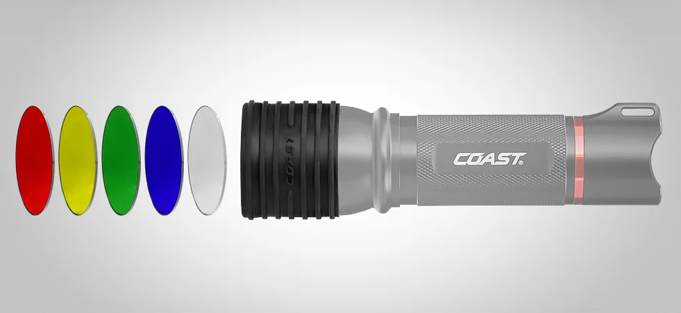
In 2017 I wrote a two-part blog post titled “Level Up With Light Painting: Correcting the Color of Your Flashlight,” which discussed the color biases of flashlights and how to filter them to neutralize that color when shooting at different white balance settings.

In the first part I talked about the pros and cons of LED flashlights, color theory, white balance, testing your flashlight’s color and how to fashion your own custom filters. This all revolved shooting at Daylight white balance.

In the second part I followed up with how to filter Coast HP7R and HP5R flashlights to provide a neutral color when the white balance is set to 3200 K. This is a common setting for shooting in urban areas at night, as most streetlights and other city lights are rendered overly orange when white balance is set to Daylight.

In both of those posts I used a decidedly unscientific method of performing the color tests. While the results were close to accurate, this past summer I decided to look for more precision, so I set about running color tests with the aforementioned flashlights (my favorite two to use). Now I can paint with neutral light at any white balance.

The Color Tests

For this I needed a color meter. Admittedly, color meters are expensive and not generally used by the average photographer. They are, however, an invaluable tool in commercial/advertising photography and in the film industry. Since I don’t own one, the generous folks at MAC Group arranged to loan me a Sekonic C-800 SpectroMaster. (Thank you, MAC Group! Your gracious loan benefits us all.)

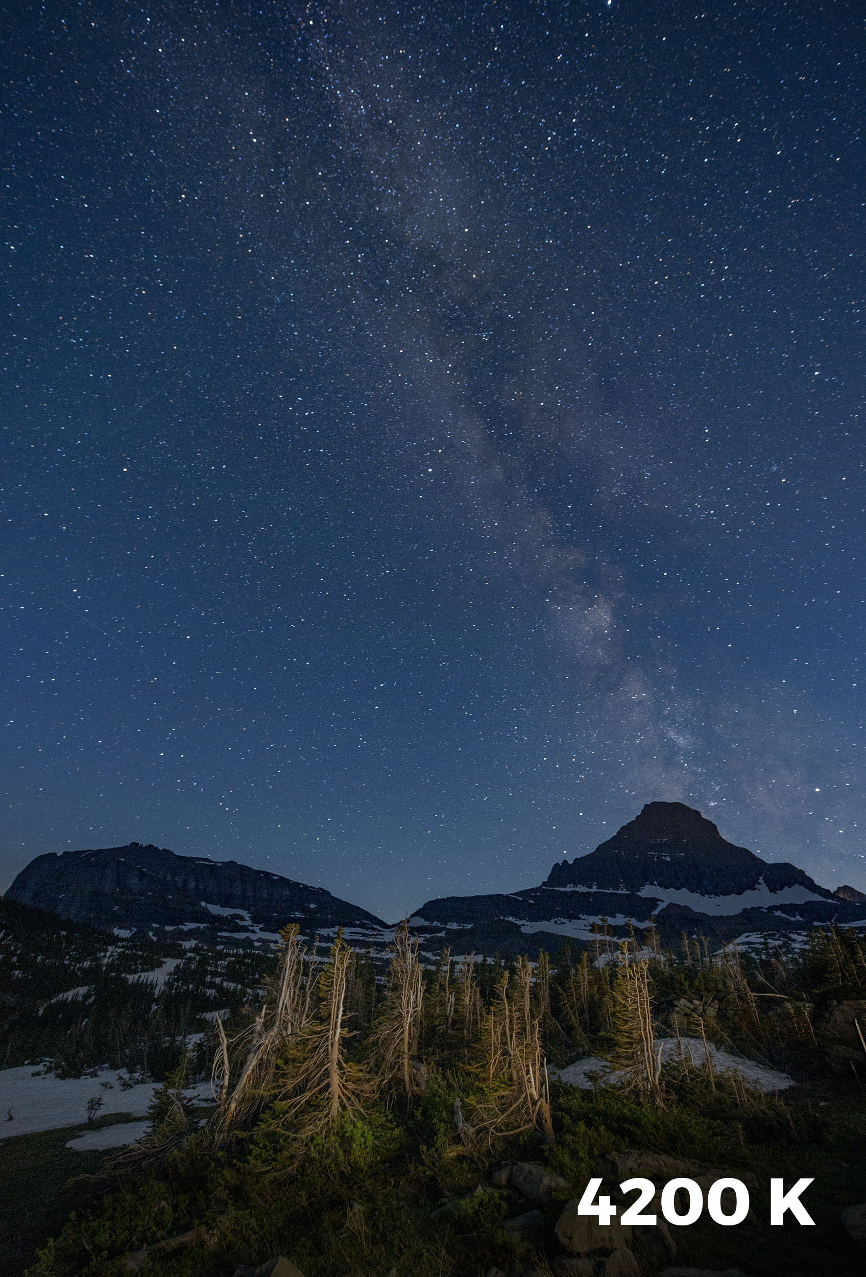
My goal for the tests was to determine the proper filtration for the HP7R and HP5R with a camera set to the white balances most often used for night photography. (For a rundown on these, see Matt’s post “How to Choose the Right White Balance for Night Skies” and my post “Making the Move to Manual White Balance.”) I tested each of nine white balance settings (5500, 5000, 4800, 4500, 4200, 4000, 3850, 3500 and 3200 K), with each flashlight set at both high and low power. I then determined which Lee Filters gels would neutralize the color while also adding a little warmth to the light.

Then we put all the results into a guide to assist other night photographers who would like to remove unwanted color casts from their Coast lights. You can download the guide by clicking here or on the image below.

Click image to download

While the chart is extensive, I would suggest not getting too wrapped preparing for all the options—it’s unlikely that you’ll be shooting at nine different white balances. For my kit, I created filters for 3850 K and 3200 K for each of my flashlights. This gives me enough flexibility for most situations I encounter.

When shooting on a white balance setting of Daylight, I use my 3850 K filter combination to add slight warmth to my flashlight. When setting my camera’s white balance to 3850 K, I use the 3850 K filter combo for a neutral light or the 3200 K filter combo for a warmer effect. Likewise, when using the 3200 K filter with the camera’s white balance set at 3200 K (i.e. Tungsten), the flashlight provides a nice neutral color.

Putting it into Practice

Let’s look at an example of this in action.

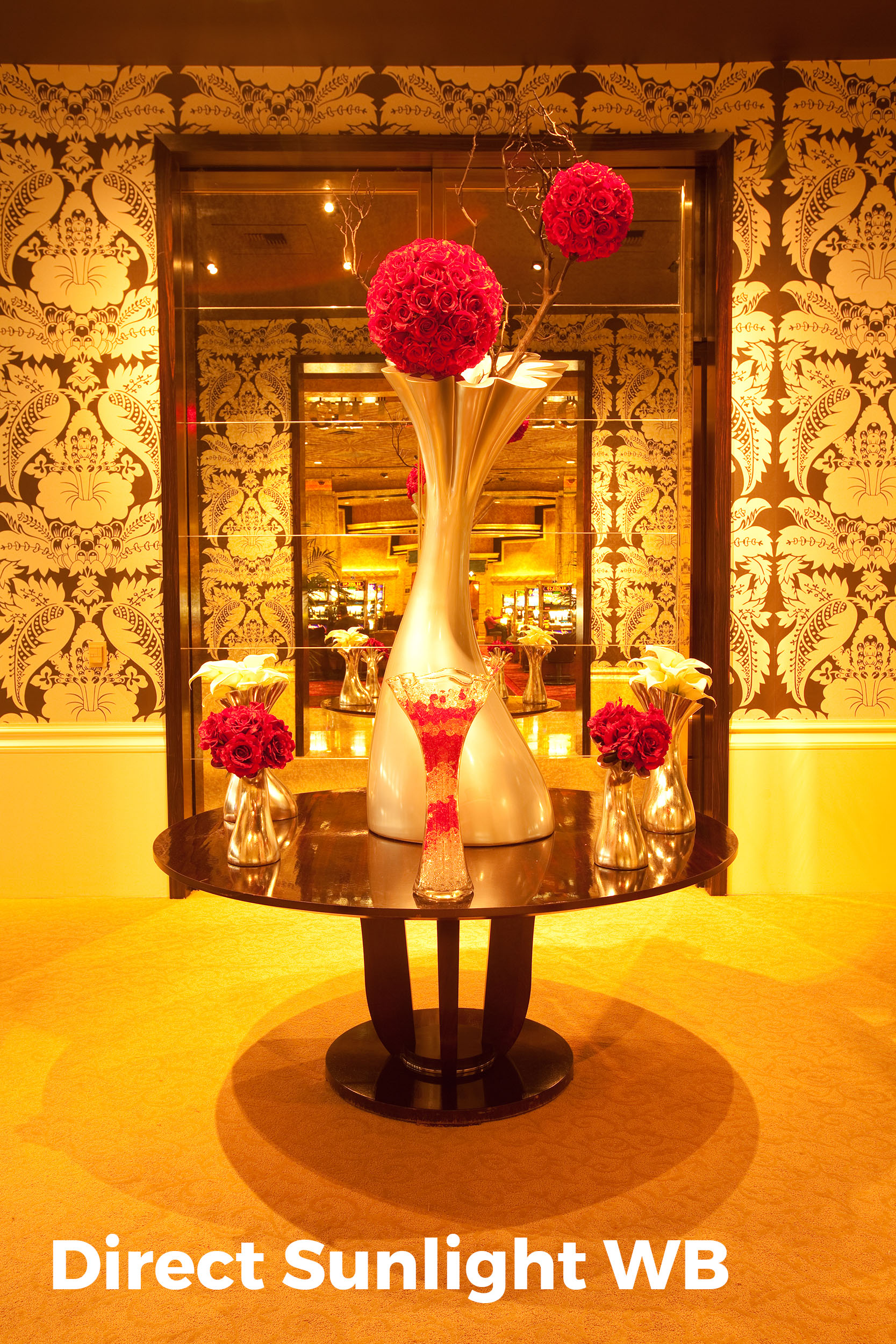
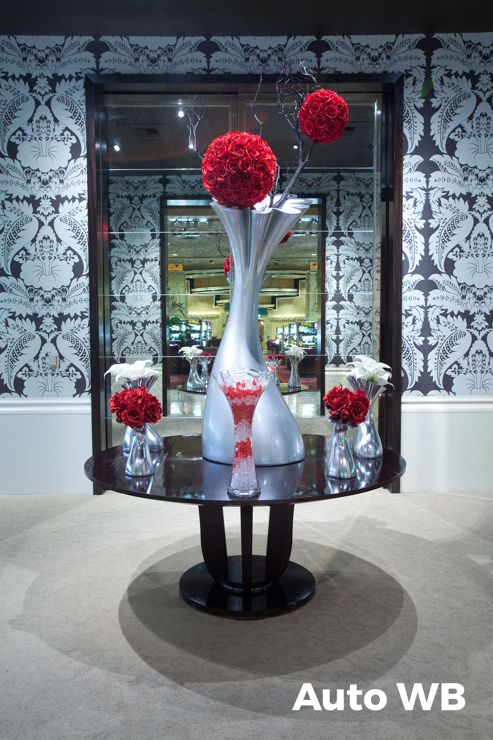
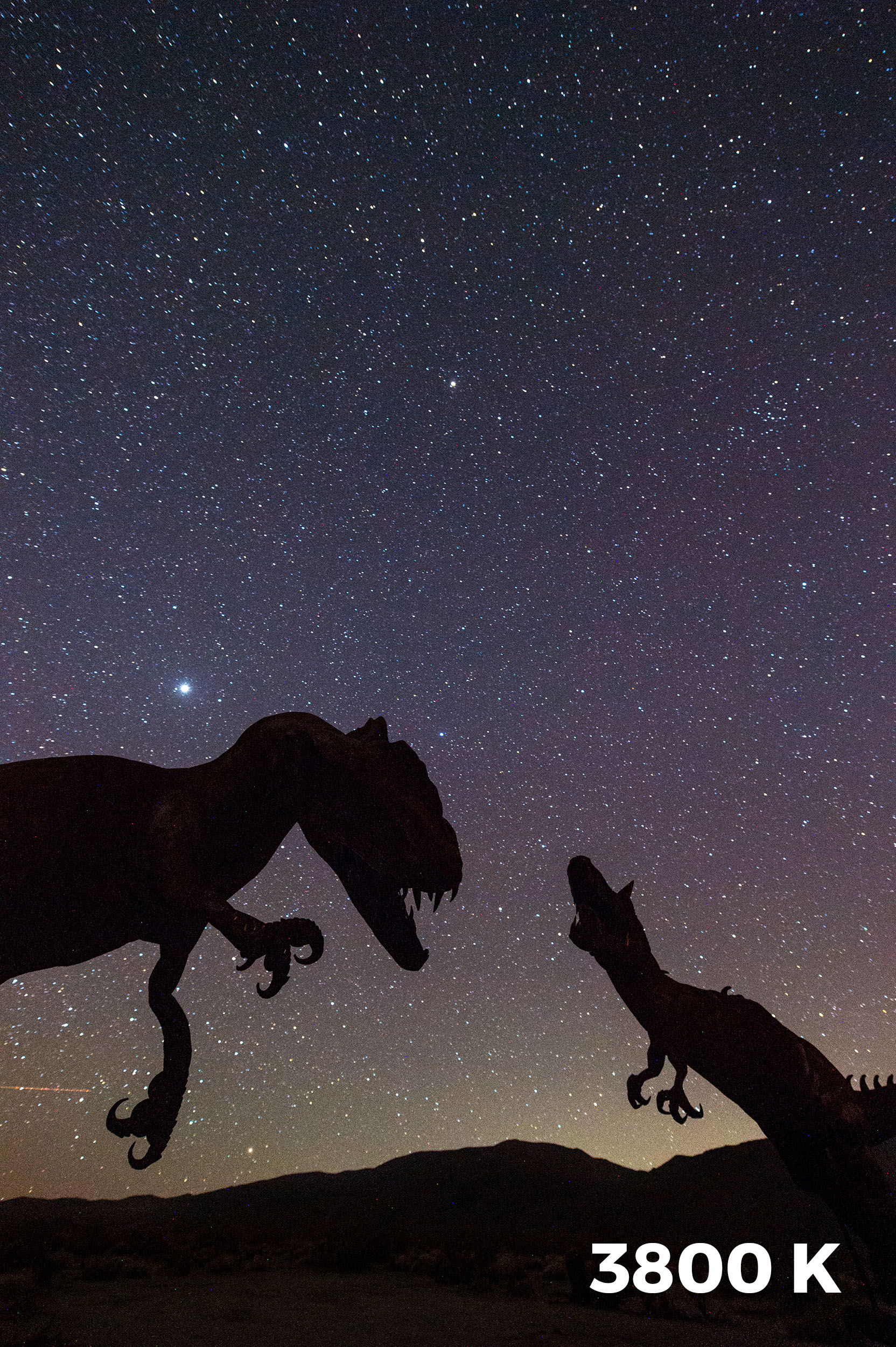
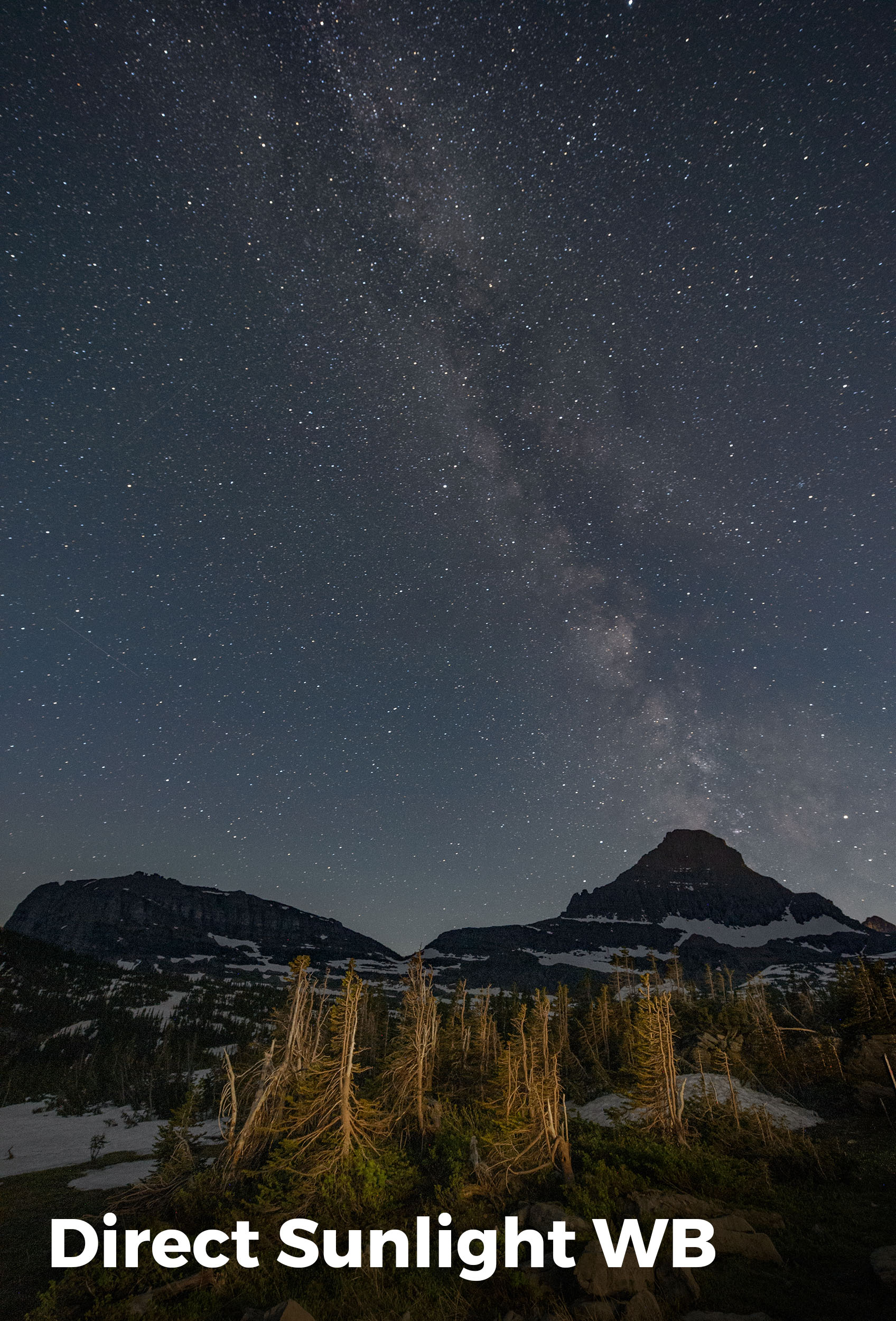
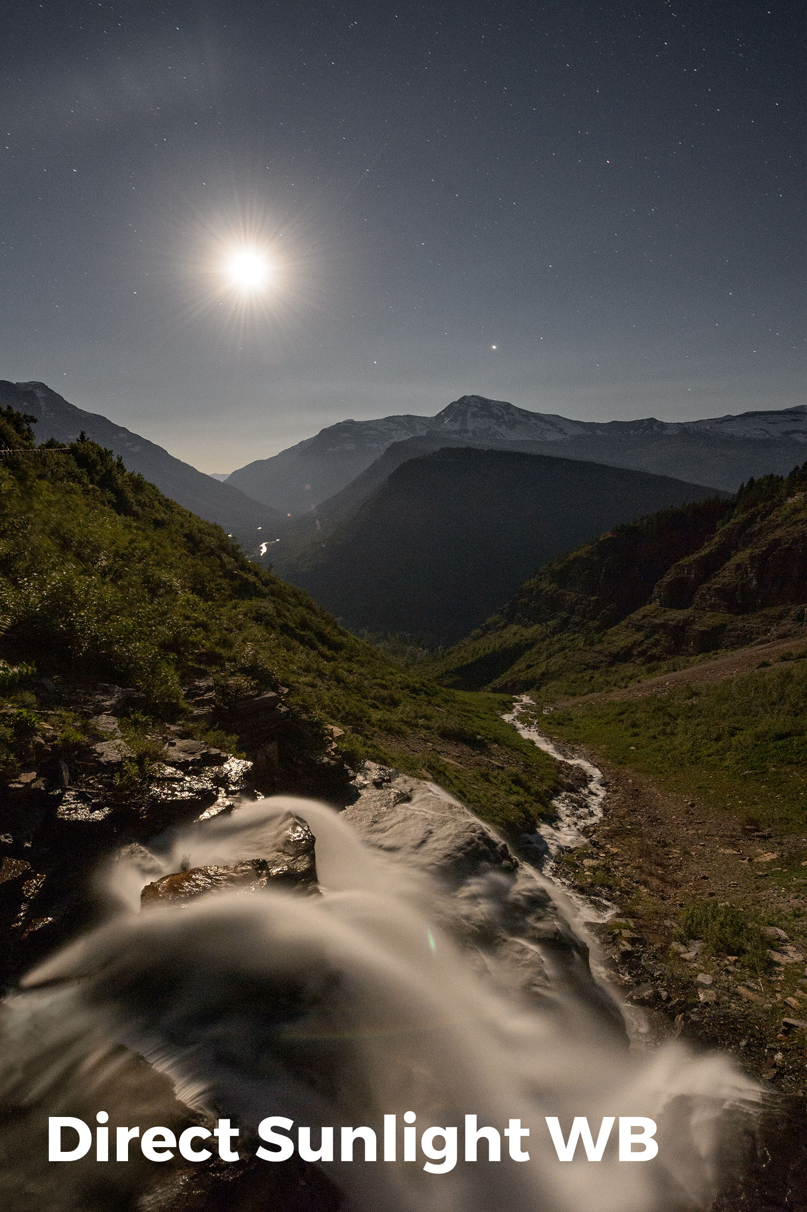
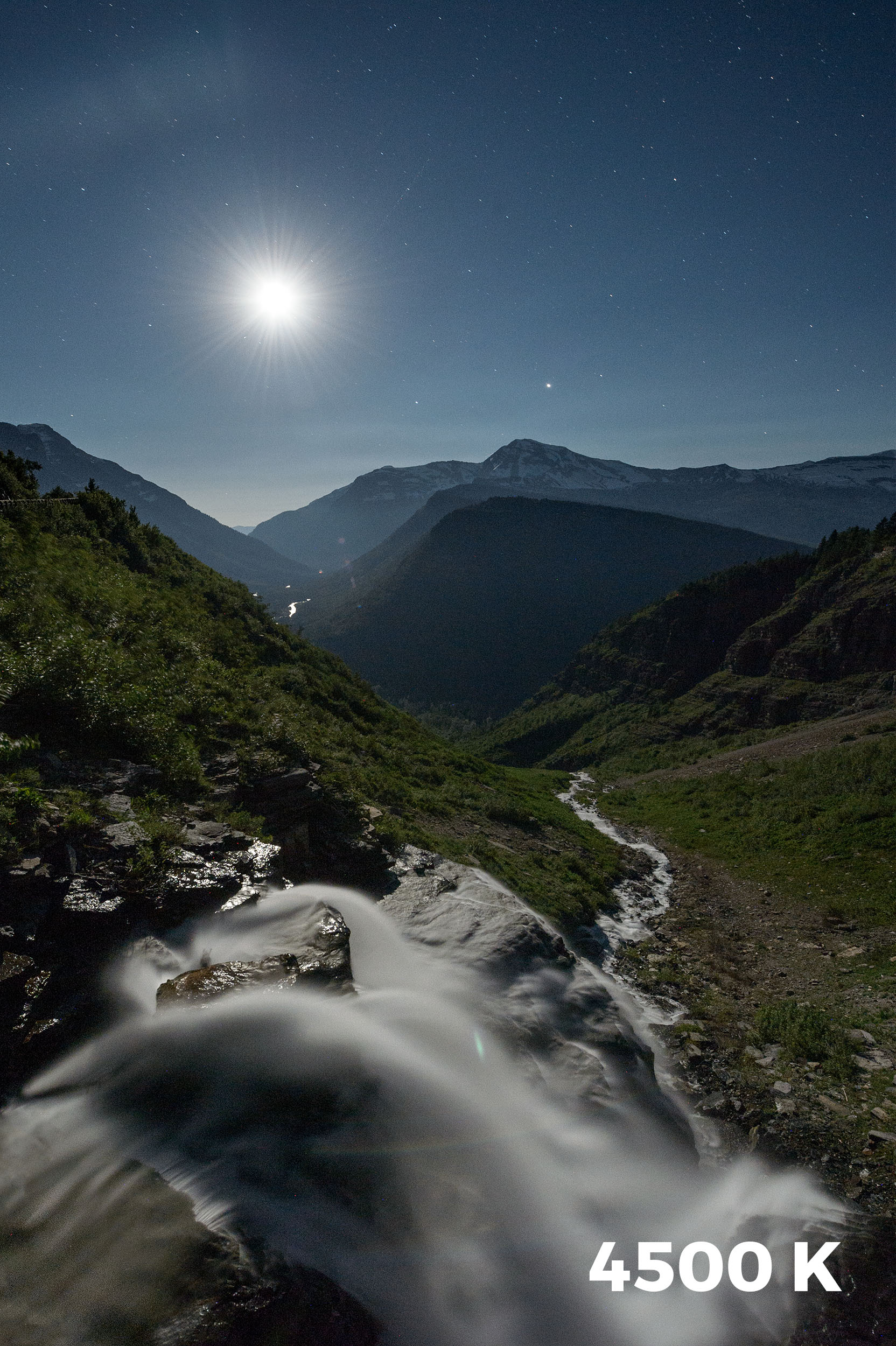
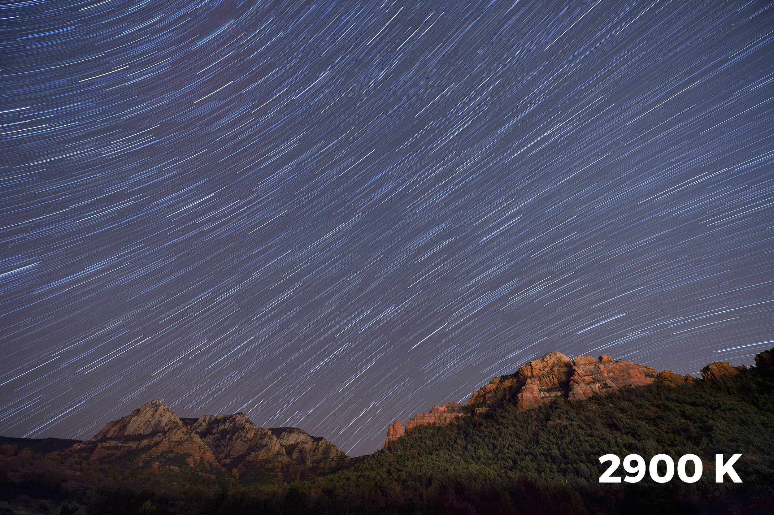
My favorite white balance for capturing the Milky Way is 3850 K. Why? Because when shooting night skies using Daylight (about 5500 K), even in dark sky environments it’s not uncommon for the resulting image to have an orange cast to it. Using 3850 K creates a cooler, more natural look to the sky while maintaining some warmth in the colors of the galaxy.

In Figure 1 you can see the result of shooting the Milky Way in Death Valley National Park with my white balance set to Daylight compared to 3850 K. The latter better represents how I want the night sky and the Milky Way to appear in a photo.

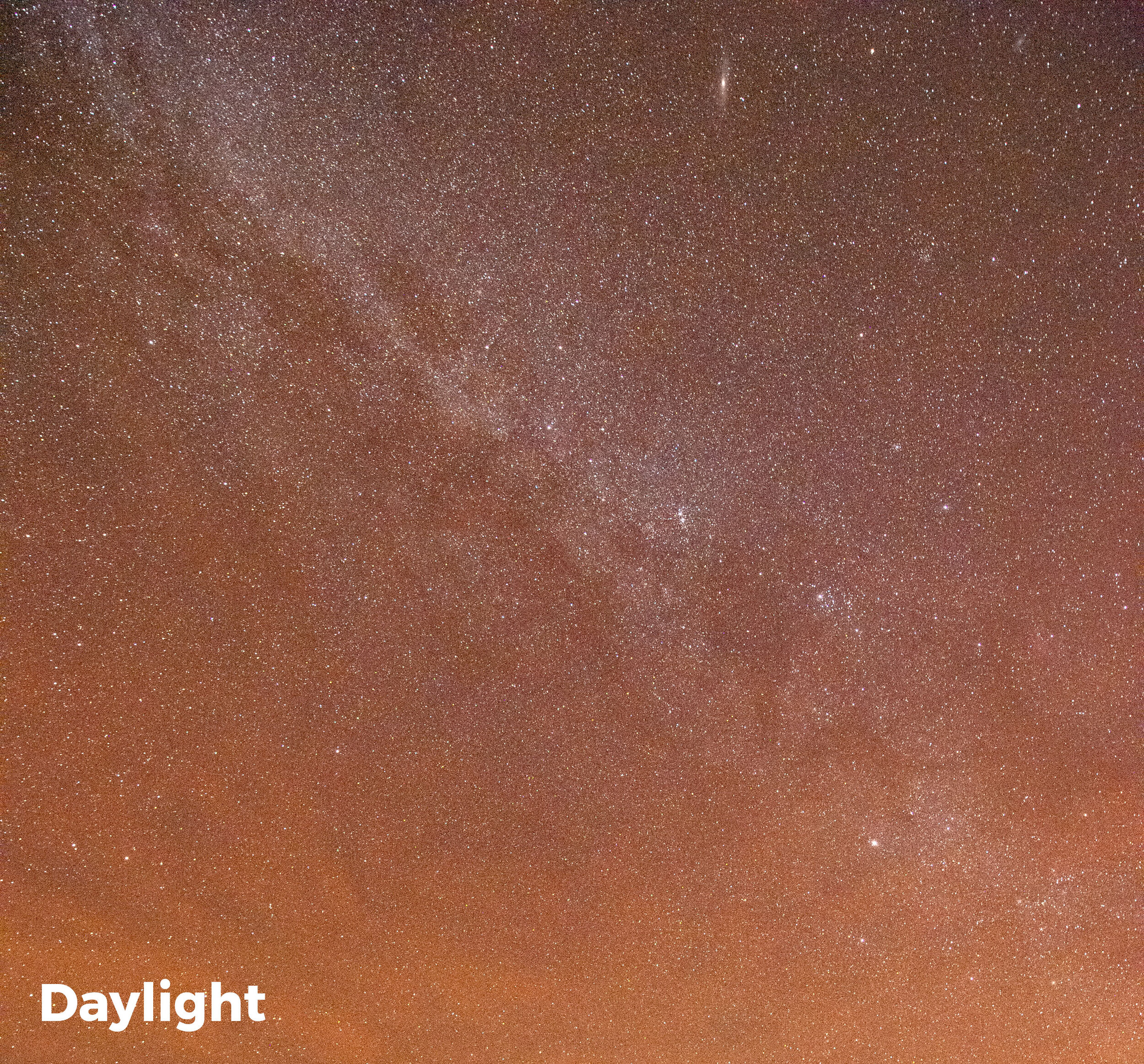
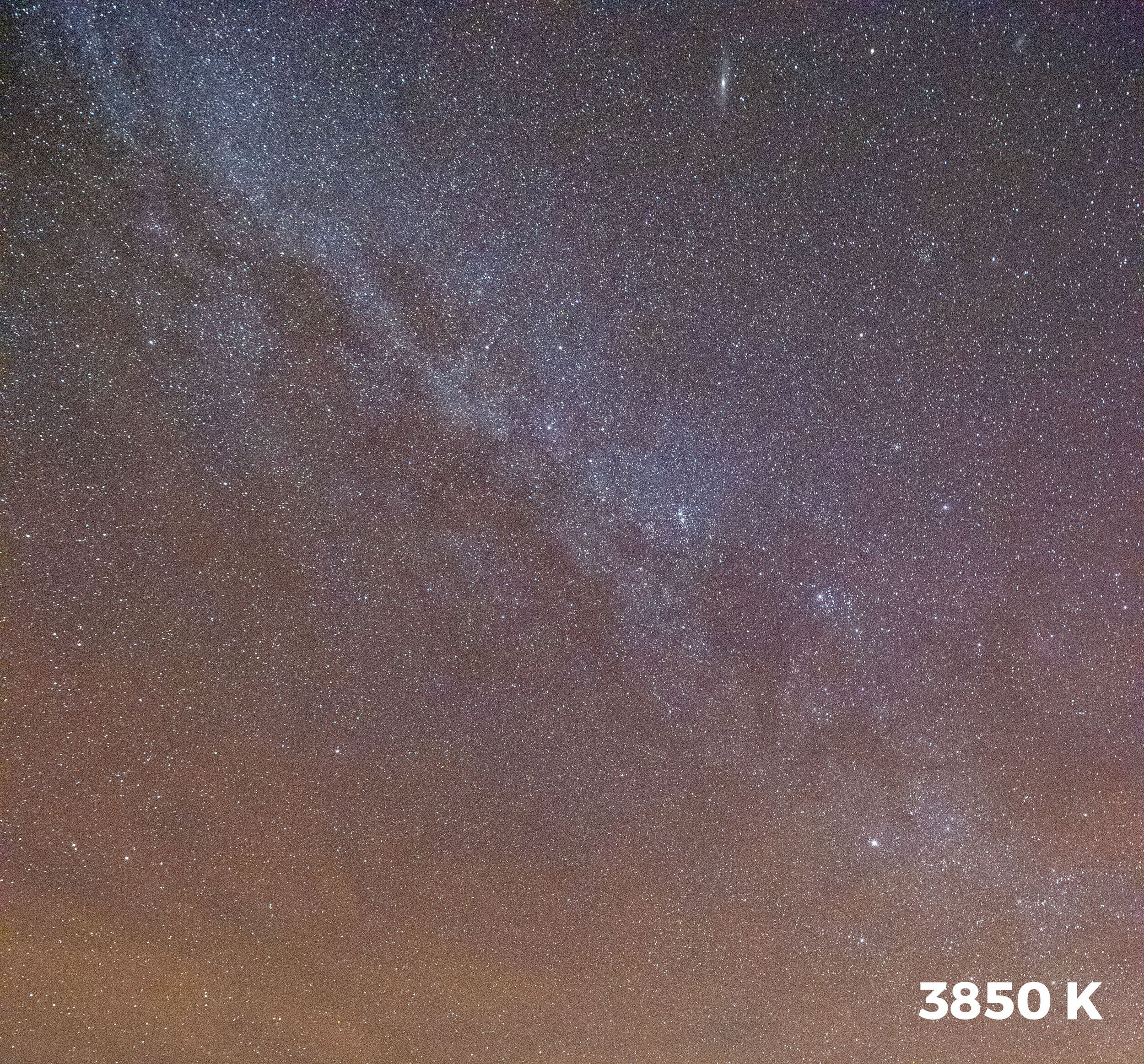
Figure 1. The color difference between shooting the Milky Way at a Daylight white balance versus 3800 K.

If shooting the Milky Way is all I wanted to accomplish, setting my white balance to 3850 K would provide great results. But for those who know me, you know I love light painting!

At Death Valley’s Devils Cornfield, I captured the first image (left) in Figure 2 with a white balance setting of 3850 K. For the light painting I used the low-power setting on my Coast HP5R. Notice the overly blue/green effect that the unfiltered flashlight created?

To get my added light to accurately render the colors of the scene, I filtered the flashlight to look good at that white balance of 3850 K. According to my test results, that meant I needed a combination of 1/2 CTO + 1/8 CTO + 1/4 Minus Green.

That fixed the incorrect color cast, but I really wanted my flashlight to put out a slightly warmer rather than neutral color, because I like the visual effect of warm light. So instead of using the filter combo for 3850 K, I used the combo for a 3200 K setting: 3/4 CTO + 1/8 CTO + 1/4 Minus Green + 1/8 Minus Green. That gave me exactly the color I was hoping for (Figure 2, right).

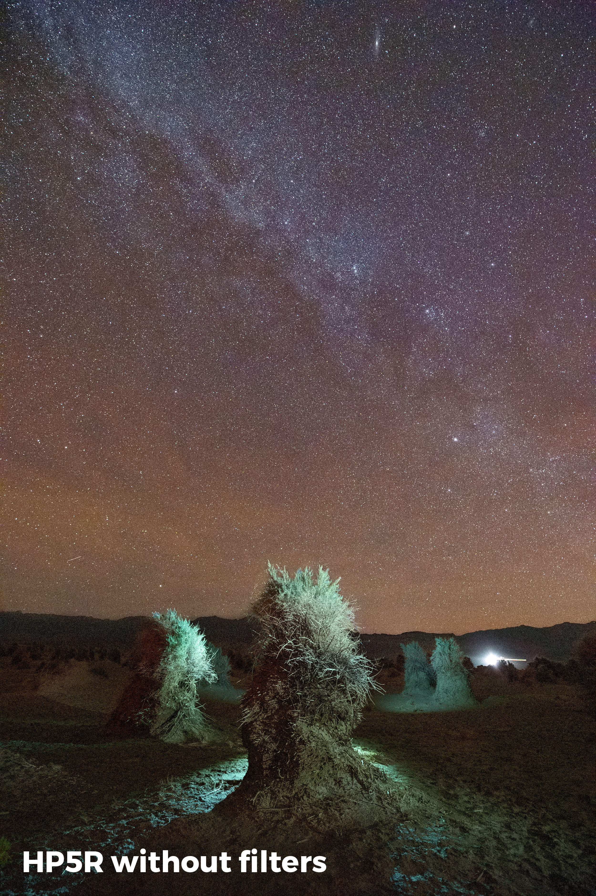
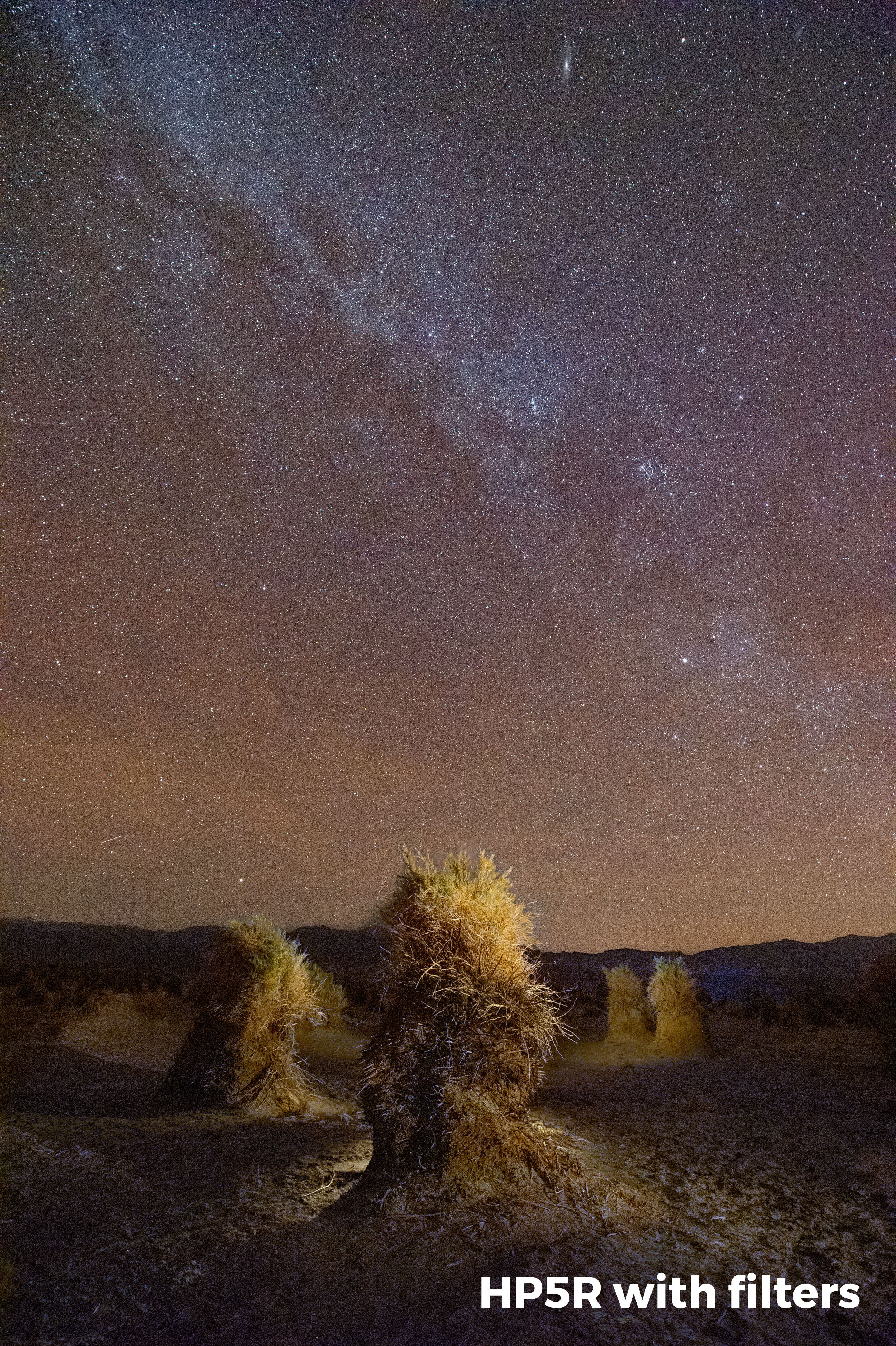
Figure 2. Devils Cornfield, Death Valley National Park. Nikon D4s with a Nikon 14-24mm f/2.8 lens. 20 seconds, f/4, ISO 6400, with a white balance of 3850 K. Light painted with a Coast HP5R unfiltered (left), and filtered (right) with Lee 3/4 CTO + 1/8 CTO + 1/4 Minus Green + 1/8 Minus Green gels.

One last point: It can be a bit tedious to hold filter gels in front of a flashlight while running around in the dark. The solution? I create a “disc” filter that attaches right to the front of the flashlight. To see how I do this, look back on Part I of this series.

Tim Cooper is a partner and workshop leader with National Parks at Night. Learn more techniques from his book The Magic of Light Painting, available from Peachpit.

UPCOMING WORKSHOPS FROM NATIONAL PARKS AT NIGHT

Control the Color Monster: Making the Move to Manual White Balance

While many of the automatic settings on our cameras can be useful from time to time, photographing at night requires us to set nearly everything on our cameras manually. Typically, when most people hear this, they think of manual exposure mode, wherein they are required to set both the aperture and shutter speed independently of each other. This is true. However, it could also mean manually focusing your lens, or switching your ISO from auto to a specific value. It could also mean setting your white balance manually.

Manual white balance?! Yup.

With the useful presets in your white balance setting (Direct Sunlight, Tungsten, Cloudy, Shade, Fluorescent, Auto, etc.), it’s easy to forget that you can go manual here as well.

To set your white balance manually, you first need to understand what the white balance setting does for us. Simply put, it alters the color cast of our photographs. It can make an image look bluer or more orange. It can render our image greener or more magenta.

The Color of Light

Let’s start outside of our camera first. All light has a certain color cast. Some light seems warmer (more orange)—for example, the color of an orange sunset or older household tungsten bulbs.

The warm colors of sunset.

Some light seems cooler (more blue)—for example, the light on a cloudy day or the sky when it just starts getting light in the morning.

The cool colors of pre-dawn.

Often our eyes ignore these color casts and we perceive the light as neutral (no cast/white/no color). It’s not that we can’t detect the color cast. We can, if we are paying attention. It’s just that other aspects of the light rate as more important in our visual hierarchy—such as noticing shadows so we can resolve ground structure and subsequently not trip and fall. Although we may not give much conscious thought to subtle shifts in the color of light throughout the day, our cameras are excellent tools for recording these precise color casts, or even for fixing those casts if we so desire.

The Kelvin Scale

Scientists found the terms “warmer,” “yellowish” or “more orange” simply too vague to accurately describe the color of light, so they use the Kelvin scale to avoid imprecision. Here is a chart that shows temperatures of some common photographic light sources:

The warmer the color, the lower its Kelvin rating. Cooler colors have higher Kelvin ratings. Notice that daylight at 5500 K is neutral. No real color cast. Some even call it “white light.” Whereas sunsets are warm and cloudy days appear cool. These are the real colors that are present under those conditions, even though, again, we may not perceive them as such.

The Camera’s White Balance Setting

Depending on the white balance setting we choose, the camera can either render the real color of the scene or render an alternate to reality. When our cameras are set to Direct Sunlight (also called Daylight or Sun on some cameras), the camera is rendering the colors of the scene precisely as they are. The resulting picture may appear more warm or cool to our eye, but that’s because we failed to notice the color cast at the time.

On the other hand, any of the camera’s other white balance presets will alter the color. They are designed to “fix” the color cast to match what our minds expect it to be. This may or may not be want you want. In the following images, I decided to keep the natural color by using the Direct Sunlight white balance.

Warm colors captured by using Direct Sunlight white balance (above), and the cool colors of an overcast day captured by using Direct Sunlight white balance.

So, if you find the cool light of an overcast day (around 6500 K) unpleasant, you can switch your white balance to Cloudy and the camera will add in warmth to cancel out the extra blue in that situation.

An overcast day is around 6500 K. The Cloudy white balance setting will warm the scene by adding in yellow/orange to cancel out blue and make “white” light.

Let’s look at this in a real-world scenario. Below you can see an image photographed at two white balances. The version on the left shows how it looks on an overcast day when shot with Direct Sunlight white balance. The version on the right shows the same image shot with Cloudy white balance.

Unlike the presets of Cloudy, Shade, Tungsten and Direct Sunlight, which have set values, the Auto white balance setting varies depending on what the camera detects. It looks at a percentage of the brightest pixels in the scene, determines their color cast, and then adds in the opposite color to neutralize.

The Question of Fixing Color

Of course, it’s always your choice whether to fix the color cast or leave it as. For example, why would you want to “fix” or neutralize the beautiful warm colors of a sunset? I also find that when shooting forests or waterfalls on a cloudy day, I tend to keep my white balance set to Direct Sunlight to allow the “cool” feeling to come through.

White balance is very subjective. We can, however, list out a few rough guidelines. Here are mine:

  • When shooting outdoors on a sunny day, I choose Direct Sunlight.

  • When shooting sunrise and sunset, again, Direct Sunlight.

  • On overcast days, I choose Direct Sunlight or Cloudy.

  • In the open shade, I choose Cloudy or Shade.

  • When shooting indoors under artificial light, I choose Auto.

  • When shooting at night? I set my white balance manually.

Manual White Balance

I choose a manual white balance at night so that I can completely control the color of the night sky along with any existing light or any light that I choose to add to the photo.

Manual white balance is achieved by using the Kelvin white balance setting. It allows you to set your white balance to any color temperature you desire. No presets, no Auto fix. Just your choice of how you want your image to look.

This setting is found in your White Balance presets and is signified by either a K or the word Kelvin.

Nikon’s White Balance menu.

Clicking on this choice allows you to choose from Kelvin values of anywhere from 2000 K to 10,000 K.

  • The higher the number you use, the warmer the picture will be.

  • The lower the number you use, the cooler the picture will be.

Using the Kelvin white balance setting allows for very precise control over the color of the resulting image.

Setting the Kelvin value.

It’s very common for photographers to leave their white balance set on Direct Sunlight when shooting at night. Even with no moonlight this can cause an overly warm look to the image. By your using Kelvin white balance and lowering the setting to, say, 3800 K, you’ll be cooling down your photo and thereby making it look and feel more like night.

The exact Kelvin setting you choose will vary greatly depending on the circumstances. Here the white balance of the first shot was set to Direct Sunlight. There was very little moonlight and little to no light pollution from nearby towns. In this case, I cooled down my photo by setting a Kelvin temperature of 4200 K.

The following images were made under a full moon. The first was made with a white balance of Direct Sunlight. The second image was with a manual setting of 4500 K.

When you are near cities or towns, the lights can dramatically influence the color cast of your photographs. In the following images I was just outside of Sedona, Arizona. With the white balance set to Direct Sunlight, the color cast was way too warm. In this case I had to move my Kelvin setting all the way down to 2800 K.

As with most white balance settings, there are no absolutes. So much depends on your personal choice, the current moon phase, the amount of ambient light pollution from nearby towns or cities, and even the type of camera you use. Every camera will render colors a little differently.

The key here is experimentation. Try different K settings under many different conditions. After downloading, examine them closely on your computer. Make notes. Go out and try again. The more you experiment, the better you’ll be at setting your Kelvin temperature. And the better you are nailing the white balance in the field, the less time you have to spend fixing the image in post-processing!

Tim Cooper is a partner and workshop leader with National Parks at Night. Learn more techniques from his book The Magic of Light Painting, available from Peachpit.

UPCOMING WORKSHOPS FROM NATIONAL PARKS AT NIGHT

Level Up With Light Painting: Correcting the Color of Your Flashlight (Part II)

Note: This is the conclusion of a previous post, “Level Up With Light Painting: Correcting the Color of Your Flashlight (Part I).”


In my last post on flashlight color I demonstrated how LED flashlights produce a cooler light than I prefer. I went on to show you how to analyze and correct the color using simple gels from the Roscolux Swatchbook.

In that post, the filtration I worked out for my favorite flashlights—the Coast 300-lumen Coast HP7R and 185-lumen Coast HP5R—was a Roscolux 1/2 CTO combined with a 1/8 minus green. This combination works well when my Nikon’s white balance is set to Direct Sun (Daylight on a Canon). Night photography, however, often requires a significant deviation from our common white balance settings.

Finding the Fix

Direct Sun white balance has an approximate Kelvin temperature of 5500. Although, as I mentioned in my last post, Lightroom may display your Kelvin temperature higher or lower depending on Adobe’s interpretation of your camera. Adobe interprets my Nikon’s D4s’s white balance as 4900 K. For the remainder of this post I’ll refer to the Kelvin setting on the camera rather than Adobe’s interpretation.

When using the Direct Sun white balance setting, subjects photographed under average midday sunlight will be rendered properly with regard to color. If, however, your white balance is set to Direct Sun and you photograph a subject under a different light source, the subject will take on the color cast of that light source. For example, for the photo in Figure 1, I kept my camera set to Direct Sun white balance while photographing under the heavy orange cast of the sign lights. Figure 2 shows the color-corrected version at 2000 K.

Figure 1. 5500 K (Direct Sun) white balance

Figure 2. 2000 K white balance

Lowering that white balance had the effect of adding in a blue cast, counteracting the orange/yellow cast it had before. Now imagine if I had used my somewhat blue LED flashlight to paint the people in the foreground. After color correction, the subjects illuminated by the flashlight would be even more blue due to the lower Kelvin temperature.

So while the filter combination I used for my flashlight worked well with Direct Sun white balance, that same filter combinations would turn the flashlight light to blue when using white balance settings typical of night photography.

Finding the Filters

How to resolve this issue? Once again I turned to my X-Rite ColorChecker chart for my visual tests. I began by setting my camera’s white balance to Tungsten, which is roughly 3200 K. This is a setting I often use for night photography. Next I light-painted the chart with my standard filtration of 1/2 CTO combined with a 1/8 minus green. This produced the color in Figure 3.

Figure 3. 3200 K white balance, Coast HP7R filtered with Rosco 1/2 CTO and 1/8 minus green filter gels

Figure 3. 3200 K white balance, Coast HP7R filtered with Rosco 1/2 CTO and 1/8 minus green filter gels

The chart is noticeably cool due to the lowered white balance setting of 3200 K. So I experimented with a variety of gels, looking for the right mix to produce a more accurate color balance. After experimenting, I settled on a Roscolux Dark Bastard Amber, which when added to my 1/2 CTO and 1/8 minus green, produced the effect we see in Figure 4.

Figure 4. 3200 K white balance, Coast HP7R filtered with Rosco 1/2 CTO and 1/8 minus green plus Dark Bastard Amber filter gels.

Figure 4. 3200 K white balance, Coast HP7R filtered with Rosco 1/2 CTO and 1/8 minus green plus Dark Bastard Amber filter gels.

You can see that new combination of filters has produced a color cast that is neutral to slightly warm when shooting with Tungsten white balance.

Putting This Into Practice

For the last step, I took a new clear plastic filter from a Coast LF100 filter kit and again traced and cut out a 1/2 CTO, a 1/8 minus green and a Dark Bastard Amber, and taped them all to the filter. Now I can easily interchange the two plastic filters (one with my original gel combo and the second with the original combo plus Dark Bastard Amber) when I change my white balance from Direct Sun to a Tungsten.

Figures 5 through 8 show a real-world example of how this affects the color of a scene. In Figure 5, my camera’s Direct Sun white balance produces an overly orange image due to the sodium vapor lights (common in most city lighting) illuminating the building.

Figure 5. Direct Sun white balance

Figure 5. Direct Sun white balance

Figure 6 shows the same scene after I changed my camera’s white balance to Tungsten (3200K). Notice the nearly neutral color of the metal and white door.

Figure 6. Tungsten white balance

Figure 6. Tungsten white balance

For Figure 7 I kept the white balance set to Tungsten and illuminated the door with my unfiltered flashlight. The door becomes very blue due to the cooler white balance setting.

Figure 7. Tungsten white balance with unfiltered flashlight illumination

Figure 7. Tungsten white balance with unfiltered flashlight illumination

Figure 8 shows the same scene with my camera still on the Tungsten white balance setting, but light-painted with the flashlight gelled with the 1/2 CTO, 1/8 minus green and Dark Bastard Amber combination.

Figure 8. Tungsten white balance with filtered flashlight illumination

Figure 8. Tungsten white balance with filtered flashlight illumination

Of course, Tungsten white balance is not the only setting I use for night photography. My night settings range from 3200 K to 5500 K, with 3800 K being the setting I use most often. So, you may ask, why did I run my test at 3200 K if use 3800 K more often? In a word, warmth. I like my flashlight illumination to be somewhat on the warm side. A gel that produces a neutral cast at 3200 K will produce a warmer cast at 3800 K. Just how I like it!

Remember, no LED flashlight will produce perfect color. But, with a little testing and experimentation, you can create your perfect color for your light-painting illumination!

Learn more techniques from Tim Cooper’s book The Magic of Light Painting, available from Peachpit.

UPCOMING WORKSHOPS FROM NATIONAL PARKS AT NIGHT

Level Up With Light Painting: Correcting the Color of Your Flashlight (Part I)


For the photographer who enjoys light painting, the flashlight (or “torch,” if you are a Brit) is your most basic tool. However, all flashlights are not created equal. They come in a wide variety of intensities, beam patterns and color variations. In this post I’ll deal with that last variable, and show you how to control the color of this essential tool.

Defining the Color Problem

While incandescent flashlights have been the norm for a very long time, today the most commonly found flashlights use LED (light emitting diode) technology. The LED is superior in many ways. LED flashlights are more resistant to shock, are easily dimmable, and last much longer than a typical incandescent bulb.

The downside is that LED flashlights rarely have the nice warm color that was so common in our old household Everyready or Maglite. Most LEDs produce a cooler blue or even greenish color. For photographers working in black and white, this is a non-issue. But color photographers might want to determine their flashlight’s color cast so they can add the proper filtration to obtain a desired color temperature.

Measuring the Discrepancy

Like most folks, I don’t own any special color meter equipment, so I set up a simple test using the tools that I had on hand: My Nikon D4s and Gitzo Series 2 Traveler carbon fiber tripod, an X-Rite ColorChecker color-test chart, Adobe Lightroom, and my Coast HP7R flashlight. (I should note that the HP7R is an amazing light, one of the workhorses of my kit—the fact that I’m using it for this test does not denote a shortcoming with this model in particular, but rather with the LED technology as a whole.)

I set up the color test chart in a dark room. With my camera on the tripod and white balance set to Direct Sun (Daylight on a Canon), I illuminate the test chart with my flashlight and take a picture. Notice the cool color cast of the resulting image in Figure 1? The daylight white balance of the camera shows us the natural bluish cast of the flashlight.

Figure 1. Bluish color cast of the Coast HP7R flashlight, typical of many LED flashlights.

Figure 1. Bluish color cast of the Coast HP7R flashlight, typical of many LED flashlights.

To determine the exact color cast, I import the image into Lightroom and open it in the Develop module. The area at the top of the Basic panel displays the image’s white balance setting.

When shooting your camera with a white balance setting of Daylight, you would expect this reading to be 5500 on the blue-yellow axis and 0 on the green-magenta axis. The numbers we see here, however, are Adobe’s interpretation of my camera’s file. Adobe sees my camera as 4900 on the blue-yellow axis and +1 on the green-magenta axis. The fact that these numbers (Figure 2) don’t match the traditional daylight Kelvin temperature of 5500 is not a big deal; remember, this is just Adobe’s interpretation.

Figure 2. Adobe’s interpretation of my camera’s white balance when shooting with the unfiltered HP7R.

Figure 2. Adobe’s interpretation of my camera’s white balance when shooting with the unfiltered HP7R.

Next I grab the White Balance Selector tool (circled in red in Figure 3) and click on one of the light gray patches of the color checker chart.

Figure 3. The White Balance Selector tool.

Figure 3. The White Balance Selector tool.

The White Balance Selector is a great tool for color-correcting when you have a known neutral color in a scene, such as the gray areas of this chart (which I carry with me for times when I need to get precise color correction under artificial lights). When you click on an area of the image with this tool, Lightroom tries to balance that area to a neutral color, resulting in no color cast. Figure 4 shows the image after I click on the light gray patch. Notice how the cool cast is removed from the image, resulting in neutral grays.

Figure 4. The chart after using the White Balance Selector.

Figure 4. The chart after using the White Balance Selector.

Figure 5 shows a magnified section of before and after the Lightroom adjustment.

Figure 5. Natural light of my Coast HP7R (top) and the color-corrected version (bottom).

Figure 5. Natural light of my Coast HP7R (top) and the color-corrected version (bottom).

Also after clicking on the chart, the numbers on the sliders change to reflect the new white balance (Figure 6).

Figure 6. Original white balance (left) and the corrected white balance (right).

Figure 6. Original white balance (left) and the corrected white balance (right).

At this point I am not overly concerned with the actual numbers. The real information I am looking for is which way the sliders moved. Figure 6 shows us that Adobe color-corrected by adding a bunch of yellow. This is the important thing for me to note, because it means that in order to correct my flashlight, I need to do the same thing!

Fixing the Flashlight

The next step is to begin experimenting with filtration. A common form of filtration for the photographer is a thin, heat-resistant, polyester filter that’s often called a “gel.” Gels come in a staggering number of variations and are used to enhance the color of light or to color-correct it. Gels also come in different sizes, but the ones typically used for on-camera flash units and flashlights are about 1.5 by 3 inches. Figure 7 shows how this size is neatly bundled into a swatch book. For the small investment of $2.50, the Roscolux Swatchbook is must-have for light painters.

Figure 7. Roscolux Swatchbook.

Figure 7. Roscolux Swatchbook.

Knowing that I have to cancel out blue, I open my swatch book and find a common gel called a CTO (color temperature orange). It comes in several strengths, with designations such as 1/4 CTO, 1/2 CTO and Full CTO (the strongest). By tearing out the gels from the swatch book, I can cover the flashlight, illuminate the color chart and begin taking pictures of the color chart again.

After making some test shots, I load them into Lightroom and visually compare the charts with the original and color-corrected versions. After several experiments I find that the 1/4 CTO does a pretty good job of neutralizing the blue cast.

However, I also want to add a bit of warmth to my light, so I up the strength of the CTO to 1/2. This works well, but it does impart a bit of green, so I add a 1/8 minus green filter which adds some magenta. Figure 8 shows the color-corrected chart on the top and the chart illuminated by my Coast HP7R gelled with Rosco 1/2 CTO and 1/8 minus green filters.

Figure 8. Color-corrected chart on top, filtered version on the bottom.

Figure 8. Color-corrected chart on top, filtered version on the bottom.

This test is by no means superscientific, but it gets you in the ballpark. Taking the time to experiment with a few filters will allow you to paint with confidence out in the field and will save you a ton of time color-correcting in Lightroom and Photoshop. Of course, if you use the Coast HP7R, you don’t have to run any tests at all, because I just told you the results! A Roscolux 1/2 CTO and a 1/8 minus green combo work nicely. It’s also a good combination for the lower-powered Coast HP5R, another of my favorite flashlights.

Putting This Into Practice

Once you’ve determined which gels you need, it’s time to attach them to your flashlight. This can be accomplished in many different ways. The easiest is to simply fold the gel(s) over the end of the flashlight and wrap a rubber band around it. This certainly works, but is not overly elegant and may result in lost or damaged gels over time.

For my gels, I purchased the $4.99 LF100 Lens Filter Kit from Coast. Figure 9 shows how the rubber bezel cover can hold any of several colored or clear plastic filters that are included with the kit.

Figure 9. LF100 Lens Filter Kit from Coast.

Figure 9. LF100 Lens Filter Kit from Coast.

I used a filter from the kit to trace and cut my 1/2 CTO and 1/8 minus green filters, then simply taped them to the clear filter. Voila. Perfect color and no hassle of taking filters on and off out in the field. The LF50 Lens Filter Kit does the same job on the smaller HP5R flashlight.

Figure 10. A rusty fence light-painted with just the Coast HP7R (left), and with the same flashlight modified with the 1/2 CTO and 1/8 minus green filters (right).

However, while my test has provided the desired color from my flashlight, it works only when I am using Direct Sun (daylight) white balance. In Part II of this topic, I’ll address the issue of filtering your flashlight when you are using the common nighttime white balance setting of 3200 K.

See the continuation of this article: “Level Up With Light Painting: Correcting the Color of Your Flashlight (Part II).”

Learn more techniques from Tim Cooper’s book The Magic of Light Painting, available from Peachpit.

UPCOMING WORKSHOPS FROM NATIONAL PARKS AT NIGHT