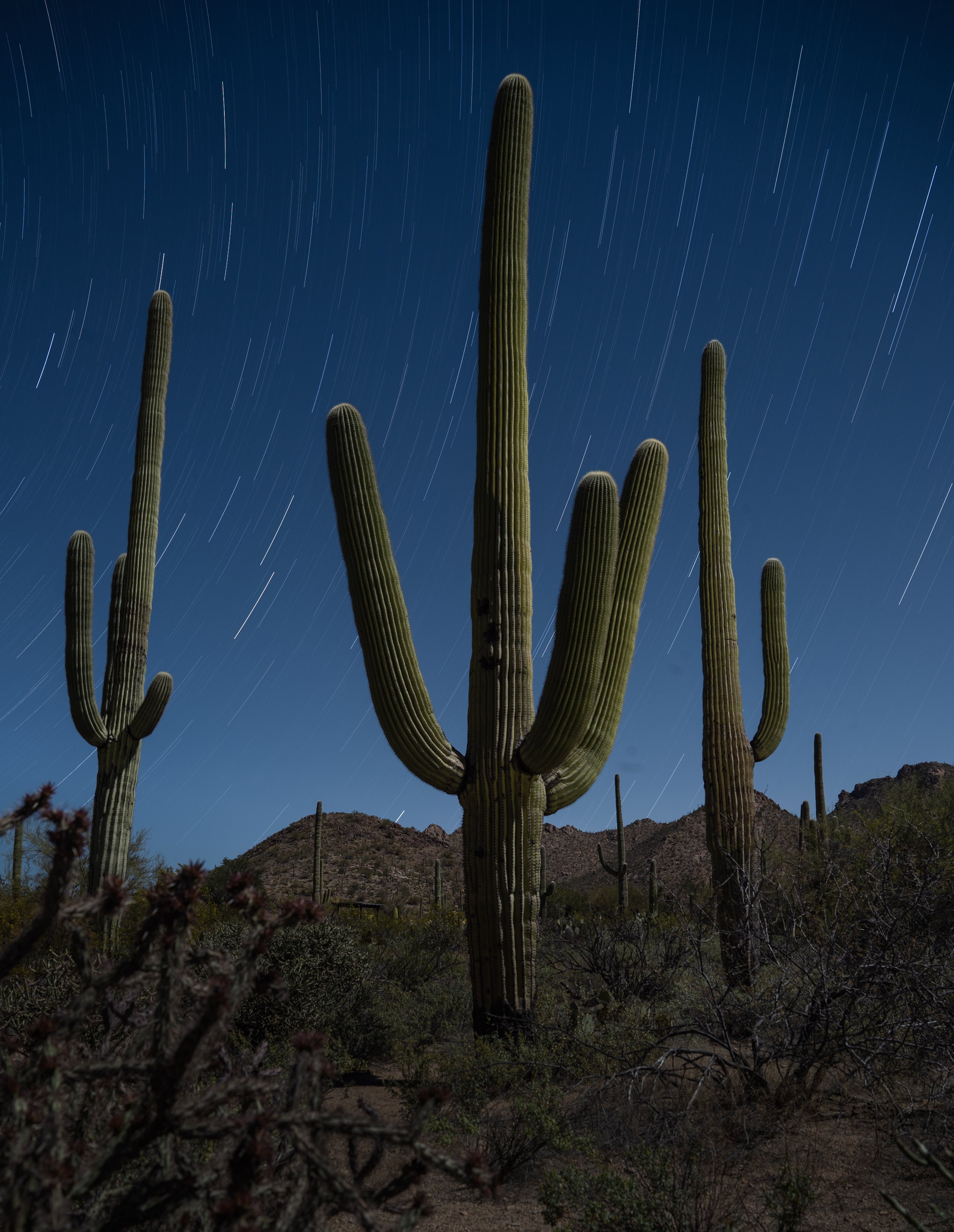
For the photographer who enjoys light painting, the flashlight (or “torch,” if you are a Brit) is your most basic tool. However, all flashlights are not created equal. They come in a wide variety of intensities, beam patterns and color variations. In this post I’ll deal with that last variable, and show you how to control the color of this essential tool.
Defining the Color Problem
While incandescent flashlights have been the norm for a very long time, today the most commonly found flashlights use LED (light emitting diode) technology. The LED is superior in many ways. LED flashlights are more resistant to shock, are easily dimmable, and last much longer than a typical incandescent bulb.
The downside is that LED flashlights rarely have the nice warm color that was so common in our old household Everyready or Maglite. Most LEDs produce a cooler blue or even greenish color. For photographers working in black and white, this is a non-issue. But color photographers might want to determine their flashlight’s color cast so they can add the proper filtration to obtain a desired color temperature.
Measuring the Discrepancy
Like most folks, I don’t own any special color meter equipment, so I set up a simple test using the tools that I had on hand: My Nikon D4s and Gitzo Series 2 Traveler carbon fiber tripod, an X-Rite ColorChecker color-test chart, Adobe Lightroom, and my Coast HP7R flashlight. (I should note that the HP7R is an amazing light, one of the workhorses of my kit—the fact that I’m using it for this test does not denote a shortcoming with this model in particular, but rather with the LED technology as a whole.)
I set up the color test chart in a dark room. With my camera on the tripod and white balance set to Direct Sun (Daylight on a Canon), I illuminate the test chart with my flashlight and take a picture. Notice the cool color cast of the resulting image in Figure 1? The daylight white balance of the camera shows us the natural bluish cast of the flashlight.

Figure 1. Bluish color cast of the Coast HP7R flashlight, typical of many LED flashlights.
To determine the exact color cast, I import the image into Lightroom and open it in the Develop module. The area at the top of the Basic panel displays the image’s white balance setting.
When shooting your camera with a white balance setting of Daylight, you would expect this reading to be 5500 on the blue-yellow axis and 0 on the green-magenta axis. The numbers we see here, however, are Adobe’s interpretation of my camera’s file. Adobe sees my camera as 4900 on the blue-yellow axis and +1 on the green-magenta axis. The fact that these numbers (Figure 2) don’t match the traditional daylight Kelvin temperature of 5500 is not a big deal; remember, this is just Adobe’s interpretation.
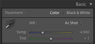
Figure 2. Adobe’s interpretation of my camera’s white balance when shooting with the unfiltered HP7R.
Next I grab the White Balance Selector tool (circled in red in Figure 3) and click on one of the light gray patches of the color checker chart.

Figure 3. The White Balance Selector tool.
The White Balance Selector is a great tool for color-correcting when you have a known neutral color in a scene, such as the gray areas of this chart (which I carry with me for times when I need to get precise color correction under artificial lights). When you click on an area of the image with this tool, Lightroom tries to balance that area to a neutral color, resulting in no color cast. Figure 4 shows the image after I click on the light gray patch. Notice how the cool cast is removed from the image, resulting in neutral grays.

Figure 4. The chart after using the White Balance Selector.
Figure 5 shows a magnified section of before and after the Lightroom adjustment.

Figure 5. Natural light of my Coast HP7R (top) and the color-corrected version (bottom).
Also after clicking on the chart, the numbers on the sliders change to reflect the new white balance (Figure 6).

Figure 6. Original white balance (left) and the corrected white balance (right).
At this point I am not overly concerned with the actual numbers. The real information I am looking for is which way the sliders moved. Figure 6 shows us that Adobe color-corrected by adding a bunch of yellow. This is the important thing for me to note, because it means that in order to correct my flashlight, I need to do the same thing!
Fixing the Flashlight
The next step is to begin experimenting with filtration. A common form of filtration for the photographer is a thin, heat-resistant, polyester filter that’s often called a “gel.” Gels come in a staggering number of variations and are used to enhance the color of light or to color-correct it. Gels also come in different sizes, but the ones typically used for on-camera flash units and flashlights are about 1.5 by 3 inches. Figure 7 shows how this size is neatly bundled into a swatch book. For the small investment of $2.50, the Roscolux Swatchbook is must-have for light painters.

Figure 7. Roscolux Swatchbook.
Knowing that I have to cancel out blue, I open my swatch book and find a common gel called a CTO (color temperature orange). It comes in several strengths, with designations such as 1/4 CTO, 1/2 CTO and Full CTO (the strongest). By tearing out the gels from the swatch book, I can cover the flashlight, illuminate the color chart and begin taking pictures of the color chart again.
After making some test shots, I load them into Lightroom and visually compare the charts with the original and color-corrected versions. After several experiments I find that the 1/4 CTO does a pretty good job of neutralizing the blue cast.
However, I also want to add a bit of warmth to my light, so I up the strength of the CTO to 1/2. This works well, but it does impart a bit of green, so I add a 1/8 minus green filter which adds some magenta. Figure 8 shows the color-corrected chart on the top and the chart illuminated by my Coast HP7R gelled with Rosco 1/2 CTO and 1/8 minus green filters.

Figure 8. Color-corrected chart on top, filtered version on the bottom.
This test is by no means superscientific, but it gets you in the ballpark. Taking the time to experiment with a few filters will allow you to paint with confidence out in the field and will save you a ton of time color-correcting in Lightroom and Photoshop. Of course, if you use the Coast HP7R, you don’t have to run any tests at all, because I just told you the results! A Roscolux 1/2 CTO and a 1/8 minus green combo work nicely. It’s also a good combination for the lower-powered Coast HP5R, another of my favorite flashlights.
Putting This Into Practice
Once you’ve determined which gels you need, it’s time to attach them to your flashlight. This can be accomplished in many different ways. The easiest is to simply fold the gel(s) over the end of the flashlight and wrap a rubber band around it. This certainly works, but is not overly elegant and may result in lost or damaged gels over time.
For my gels, I purchased the $4.99 LF100 Lens Filter Kit from Coast. Figure 9 shows how the rubber bezel cover can hold any of several colored or clear plastic filters that are included with the kit.
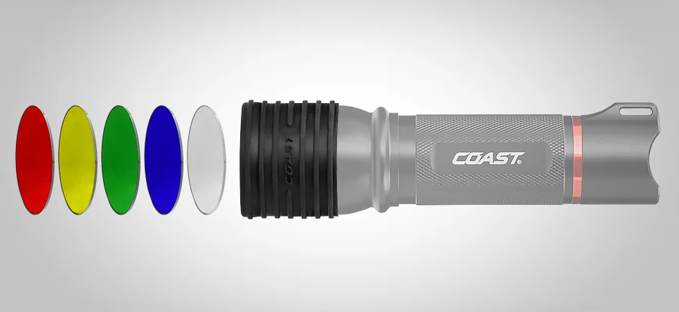
Figure 9. LF100 Lens Filter Kit from Coast.
I used a filter from the kit to trace and cut my 1/2 CTO and 1/8 minus green filters, then simply taped them to the clear filter. Voila. Perfect color and no hassle of taking filters on and off out in the field. The LF50 Lens Filter Kit does the same job on the smaller HP5R flashlight.
Figure 10. A rusty fence light-painted with just the Coast HP7R (left), and with the same flashlight modified with the 1/2 CTO and 1/8 minus green filters (right).
However, while my test has provided the desired color from my flashlight, it works only when I am using Direct Sun (daylight) white balance. In Part II of this topic, I’ll address the issue of filtering your flashlight when you are using the common nighttime white balance setting of 3200 K.
See the continuation of this article: “Level Up With Light Painting: Correcting the Color of Your Flashlight (Part II).”