Light Painting

Advanced Light Painting: Balancing Ambient and Added Light to Achieve Your Objective

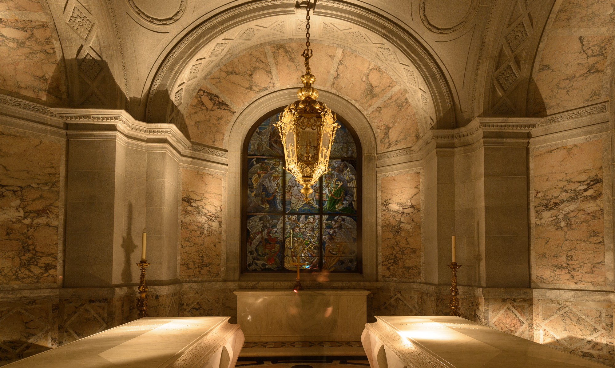
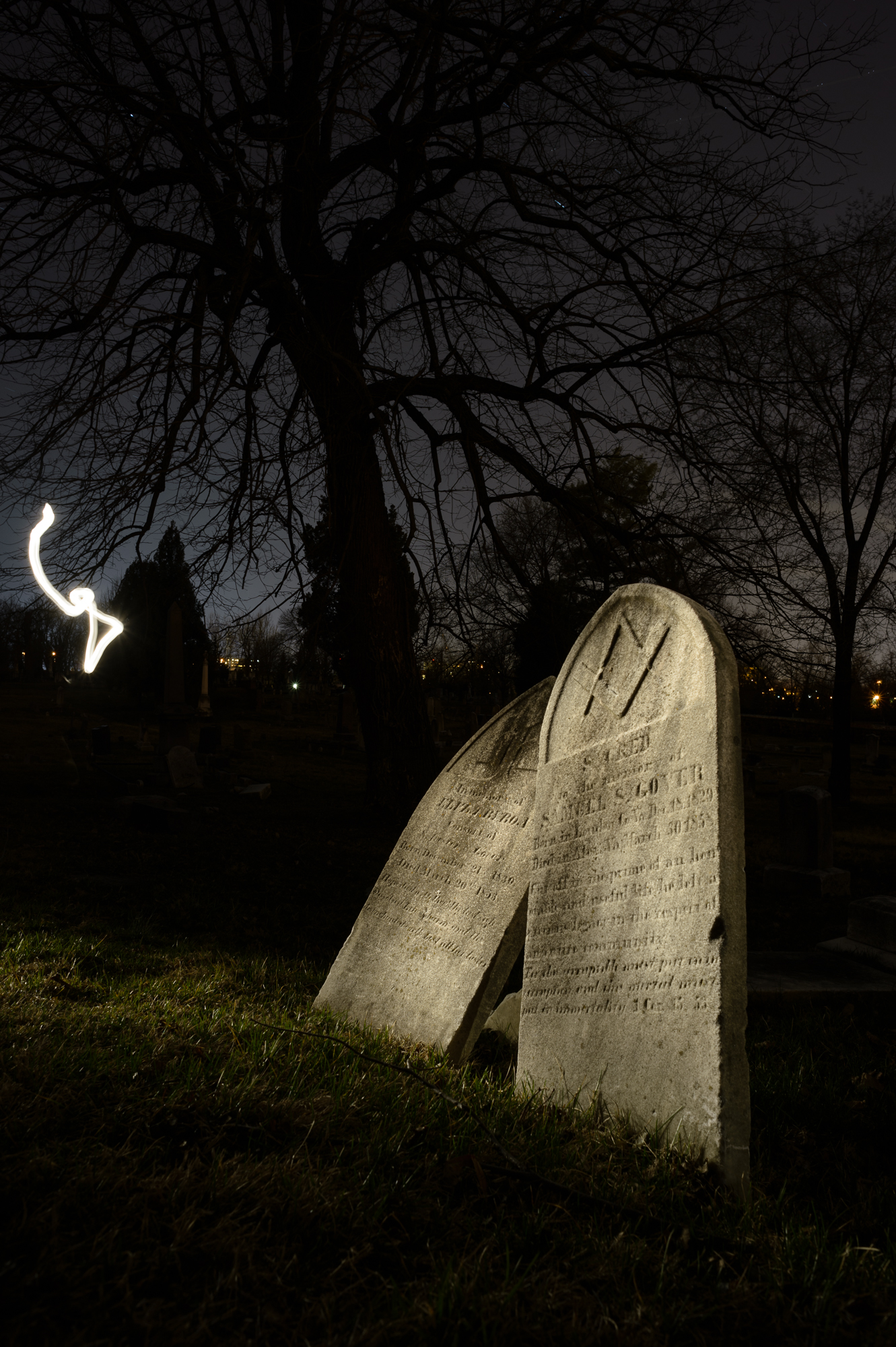
Light painting can be fun, creative and rewarding, but also one of the most challenging aspects of night photography. Carefully crafted light painting can make the difference between a boring and a spectacular image. The range of tools and techniques we have at our disposal make for unlimited possibilities. Effects can range from subtle (from simply filling in shadows to manage contrast and exposure) to dramatic and bold (highlighting a subject in a way that only light can do).

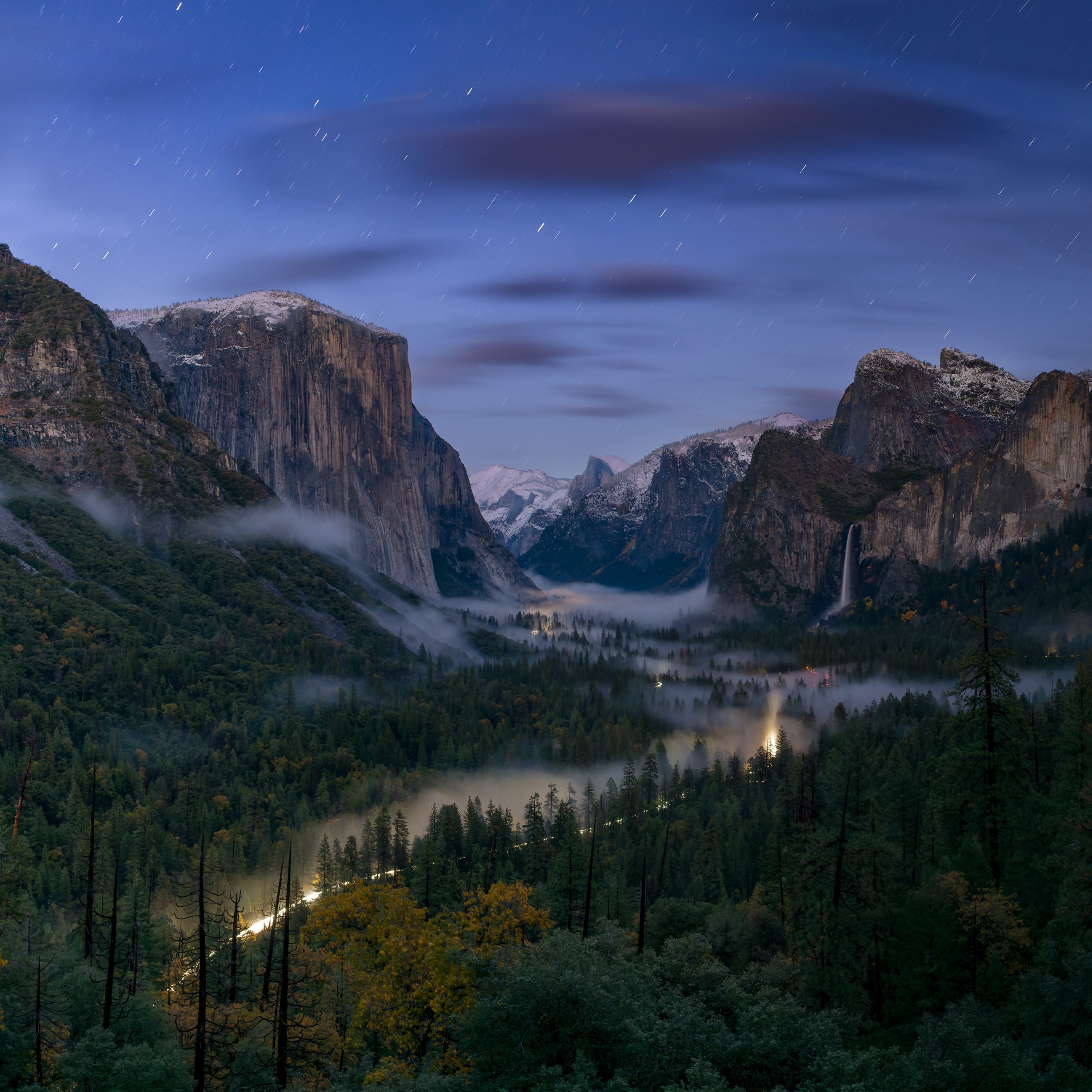
The full moon is rising behind the vertical car. The bus has a Luxli Constructor light on medium power inside at ground level and facing toward the back of the bus. The car in the foreground does not have any added light. The backlighting from the moon created strong shadows and a glow in the sky around the car. All three variations 20 seconds, f/6.3, ISO 3200 with a Nikon D750 and Irix 15mm f/2.4 lens.

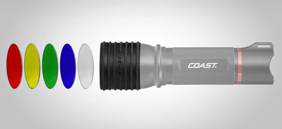
Even a quick pass of a Surefire P6 from camera-left was too much light because of the high ISO.

In the final version, I bounced the light from a Surefire P6 off my hand held over my head while standing about 6 feet to the left of the camera. It was enough to subtly light the car in the foreground while preserving the shadows and overall feel of the image.

The first step to light painting is to figure out what you want to light, and what you are trying to achieve by lighting it.

Once you have that down, the next step is to determine the amount, color and quality of light required. There are lots of decisions to be made, and the answers are different for every image and every situation:

  • Are you lighting multiple objects or multiple surfaces?
  • Do you need to illuminate from multiple positions?
  • Do you want soft, diffuse light or contrasty directional light?
  • Should you use light that matches or contrasts the color of the existing light?

The remainder of this article assumes that you have gotten to this point, and are ready to take it to the next step.

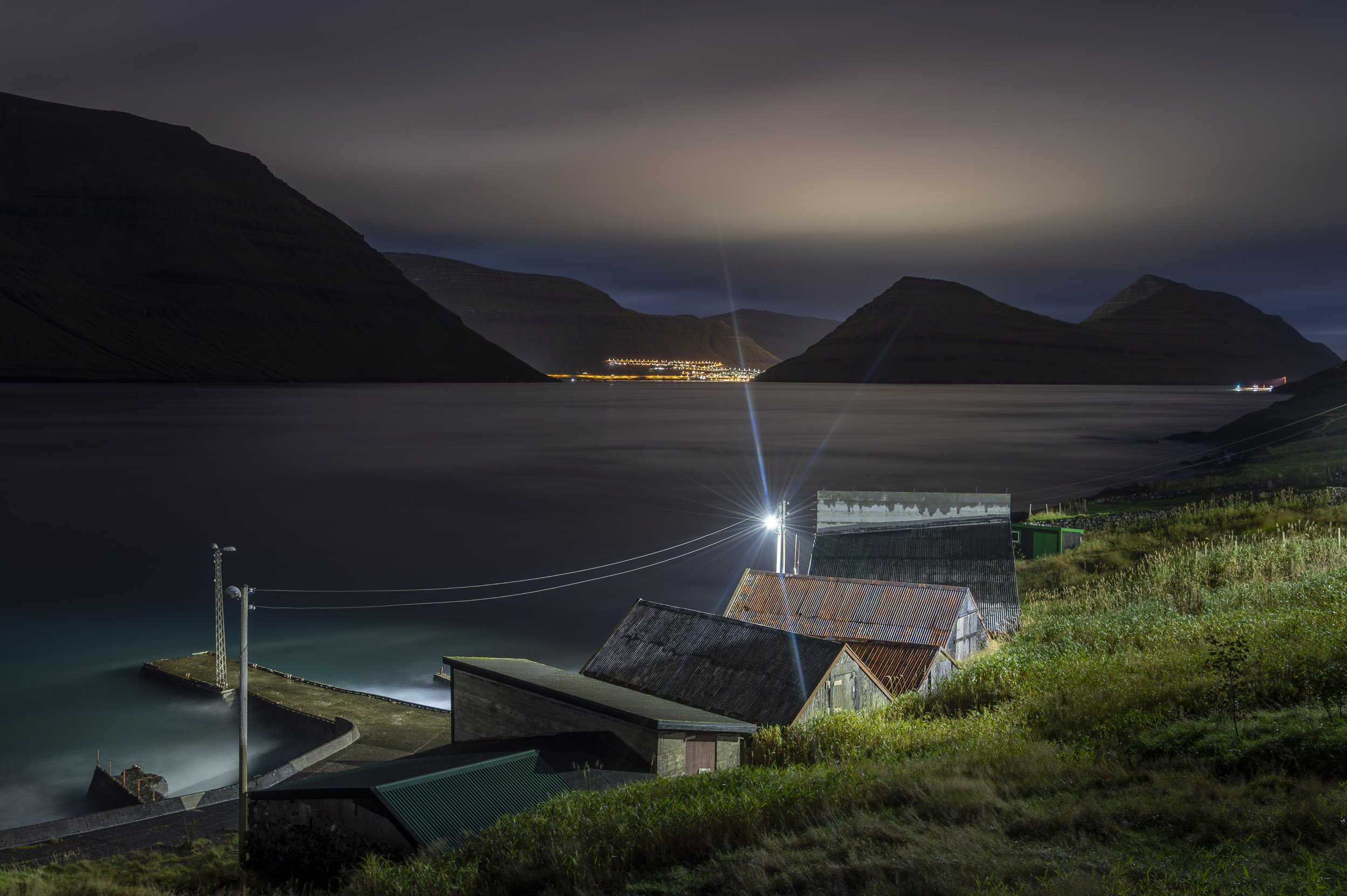
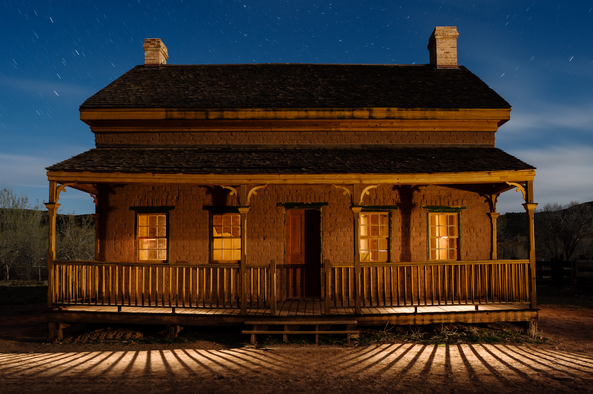
The last-quarter moon was just rising behind camera to the right. Lit with a Surefire P9 incandescent flashlight from the left and right sides at oblique angles. It was a challenge to light both sides of this large building in 30 seconds, but it was freezing cold so I ran from side to side to do the lighting to keep warm. You can see that I overlit the right side and the underside of the top of the building. The background was too dark. 30 seconds, f/8, ISO 800. Canon 6D and Nikkor 28mm f/3.5 PC lens.

After several attempts, I conceded that I would need to use a longer shutter speed, both to add more exposure to the background and to do a better job at the lighting. The light painting is more evenly distributed, and I added light to the foreground. Additionally, the longer exposure opened up the inside of the store, which is lit by vintage, very orange Edison bulbs that have been burning continuously for decades. 75 seconds, f/8, ISO 800. Canon 6D and Nikkor 28mm f/3.5 PC lens.

Controlling the Look

Learning to control lighting ratios between the existing light and whatever light you bring to the party is one of the most powerful ways that you can influence the overall look of your images.

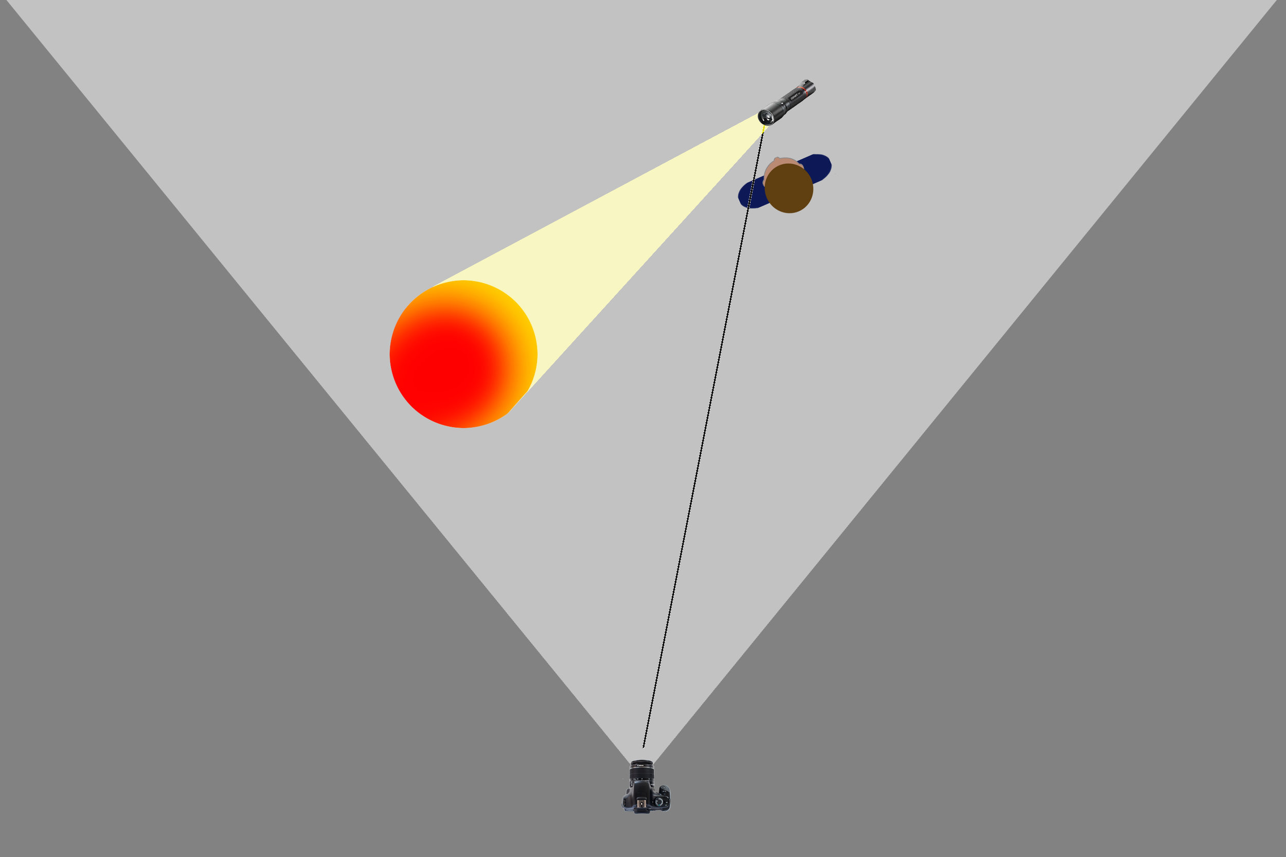
If you are not sure what I mean, think of it in terms of a rudimentary on-camera flash. If you use flash on a point-and-shoot camera, or even a DSLR in โ€œPโ€ mode indoors at night, youโ€™ll end up with a foreground that is properly exposed, and a background that is likely to be dark and underexposed. You can adjust the flash compensation to reduce the amount of flash relative to the existing light for a better balanced overall exposure. Another way to achieve the same end would be to increase the exposure time to increase the background exposure.

The more light you add to your subject relative to the ambient light, the more your illuminated subject will stand out from the background.

We can do that same thing in the field with light painting. But it takes a bit of work, and a clear idea of what we want to say with our images.

Itโ€™s all about the context. If your added light is two or three stops darker than the existing light, it will be barely noticeable. If it is two or three stops brighter, the more pronounced and dramatic it will be.

In the simplest terms, the more light you add to your subject relative to the ambient light, the more your illuminated subject will stand out from the background. Within the parameters of a workable exposure, exactly how much light to add compared with the ambient light is a matter of taste, and is one of the ways a night photographer can style their images.


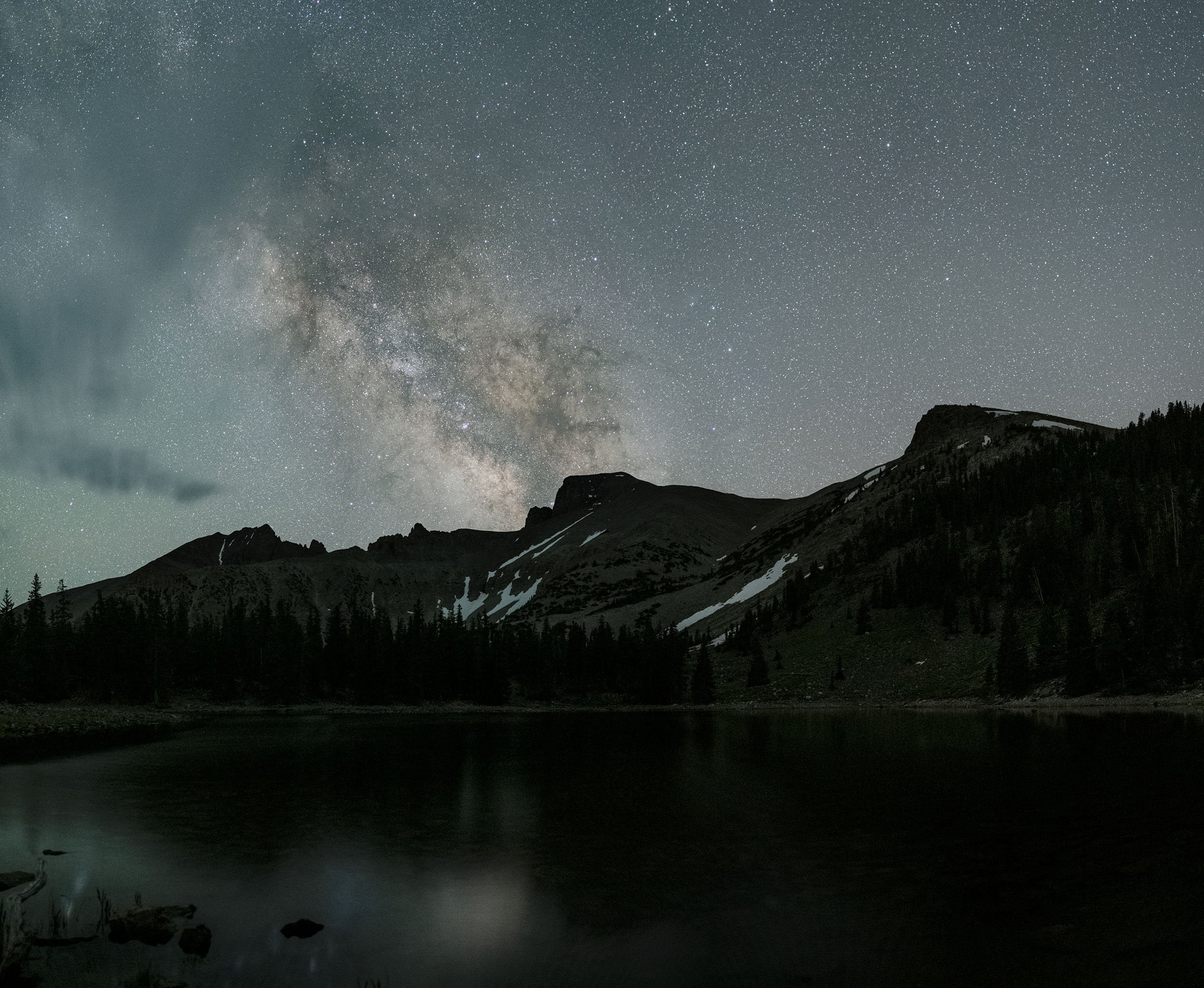
Case Study: Mono Lake Series

The exposure for all five images is 20 seconds, f/4, ISO 12800, and they were shot with a Canon 6D and Nikkor 28mm f/3.5 PC lens. Starlight conditions with practically no light pollution.

Starlight only.

Very low power, broad-beam LED flashlight from camera-right for 2 seconds.

Bright LED flashlight from camera-left for shortest possible time. The brightness of the light meant that I had to use it like a flash by waving it in and out of the scene as quickly as possible. It was impossible to control the light with any consistency.

Very low power, broad-beam LED flashlight from camera-left and right for 3 seconds from each side. I liked the look, but wanted to try a warm light that would contrast the cool, blue sky.

Very low-power, incandescent flashlight from camera-left and right for 1 second from each side. This light was brighter, and therefore harder to control at ISO 12800. It was also less diffuse, which made it difficult to light the formation with just a single 1-second pass of the light from each side, but it was my preferred result.


Arriving at a Ratio

How, though, do you decide how much light to add in comparison with your ambient exposure?

There are two main ways to vary the lighting ratio:

  1. Just as in the flash example above, you could increase or decrease the amount of added light. This can be achieved with a brighter or dimmer light source, or by using a continuous light for a longer or shorter period of time, or by popping a flash once or multiple times.
  2. Extend or shorten the exposure time. Assuming that you used the same amount of light painting, the length of the shutter speed would affect only the ambient exposure. (Whereas changing either the ISO or the aperture would affect both the existing and added light. Our goal is to separate the ambient and added light, not to adjust them proportionally.)

To summarize, you change the lighting ratio by increasing or decreasing the amount of added light, or lengthening or shortening the overall exposure time without changing the added light. Use whichever method works better for each particular shot.

Controlling the Light

You can control how much light you add in different ways depending on the painting tool youโ€™re using:

  • If you are using flash, or a variable brightness continuous light source such as our beloved Luxli Viola, you can increase or decrease the intensity.
  • With a flash, you could also use multiple pops of light, and each additional fire doubles the amount of light on your subject.
  • If you are using a flashlight, then you can increase or decrease the amount of time you employ it to light your subject, provided that time fits within your exposure length. (Increasing the exposure time without altering the added light painting will reduce the ratioโ€”and therefore the impactโ€”of the light painting. Reducing the exposure time without altering the light painting will make the light painting stand out more.)
  • In some situations, of course, you may need to adjust both the added light and the exposure time to find the right combination.
  • One other way to modify your light painting is to increase or decrease the distance between your light source and your subject, keeping the Inverse Square Law in mind. The Inverse Square Law essentially states that doubling the light-source-to-subject distance results in one-quarter of the light reaching the subject.

Case Study: Trona Series

From my โ€œLoos With Viewsโ€ series. A nearly full moon, with light pollution from Trona and Ridgecrest in the background.

The first attempt. 30 seconds, f/4, ISO 800. Canon 5D Mark II with an Olympus Zuiko Shift 35mm f/2.8 lens. Incandescent flashlight from the right, and inside the loo. I considered this to be overlit.

The second attempt. 30 seconds, f/4, ISO 800. Canon 5D Mark II with an Olympus Zuiko Shift 35mm f/2.8 lens. Incandescent flashlight reflected off my hand from camera-left, and LED bounced off the back wall of the structure. The LED was too harsh, and I didnโ€™t want to see the signage on the front.

The third attempt. 30 seconds, f/4, ISO 800. Canon 5D Mark II with an Olympus Zuiko Shift 35mm f/2.8 lens. Better-controlled LED bounced off the back wall of the structure, and no light on the front.

The final attempt. 10 minutes, f/4, ISO 100. Canon 5D Mark II with an Olympus Zuiko Shift 35mm f/2.8 lens. A few seconds from camera-far-left with a Surefire P6 incandescent flashlight to show texture in the structure. I used the same light for a few seconds inside the loo, bounced off the front wall. The light on the rock and the vent pipe was ambient that accumulated during the long exposure. The color of the sky is so different due to the combination of the long exposure and the moonlightโ€™s effect on the white balance.


Complications

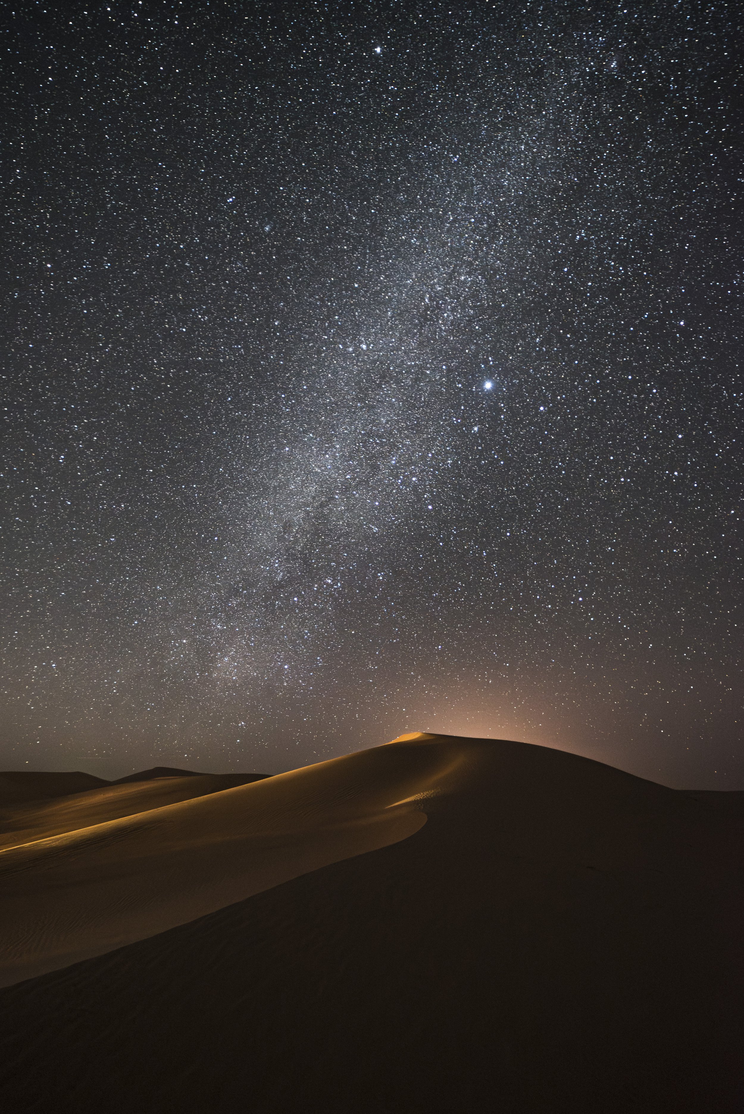
Other constraints (such as shooting at high ISOs to avoid star trails) may come into play, and these can complicate things further.

A common scenario when light painting at high ISOs to preserve star points is that a light source may be so bright that a fraction of a second is all that is required to light a scene, making it next to impossible to control the light well. Reducing the camera exposure would have a negative impact on the stars, and would also even further reduce the amount of time available to get into position and execute the lighting.

In that case, using a dimmer light source is the best option. If the location is treacherous and getting into position takes some time, two good strategies are setting a delay on the exposure or triggering the shutter remotely once you get into position.

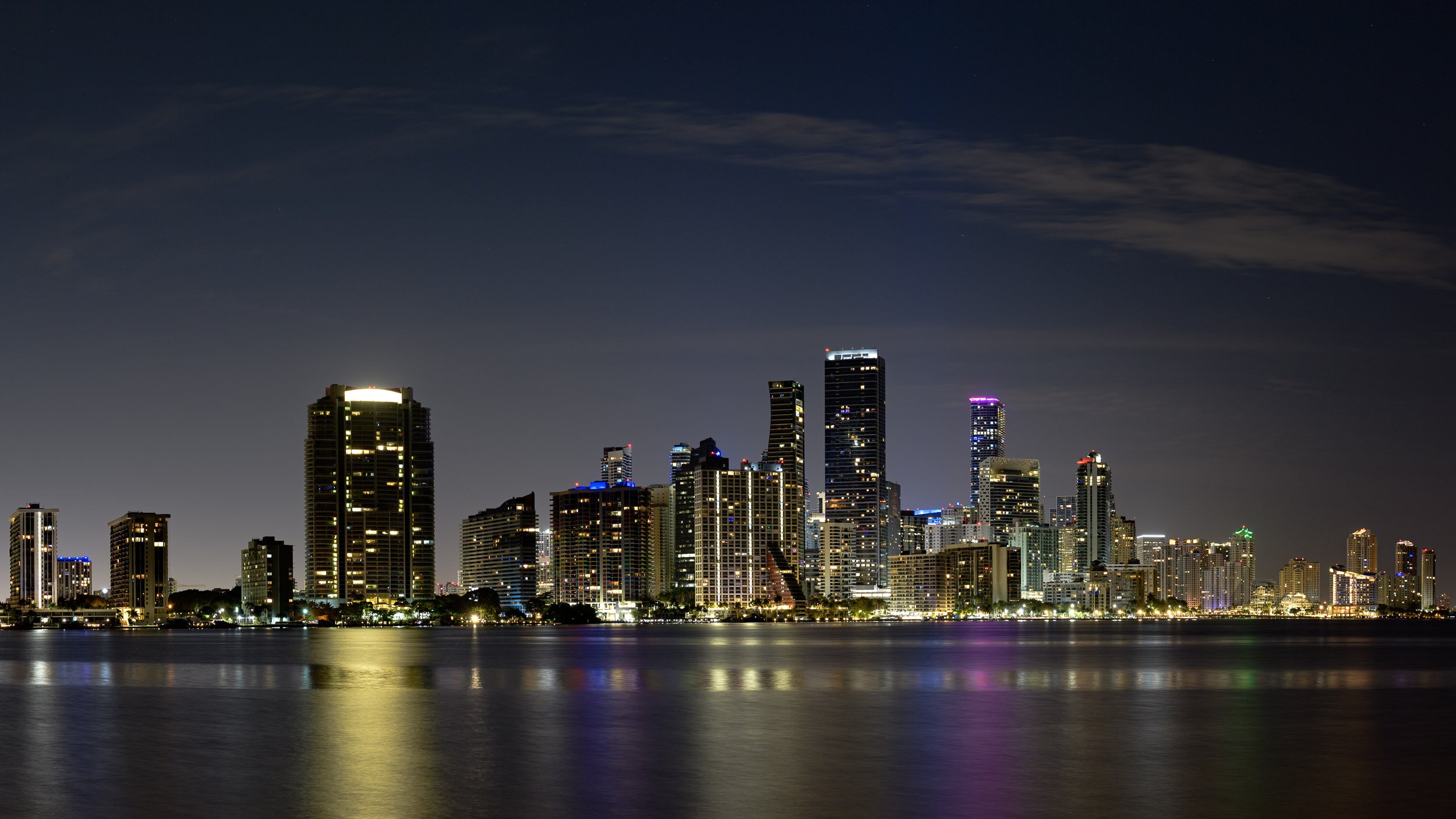
Conversely, when working under the light of a full moon, a longer duration of light painting is a good way to increase the added-to-existing light ratio. In urban environments with a lot of ambient light and relatively short exposure times, utilizing a brighter light source might be the best approach.

But Itโ€™s Really Not Complicated

In any case, some thoughtful examination of the situation and available options will go a long way toward achieving the desired look.

If after reading this you are thinking about going back to daytime photography, please know that these decisions and tactics are really not that complicated. I donโ€™t know anyone who does mathematical calculations in the field to figure out their light paintingโ€”at least no one who has done it more than once!

Like everything related to night photography, itโ€™s a mรฉlange of art and science that can be mastered only by trial and error, accumulating knowledge and experience along the way.

Lance Keimig is a partner and workshop leader with National Parks at Night. He has been photographing at night for 30 years, and is the author of Night Photography and Light Painting: Finding Your Way in the Dark (Focal Press, 2015). Learn more about his images and workshops at www.thenightskye.com.

UPCOMING WORKSHOPS FROM NATIONAL PARKS AT NIGHT

The Right Angle: Creating Texture and Shape When Light Painting

The word photography means to draw or paint with light. When I first began studying photography, I was told that along with composition, the study of light would be a lifelong endeavor. Over the years, Iโ€™ve found this to be an absolute truth.

The master painters knew light intimately. They were genius at using light to define, shape and illuminate their subjects. This skill came from careful attention to the way light wrapped around their subjects. The way it reflected off them. The awareness of color in the shadows and the recognition of specular highlights.

We can learn from them. We can learn from paying careful attention to light and the way it plays on our subjects.

One factor crucial to painting in your own light is the angle of the beam. This is critical in bringing out texture and creating depth in your images (Figures 1 and 2). Painting your subject from the position of your camera will result in the least flattering light. Painting it from the side will produce the most texture and dimension.

Figure 1. Painting at the same angle as the camera will produce the least-interesting version of your scene.

Figure 2. Painting the subject from the side will result in the most texture and dimension.

The two images of the star (Figures 3 and 4) show the difference between a subject painted straight on and one painted from the side. The star in Figure 3 was painted while I stood right at the camera, which was about 8 feet from the subject. Notice how flat the image is; it displays very little depth. The photography term for this is โ€œfront-lit.โ€

The star in Figure 4 was created by standing to the side of the star while painting, very close to the fence, and again about 8 feet away. Everything in the scene begins to show more texture. The star becomes much more three-dimensional.

Figure 3. Created under city lights using an exposure of 30 seconds, f/8, ISO 200, and lit from the front.

Figure 4. Same ambient light and exposure, but lit from the side. Notice how the shadows add texture to the image. (Click/tap either image for larger view.)

An abandoned gas station (Figure 5) made another good subject for showing the difference between a front-lit subject and one that is side-lit. The image was created by simply standing right next to the camera while illuminating the scene.

Whereas I created the image in Figure 6 by painting from many different angles. I divided the painting of the walls into two sections. For the left wall, I stood off to the left but close to the wall and then painted inward. I did the same for the right wall. This left the chair and ground very dark. Placing my flashlight about 8 inches from the ground, I painted across the scene to give the litter-covered concrete lots of texture. I painted the chair last by getting about 5 feet from it and painting downward.

Figure 5. This old gas station in rural Arizona was illuminated using only a flashlight. There were no city lights to influence the overall exposure, but the moonlight was moderate, so I used an exposure of 2 minutes, f/11 to keep the ambient light low. In this image, I light painted from the front ...

Figure 6.  ... whereas in this frame I light painted from the side in multiple locations. (Click/tap either image for larger view.)

This light-painted old building (Figure 7) was a typical situation of establishing the ambient exposure for the night sky and then light painting the buildings. The ambient exposure was 4 minutes, f/8, ISO 200. This exposure left the building quite dark. Using my 65-lumen flashlight, I began by painting the building from the right for about 1 minute, moving further to the right as I painted. Noting the shadows of the porch posts on the building will give you an idea of my angle while painting.

Next I moved onto the porch and stood in front of the far-right window. Hiding the front of my flashlight from the lens, I swung the flashlight from right to left for about 30 seconds as I pointed toward the ground in front of the porch. This caused the light and shadow in front of the house. Keeping my flashlight in one position kept the shadows on the ground sharp. If I had physically moved the flashlight from right to left, rather than swung it from a single position, the shadows would have become softer and less defined. Because I was much closer, the ground is lighter than the building. I then repeated this process standing in front of the far-left window.

To complete the effect, a student popped a flash in the window on the right side of the building and then again on the left side of the building. This gave the impression of interior lights being on.

Figure 7. I love to visit Grafton ghost town during workshops in Zion National Park. On this occasion, I was teaching a night photography workshop with Gabriel Biderman. Our group was focused on shooting the night sky while light painting the various buildings.

In Figure 8, the only moonlight striking the scene is on the ground in front of the truck. The ambient exposure of 2 minutes, f/8, ISO 100 kept the moonlight foreground somewhat dark. Using my 65-lumen flashlight, I started by painting the back wall from the cameraโ€™s far left. This distance created a broader beam, which covered most of the wall at once.

Next, I moved close to the truck and somewhat behind it. From this vantage point I painted the grill, fenders and windshield. This gives the truck a heavy side-lit, almost back-lit feel.

At this point I moved around to the right of the camera and painted the truck from that side. I spent less time painting here, so it wasnโ€™t as bright as the other side. Filling in some light from this side helped give the truck dimension and kept it from being pure black in the final image. I created highlights in the scene by moving very close (1 foot) to the headlamps and painting each one for a couple of seconds. To finish the image off, I painted the inside of the cab for a couple of seconds from each window.

Figure 8. I photographed this old truck at Nelson ghost town in Nevada. Our workshop group was photographing under a full moon, but most of this truck was in the shade of the building.

Paying careful attention to the way light wraps around and reflects off of your subject is a great learning experience. Notice light while youโ€™re looking at magazines, watching TV or walking down the street. Take into account the angle, color and quality of the light. When it comes time to supply your own light, remember these lessons. Experiment with different vantage points and keep your flashlight at a severe angle to your camera.

Never paint from behind the camera!

Note: This article is adapted from an excerpt of Timโ€™s ebook The Magic Light Painting (Peachpit).

Tim Cooper is a partner and workshop leader with National Parks at Night. Learn more techniques from his book The Magic of Light Painting, available from Peachpit.

UPCOMING WORKSHOPS FROM NATIONAL PARKS AT NIGHT

Level Up With Light Painting: Correcting the Color of Your Flashlight (Part II)

Note: This is the conclusion of a previous post, โ€œLevel Up With Light Painting: Correcting the Color of Your Flashlight (Part I).โ€


In my last post on flashlight color I demonstrated how LED flashlights produce a cooler light than I prefer. I went on to show you how to analyze and correct the color using simple gels from the Roscolux Swatchbook.

In that post, the filtration I worked out for my favorite flashlightsโ€”the Coast 300-lumen Coast HP7R and 185-lumen Coast HP5Rโ€”was a Roscolux 1/2 CTO combined with a 1/8 minus green. This combination works well when my Nikonโ€™s white balance is set to Direct Sun (Daylight on a Canon). Night photography, however, often requires a significant deviation from our common white balance settings.

Finding the Fix

Direct Sun white balance has an approximate Kelvin temperature of 5500. Although, as I mentioned in my last post, Lightroom may display your Kelvin temperature higher or lower depending on Adobeโ€™s interpretation of your camera. Adobe interprets my Nikonโ€™s D4sโ€™s white balance as 4900 K. For the remainder of this post Iโ€™ll refer to the Kelvin setting on the camera rather than Adobeโ€™s interpretation.

When using the Direct Sun white balance setting, subjects photographed under average midday sunlight will be rendered properly with regard to color. If, however, your white balance is set to Direct Sun and you photograph a subject under a different light source, the subject will take on the color cast of that light source. For example, for the photo in Figure 1, I kept my camera set to Direct Sun white balance while photographing under the heavy orange cast of the sign lights. Figure 2 shows the color-corrected version at 2000 K.

Figure 1. 5500 K (Direct Sun) white balance

Figure 2. 2000 K white balance

Lowering that white balance had the effect of adding in a blue cast, counteracting the orange/yellow cast it had before. Now imagine if I had used my somewhat blue LED flashlight to paint the people in the foreground. After color correction, the subjects illuminated by the flashlight would be even more blue due to the lower Kelvin temperature.

So while the filter combination I used for my flashlight worked well with Direct Sun white balance, that same filter combinations would turn the flashlight light to blue when using white balance settings typical of night photography.

Finding the Filters

How to resolve this issue? Once again I turned to my X-Rite ColorChecker chart for my visual tests. I began by setting my cameraโ€™s white balance to Tungsten, which is roughly 3200 K. This is a setting I often use for night photography. Next I light-painted the chart with my standard filtration of 1/2 CTO combined with a 1/8 minus green. This produced the color in Figure 3.

Figure 3. 3200 K white balance, Coast HP7R filtered with Rosco 1/2 CTO and 1/8 minus green filter gels

Figure 3. 3200 K white balance, Coast HP7R filtered with Rosco 1/2 CTO and 1/8 minus green filter gels

The chart is noticeably cool due to the lowered white balance setting of 3200 K. So I experimented with a variety of gels, looking for the right mix to produce a more accurate color balance. After experimenting, I settled on a Roscolux Dark Bastard Amber, which when added to my 1/2 CTO and 1/8 minus green, produced the effect we see in Figure 4.

Figure 4. 3200 K white balance, Coast HP7R filtered with Rosco 1/2 CTO and 1/8 minus green plus Dark Bastard Amber filter gels.

Figure 4. 3200 K white balance, Coast HP7R filtered with Rosco 1/2 CTO and 1/8 minus green plus Dark Bastard Amber filter gels.

You can see that new combination of filters has produced a color cast that is neutral to slightly warm when shooting with Tungsten white balance.

Putting This Into Practice

For the last step, I took a new clear plastic filter from a Coast LF100 filter kit and again traced and cut out a 1/2 CTO, a 1/8 minus green and a Dark Bastard Amber, and taped them all to the filter. Now I can easily interchange the two plastic filters (one with my original gel combo and the second with the original combo plus Dark Bastard Amber) when I change my white balance from Direct Sun to a Tungsten.

Figures 5 through 8 show a real-world example of how this affects the color of a scene. In Figure 5, my cameraโ€™s Direct Sun white balance produces an overly orange image due to the sodium vapor lights (common in most city lighting) illuminating the building.

Figure 5. Direct Sun white balance

Figure 5. Direct Sun white balance

Figure 6 shows the same scene after I changed my cameraโ€™s white balance to Tungsten (3200K). Notice the nearly neutral color of the metal and white door.

Figure 6. Tungsten white balance

Figure 6. Tungsten white balance

For Figure 7 I kept the white balance set to Tungsten and illuminated the door with my unfiltered flashlight. The door becomes very blue due to the cooler white balance setting.

Figure 7. Tungsten white balance with unfiltered flashlight illumination

Figure 7. Tungsten white balance with unfiltered flashlight illumination

Figure 8 shows the same scene with my camera still on the Tungsten white balance setting, but light-painted with the flashlight gelled with the 1/2 CTO, 1/8 minus green and Dark Bastard Amber combination.

Figure 8. Tungsten white balance with filtered flashlight illumination

Figure 8. Tungsten white balance with filtered flashlight illumination

Of course, Tungsten white balance is not the only setting I use for night photography. My night settings range from 3200 K to 5500 K, with 3800 K being the setting I use most often. So, you may ask, why did I run my test at 3200 K if use 3800 K more often? In a word, warmth. I like my flashlight illumination to be somewhat on the warm side. A gel that produces a neutral cast at 3200 K will produce a warmer cast at 3800 K. Just how I like it!

Remember, no LED flashlight will produce perfect color. But, with a little testing and experimentation, you can create your perfect color for your light-painting illumination!

Learn more techniques from Tim Cooperโ€™s book The Magic of Light Painting, available from Peachpit.

UPCOMING WORKSHOPS FROM NATIONAL PARKS AT NIGHT

Level Up With Light Painting: Correcting the Color of Your Flashlight (Part I)


For the photographer who enjoys light painting, the flashlight (or โ€œtorch,โ€ if you are a Brit) is your most basic tool. However, all flashlights are not created equal. They come in a wide variety of intensities, beam patterns and color variations. In this post Iโ€™ll deal with that last variable, and show you how to control the color of this essential tool.

Defining the Color Problem

While incandescent flashlights have been the norm for a very long time, today the most commonly found flashlights use LED (light emitting diode) technology. The LED is superior in many ways. LED flashlights are more resistant to shock, are easily dimmable, and last much longer than a typical incandescent bulb.

The downside is that LED flashlights rarely have the nice warm color that was so common in our old household Everyready or Maglite. Most LEDs produce a cooler blue or even greenish color. For photographers working in black and white, this is a non-issue. But color photographers might want to determine their flashlightโ€™s color cast so they can add the proper filtration to obtain a desired color temperature.

Measuring the Discrepancy

Like most folks, I donโ€™t own any special color meter equipment, so I set up a simple test using the tools that I had on hand: My Nikon D4s and Gitzo Series 2 Traveler carbon fiber tripod, an X-Rite ColorChecker color-test chart, Adobe Lightroom, and my Coast HP7R flashlight. (I should note that the HP7R is an amazing light, one of the workhorses of my kitโ€”the fact that Iโ€™m using it for this test does not denote a shortcoming with this model in particular, but rather with the LED technology as a whole.)

I set up the color test chart in a dark room. With my camera on the tripod and white balance set to Direct Sun (Daylight on a Canon), I illuminate the test chart with my flashlight and take a picture. Notice the cool color cast of the resulting image in Figure 1? The daylight white balance of the camera shows us the natural bluish cast of the flashlight.

Figure 1. Bluish color cast of the Coast HP7R flashlight, typical of many LED flashlights.

Figure 1. Bluish color cast of the Coast HP7R flashlight, typical of many LED flashlights.

To determine the exact color cast, I import the image into Lightroom and open it in the Develop module. The area at the top of the Basic panel displays the imageโ€™s white balance setting.

When shooting your camera with a white balance setting of Daylight, you would expect this reading to be 5500 on the blue-yellow axis and 0 on the green-magenta axis. The numbers we see here, however, are Adobeโ€™s interpretation of my cameraโ€™s file. Adobe sees my camera as 4900 on the blue-yellow axis and +1 on the green-magenta axis. The fact that these numbers (Figure 2) donโ€™t match the traditional daylight Kelvin temperature of 5500 is not a big deal; remember, this is just Adobeโ€™s interpretation.

Figure 2. Adobeโ€™s interpretation of my cameraโ€™s white balance when shooting with the unfiltered HP7R.

Figure 2. Adobeโ€™s interpretation of my cameraโ€™s white balance when shooting with the unfiltered HP7R.

Next I grab the White Balance Selector tool (circled in red in Figure 3) and click on one of the light gray patches of the color checker chart.

Figure 3. The White Balance Selector tool.

Figure 3. The White Balance Selector tool.

The White Balance Selector is a great tool for color-correcting when you have a known neutral color in a scene, such as the gray areas of this chart (which I carry with me for times when I need to get precise color correction under artificial lights). When you click on an area of the image with this tool, Lightroom tries to balance that area to a neutral color, resulting in no color cast. Figure 4 shows the image after I click on the light gray patch. Notice how the cool cast is removed from the image, resulting in neutral grays.

Figure 4. The chart after using the White Balance Selector.

Figure 4. The chart after using the White Balance Selector.

Figure 5 shows a magnified section of before and after the Lightroom adjustment.

Figure 5. Natural light of my Coast HP7R (top) and the color-corrected version (bottom).

Figure 5. Natural light of my Coast HP7R (top) and the color-corrected version (bottom).

Also after clicking on the chart, the numbers on the sliders change to reflect the new white balance (Figure 6).

Figure 6. Original white balance (left) and the corrected white balance (right).

Figure 6. Original white balance (left) and the corrected white balance (right).

At this point I am not overly concerned with the actual numbers. The real information I am looking for is which way the sliders moved. Figure 6 shows us that Adobe color-corrected by adding a bunch of yellow. This is the important thing for me to note, because it means that in order to correct my flashlight, I need to do the same thing!

Fixing the Flashlight

The next step is to begin experimenting with filtration. A common form of filtration for the photographer is a thin, heat-resistant, polyester filter thatโ€™s often called a โ€œgel.โ€ Gels come in a staggering number of variations and are used to enhance the color of light or to color-correct it. Gels also come in different sizes, but the ones typically used for on-camera flash units and flashlights are about 1.5 by 3 inches. Figure 7 shows how this size is neatly bundled into a swatch book. For the small investment of $2.50, the Roscolux Swatchbook is must-have for light painters.

Figure 7. Roscolux Swatchbook.

Figure 7. Roscolux Swatchbook.

Knowing that I have to cancel out blue, I open my swatch book and find a common gel called a CTO (color temperature orange). It comes in several strengths, with designations such as 1/4 CTO, 1/2 CTO and Full CTO (the strongest). By tearing out the gels from the swatch book, I can cover the flashlight, illuminate the color chart and begin taking pictures of the color chart again.

After making some test shots, I load them into Lightroom and visually compare the charts with the original and color-corrected versions. After several experiments I find that the 1/4 CTO does a pretty good job of neutralizing the blue cast.

However, I also want to add a bit of warmth to my light, so I up the strength of the CTO to 1/2. This works well, but it does impart a bit of green, so I add a 1/8 minus green filter which adds some magenta. Figure 8 shows the color-corrected chart on the top and the chart illuminated by my Coast HP7R gelled with Rosco 1/2 CTO and 1/8 minus green filters.

Figure 8. Color-corrected chart on top, filtered version on the bottom.

Figure 8. Color-corrected chart on top, filtered version on the bottom.

This test is by no means superscientific, but it gets you in the ballpark. Taking the time to experiment with a few filters will allow you to paint with confidence out in the field and will save you a ton of time color-correcting in Lightroom and Photoshop. Of course, if you use the Coast HP7R, you donโ€™t have to run any tests at all, because I just told you the results! A Roscolux 1/2 CTO and a 1/8 minus green combo work nicely. Itโ€™s also a good combination for the lower-powered Coast HP5R, another of my favorite flashlights.

Putting This Into Practice

Once youโ€™ve determined which gels you need, itโ€™s time to attach them to your flashlight. This can be accomplished in many different ways. The easiest is to simply fold the gel(s) over the end of the flashlight and wrap a rubber band around it. This certainly works, but is not overly elegant and may result in lost or damaged gels over time.

For my gels, I purchased the $4.99 LF100 Lens Filter Kit from Coast. Figure 9 shows how the rubber bezel cover can hold any of several colored or clear plastic filters that are included with the kit.

Figure 9. LF100 Lens Filter Kit from Coast.

Figure 9. LF100 Lens Filter Kit from Coast.

I used a filter from the kit to trace and cut my 1/2 CTO and 1/8 minus green filters, then simply taped them to the clear filter. Voila. Perfect color and no hassle of taking filters on and off out in the field. The LF50 Lens Filter Kit does the same job on the smaller HP5R flashlight.

Figure 10. A rusty fence light-painted with just the Coast HP7R (left), and with the same flashlight modified with the 1/2 CTO and 1/8 minus green filters (right).

However, while my test has provided the desired color from my flashlight, it works only when I am using Direct Sun (daylight) white balance. In Part II of this topic, Iโ€™ll address the issue of filtering your flashlight when you are using the common nighttime white balance setting of 3200 K.

See the continuation of this article: โ€œLevel Up With Light Painting: Correcting the Color of Your Flashlight (Part II).โ€

Learn more techniques from Tim Cooperโ€™s book The Magic of Light Painting, available from Peachpit.

UPCOMING WORKSHOPS FROM NATIONAL PARKS AT NIGHT

Staying Invisible While Light Paintingโ€”The Art of not Being Seen

One of the first questions I am asked about light painting is, โ€œWhy donโ€™t you show up in the picture?โ€ Itโ€™s a great question.

As photographers, weโ€™re accustomed to being very mindful of whatโ€™s in our frame. Weโ€™re constantly trying to keep our hands, feet, tripod legs and tourists out of the shot. The act of painting our scene with light, however, often requires us to not only walk through, but sometimes stay within the frame for long periods of time. So why donโ€™t we show up?

Long Exposures

The main reason is time. Exposures for light painting are often so long that we just donโ€™t register in the exposure. Letโ€™s take an example of a shot made on a full moon night. If a shutter speed of 2 minutes is required to produce a well-illuminated scene, you would need to stand in the composition for 2 minutes to be properly exposed. If you stood there for 1 minute, you would be a ghostโ€”meaning that you would look transparent. For half of the exposure you are there, for the other half, the sensor is seeing whatโ€™s behind you.

Now letโ€™s take it down a bit. If you stood there for 30 seconds you would be even more transparent. And if you stood still in the frame for 8 seconds or 4 seconds, you wouldnโ€™t even register. You are just not in the frame long enough to make an impression. Couple this with the fact that you almost never stand still while light painting, and you can see why you are not seen!

For this image I stood in front of the windows and painted back at the camera to create the shadows on the ground. The overall exposure was 3 minutes. The 20 seconds that I stood in front of the windows was not enough time for me to register on the โ€ฆ

For this image I stood in front of the windows and painted back at the camera to create the shadows on the ground. The overall exposure was 3 minutes. The 20 seconds that I stood in front of the windows was not enough time for me to register on the exposure.

In order to be visible in this scene, I had to stand in the doorway for the entire length of the exposure. If I stood there for only half of the exposure, I would have been a ghost.

In order to be visible in this scene, I had to stand in the doorway for the entire length of the exposure. If I stood there for only half of the exposure, I would have been a ghost.

The Caveat

In the above scenario of the full moon we are assuming that you are not being illuminated by anything but the full moon. But, if you introduce a light source brighter than the ambient light (your flashlight, for instance), it will be โ€œseenโ€ in the scene.

This is exactly why and how our subjects become brighter than the background. We paint them with a light source brighter than the ambient lightโ€”in this case, the moon. So if you accidentally paint yourself with the flashlight, you too will register on the sensor!

Sometimes, even the light bouncing back from the object you are painting can somewhat illuminate you. In the image below you can see that I am ghosted in the lower center of the frame. Although this was a completely dark mausoleum, the walls were close enough that as I painted, they bounced enough light back onto me to make me partially visible.

Bounced light from the walls I was painting was enough to illuminate me.

Bounced light from the walls I was painting was enough to illuminate me.

Solutions to Being Seen

The first step you can take to hide yourself from the camera is to wear black clothing. Black fabrics will absorb most of the stray light and ensure that you remain invisible. Steer away from lighter colored pants such as khakis, as they will reflect more light.

Also, remember that the brighter the scene is, the shorter the exposure will be. Shorter exposures will require that you donโ€™t stay in one place for too long. Longer exposures are much more forgiving, allowing you to linger a little longer in spots.

And donโ€™t paint yourself with the flashlight! Anything the flashlight touches will show up in the scene. Keep it pointed at the subject, not yourself!

Another similar issue when light painting is when your flashlight or other light-painting tool shows up in the image. Sometimes you may want this effectโ€”such as when writing with lightโ€”but when itโ€™s an accident it can ruin your photos.

In this image, while light painting the gravestones, my flashlight slipped out from behind my body and the camera was able to โ€œseeโ€ it.

In this image, while light painting the gravestones, my flashlight slipped out from behind my body and the camera was able to โ€œseeโ€ it.

To prevent this, think of it as hiding the flashlight from your camera. The simplest way to do this is to keep your body between the flashlight and the camera. This can be difficult, especially while you are trying to paint something from the side, as seen in the image above. This flashlight angle produces beautiful texture on the subject but you must be careful to always hide the tip of the flashlight. If your camera sees the tip (where the bulb is), the light source itself will be recorded.

Keep your body between your flashlight and camera.

Keep your body between your flashlight and camera.

Another method of hiding your flashlight from the camera is to use a rubber snoot. Fit one onto the front of the light, and it will hide the bulbs while still letting the light flow into the scene where you want it. I find the Universal Connector by Light Painting Brushes works really well as a snoot (in addition to its intended use for connecting brushes to your flashlight). A less elegant DIY solution is to cover a toilet paper tube inside and out with black gaffers tape.

These Universal Connectors by Light Painting Brushes are designed to hold light-painting tools, but also can serve as excellent snoots to mask the tip of your flashlight.

These Universal Connectors by Light Painting Brushes are designed to hold light-painting tools, but also can serve as excellent snoots to mask the tip of your flashlight.

With these techniques and a little practice, youโ€™ll be effectively invisible to the camera. Fortunately in the digital age we can look at the LCD to see if weโ€™ve shown ourselves, quickly learn from our mistakes, and get the shot right the next time.

For more information about the equipment mentioned in this post, see the Our Gear page.

Learn more techniques from Tim Cooperโ€™s book The Magic of Light Painting, available from Peachpit.

UPCOMING WORKSHOPS FROM NATIONAL PARKS AT NIGHT