color

To Contrast or Complement: How to Use Color in Light Painting

Color and Color Photography

I’ve always thought that if you are going to be a color photographer, then you should understand color.

At least that’s what I thought after I learned about color. For the first several years of my photography career I was regrettably ignorant to the importance and impact of the colors we use in our images. I’ve come to find out this is not at all uncommon. Many photographers who produce color images are as equally unaware of color’s characteristics.

I can hear the naysayers already. What color? There is very little color at night. True. Sort of. While there is not an abundance of natural color at night, we do have the opportunity to add our own, with light painting. And we can do that with greater effect if we understand and use the concepts of how the color of light affects perception.

Color psychology

Whether we know it or not, color has a big impact on our lives. From the color of our house to the clothes we wear, color is a quiet indicator of who we are and what we like. You look great in that color, are you a Summer? I am a Winter.

We use it to help fit our mood, or even to enhance it. It may determine the car we drive off the lot or the image of ourselves we want to project. With this level of integration with our daily lives, it’s amazing we don’t give color a higher priority in our image-making processes. We tend to think the color that’s present (in the words of the kids these days) is what is.

pencils.jpg

There’s been barrels of ink written about how we respond emotionally to color, especially when it comes to marketing. We see orange as cheerful, red as exciting, green as peaceful and blue as trustworthy. While there may be grains of truth in this, our personal experiences, not to mention the context the color is being used, render these classifications as no more than points of interest when it comes to photography.

For example, blue may project “trustworthiness” in a logo, but that’s not the word that comes to mind when viewing a night sky. The green of the forest can be perceived as relaxing, but may not have the same effect when projected onto a night scene with a flashlight.

While I think color psychology is interesting, I believe its connection to photography is minimal. When you take a picture of an orange, your viewer is more likely to think of a citrus slice or juice rather than an active emotional state.

What I do believe is important for the photographer, however, is color dissonance and color harmony. These terms describe the effect of pairs or groupings of color.

Color Dissonance

Color dissonance can be loosely described as a color scheme that uses complementary colors, which are ones that are opposite of each other on the color wheel. In Figures 1 through 3 you can see the color wheel used for light (Additive Color Model). With this model, the primary colors are red, green and blue (RGB—sound familiar?); the respective secondary colors are cyan, magenta and yellow.

Figure 1. Additive color wheel.

Figure 2. Primary and secondary colors.

Figure 3. The complementary colors of yellow and blue.

When using complementary colors together, you are creating a color scheme that is punchy. It decreases color unity and increases color contrast.

Color Harmony

Color harmony can be loosely described as a color scheme that uses analogous colors. These are colors that are near to each other on the color wheel. Figure 4 shows the analogous colors of yellow, orange and red.

Figure 4. Analogous colors.


When using analogous colors together, you are creating a color scheme that is less punchy. It increases color unity and decreases color contrast.

Strategies for Using Color

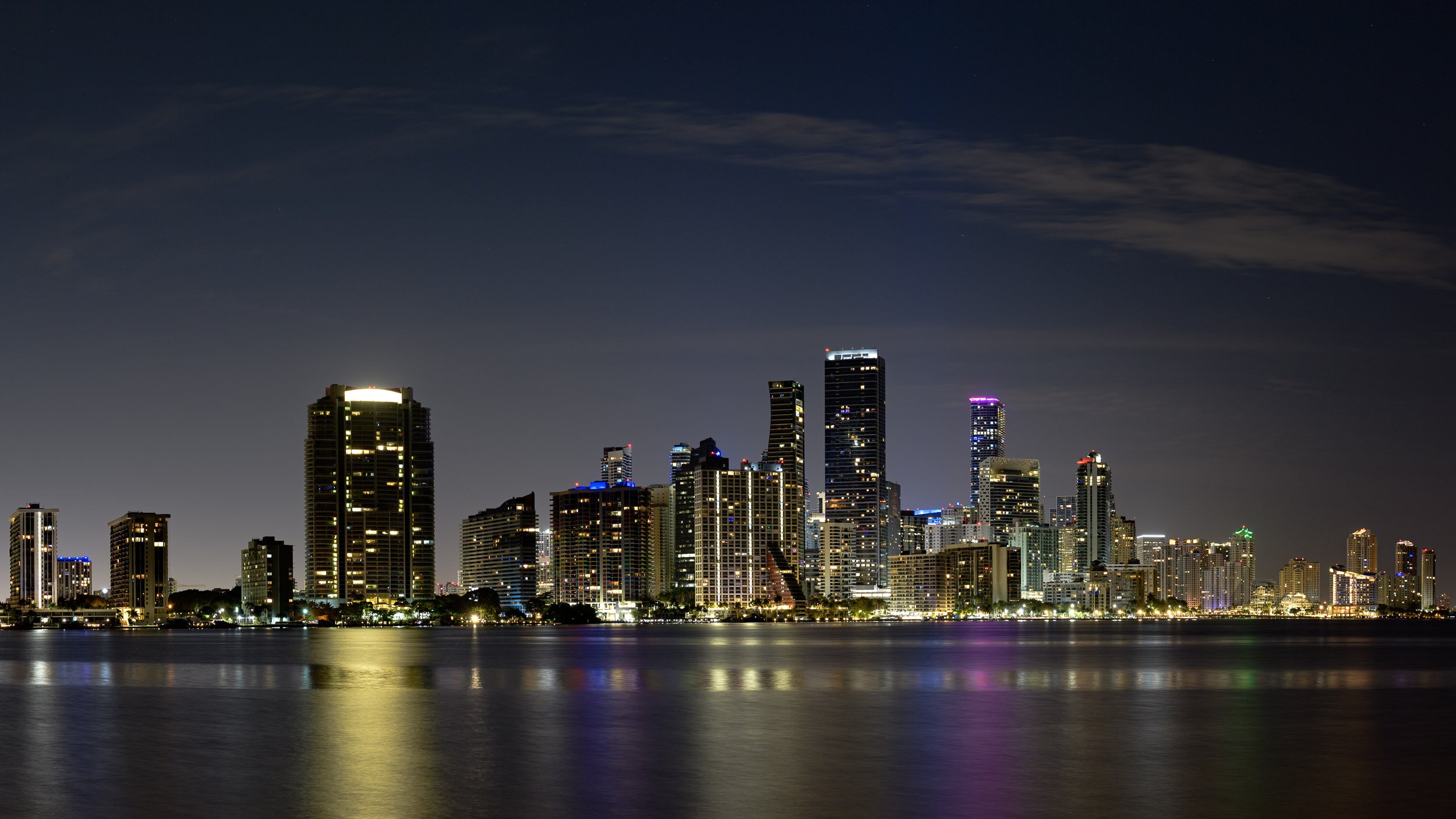
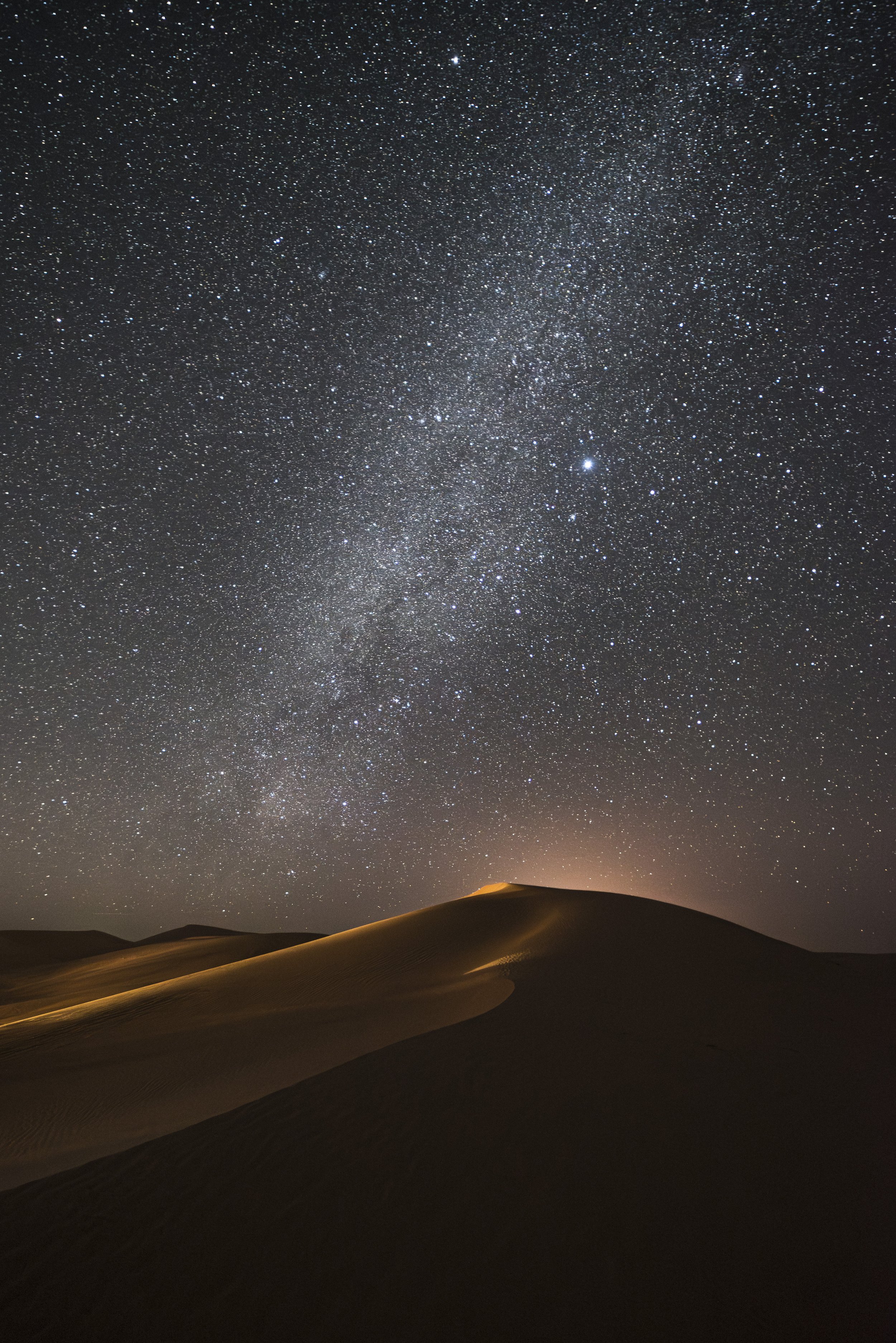
You’ll hear that warm colors such as yellow, orange and red are more active, more exciting—and that cooler colors such purple, blue and green are somewhat calming, less active. I believe there is something to that. However, night photographers rarely think of changing the entire color cast of an image to project a feeling. What’s more likely is that we’ll find ourselves in either a warm-color or cool-color situation in the field. For example, we may be shooting in the warmer light of a city (Figure 5), or in the cooler conditions of a wilderness landscape where light pollution is not present (Figure 6).

Figure 5. The warmer colors of an urban environment. Washington, D.C. Nikon D700 with Nikon 35mm f/2 lens. 30 seconds, f/16, ISO 200.

Figure 6. Cooler colors found in the absence of artificial light. Glacier National Park. Nikon D4s with a Nikon 14-24mm f/2.8 lens. 30 seconds, f/9, ISO 3200.

It’s within these common situations that we can begin to consider color, and to perhaps even create a color strategy. Sometimes we can affect the overall color dissonance or harmony, sometimes we can’t, but it’s good to know the effects of both approaches so that we can use them creatively when possible.

Figure 7 demonstrates the familiar contrast between the cool night sky and the warmth of artificial lights, and is a perfect example of how we don’t always have the ability to control the color contrast in the scene. If I had changed the white balance to try to change one color cast, that would have affected the other color cast too. In a scene like this, we are stuck with the naturally occurring color contrast.

Figure 7. Cool night sky with warm artificial lights. San Francisco. Canon EOS-1Ds with a Sigma 70-200mm f/2.8 lens. 20 seconds, f/16, ISO 100.

Other situations, however, may provide us with more power to control the overall effect of color—in particular, when we are adding our own light to the scene.

For the image in Figure 8, I chose to light paint a pale blue truck with an unfiltered Coast HP5R flashlight. I shot this image on a full-moon night with the camera’s white balance set to 4000 K. The cooler white balance kept the sky looking more blue (a warmer white balance of Daylight/Direct Sun/5500 K would have rendered the sky somewhat colorless). This cooler white balance also influenced the color of the flashlight. Here, the HP5R (like many other LED flashlights) has a slight blue cast. The cooler white balance, then, has pushed the color of my flashlight even more blue. Couple that with the blue sky and you get classic color harmony.

Figure 8. Influencing the scene toward color harmony. Nelson Ghost Town, Nevada. Nikon D4 with a Nikon 35mm f/2 lens, light painted with a Coast HP5R flashlight. 4 minutes, f/9, ISO 100.

Compare Figures 7 and 8. In Figure 7 we are seeing color contrast (dissonance), and in Figure 8, color harmony. While looking at each, notice how your eye moves. The movement is more abrupt with color contrast and a bit less when there’s color harmony.

So when you consider the possible changes you can make to color in a scene, consider dissonance versus harmony. Simply put, do you want to create an image that’s visually active and has punch (more color contrast—dissonance) or an image that is tranquil (less contrast—color harmony)?

The trick is to decide where you want the viewer to focus. If the colors are really punchy, the viewer may pay more attention to the difference in color. If the colors are similar to one another, the imaginary line drawn between the colors may be less apparent. There is no right or wrong. It’s just a matter of how you want people to move through your photograph and where you want their focus to be. That decision can be directed by your personal style, or by the subject matter.

Let’s look at a couple of case studies.

Color Dissonance

Figure 9 is an image I made at Battery Spencer on our 2019 San Francisco workshop. It was an exciting night due to the dense fog rolling in from the sea. The fog was glowing with the dominant color of the city’s sodium vapor lights.

In most circumstances I would have lowered the Kelvin temperature on my camera to neutralize this heavy orange cast. In this case I decided to stick with a Direct Sun (5500 K) white balance setting to render the city light as it was. This gave the ambient scene an otherworldly sort of look.

Then I added in my light painting. With the camera’s white balance set to Direct Sun, I knew my Coast HP7R would render as neutral, tending toward blue. But I wanted more color dissonance—more action, more excitement created by color contrast. So I put a pale blue gel over the flashlight to push the color further toward blue.

The result? A blue spotlight creating a star through the orange fog that highlights a silhouette. Color contrast. Color dissonance.

Figure 9. Creating color contrast. San Francisco. Nikon Z 6 with a Nikon Z 24-70mm f/4 lens, light painted with a Coast HP7R flashlight. 15 seconds, f/4, ISO 800.

Color Harmony

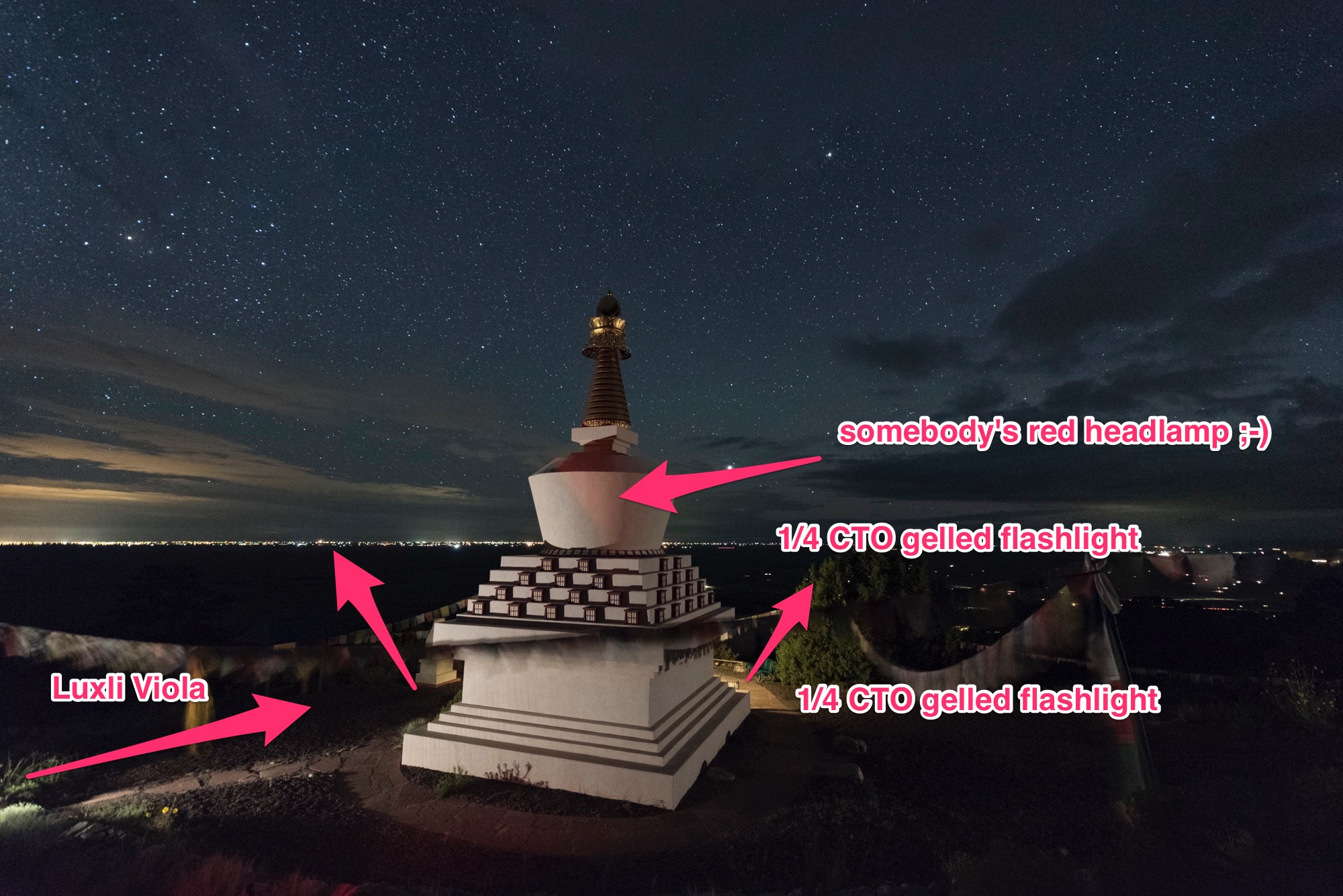
For the image in Figure 10, I went for the complete opposite: color unity. I made this at Grafton Ghost town during our Zion National Park workshop in 2016. I wanted to create a cool color harmony that would provoke a somewhat spooky feeling.

The landscape was being illuminated by a full moon. I set my white balance to 4000 K. Images made under a full moon can often look like they were shot in daylight, so lowering the white balance to 4000 K helps keep the impression of a night scene.

A setting of 4000 K renders my Coast HP5R only somewhat blue, and again I wanted more blue, to match the coolness of the ambient light. So I added a light blue gel to the front of the flashlight to increase the depth of blue, which helped retain color harmony throughout the image.

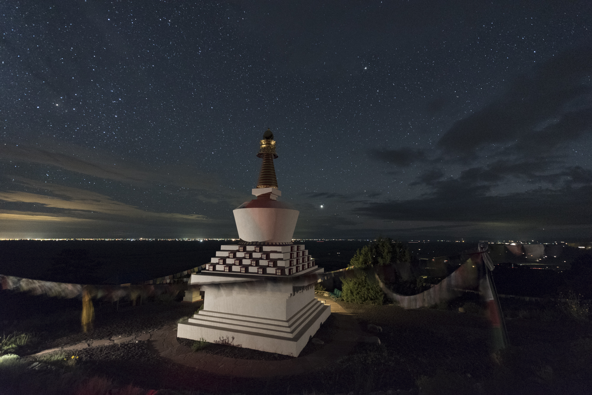
Figure 10. Creating color harmony. Grafton Ghost Town, Utah. Nikon D700 with a Nikon 24mm f/2.8 lens, light painted with a Coast HP5R flashlight. 1 minute, f/9, ISO 200.

Pulling it All Together

Color is an important feature in all of our imagery, day or night. While we don’t always have control over the color in a scene, given the opportunity, we should influence it to the best of our ability.

Here are the key considerations to choosing the color of your light painting in the field:

  1. White balance influences the overall color cast. This means it will affect all colors equally. Set the white balance to anchor the color of your ambient light (sky, fog, moonlight, etc.). This step should be done first, as it sets the stage for any color you may add into the scene.

  2. Consider the color of your flashlight or light panel and how your white balance will affect its color.

  3. Consider how you want your viewer to see the image. Should their eyes bounce back and forth between illuminated subjects (dissonance) or should they move gently through the image (harmony)?

  4. Alter the color of your light painting tool to affect either dissonance or harmony. In the case of a Luxli Cello or Viola, you can simply dial in the color temperature to contrast or unite the colors of the scene. If you are using a flashlight, first determine its actual color (see earlier blog posts on correcting the color of your flashlight), then alter the color of the light by using gels.

Wrapping Up

The next time you’re light painting, keep in mind the concepts of color contrast and color harmony. Then experiment with each to create different images with different kinds of impact. This exercise will create an expertise in applying these concepts to great affect, guaranteeing that you’ll level up your night photography.

We’d love to see what you do! Post your images in the comments, share on our Facebook page, or tag us (@nationalparksatnight) on Instagram.

Tim Cooper is a partner and workshop leader with National Parks at Night. Learn more techniques from his book The Magic of Light Painting, available from Peachpit.

UPCOMING WORKSHOPS FROM NATIONAL PARKS AT NIGHT

How to Master Color at Night with the Luxli Viola

Luxli Viola 5" On-Camera RGB LED Light

Luxli Viola 5" On-Camera RGB LED Light

Rarely do I find a tool that causes a paradigm shift in creativity or efficiency. The Luxli Viola 5" LED light is one of them. Why? Simply put, I can be very, very deliberate and accurate with the color of light I choose when light painting.

Prior to this, only a few tools really made me say, "Now I can really do something different/better." Those were:

  • a 4x5" view camera (total control over the image)
  • PocketWizard flash triggers (those changed photography forever, and for the better)
  • a light/flash meter (because I could focus on being creative instead of finding the right exposure)
  • the on-camera histogram (this unlocked the High ISO Test so we can all nail a proper long exposure)
  • the Pixelstick (because, damn … its potential for creativity as a light writing and painting tool is limitless)

Each one of these tools opened new realms of creativity. Once I started using them, I was eager to experiment, and I found new efficiency in what I could do (well, except for view cameras—they slowed me down in a truly terrific way).

As with these other tools, the single most important characteristic of the Luxli Viola is that it solves a technical problem. The result is that it allows me more time to focus on being creative.

The Real Problem this Solves

This problem is illustrated best when light painting using multiple flashlights, which often happens when working in a group. In the images below, you can see the color difference between my flashlight and Gabe's:

Note that Gabe's flashlight is warmer than mine. When I choose one flashlight source as neutral at 2600 K, the other is warm. If we had the same model flashlight and same strength and color gels, it would be the same. But we didn't. It doesn't look wrong, but I started to notice when it happened and thinking about how to collaborate better to create group masterpieces. You can even see the difference in the original 4000 K captures in-camera. 

My 2017 Self-Challenge

At the beginning of the year I asked myself, "What makes me uncomfortable? What should I be better at doing, but perhaps am avoiding putting time into practicing?"

Well, I am very fond of black and white photography. I love it so much that I practice it almost as exclusively as I do night photography. So I challenged myself to master color. And not just color in general, but being very particular and deliberate with how I use color.

My new BFF

Then in walks this rather humble-looking LED source. There are tons of on-camera LEDs for video. What sets the Luxli Viola apart and directly applies to my night photography is that it 1) renders all color temperatures from 3000 K to 10,000 K and 2) renders any hue on the color wheel that I desire. Why, you may ask, is that so groundbreaking?

Well, I've been gelling flashlights for years and frankly I hate doing it. It's awkward. It reduces the output. Sometimes I lose them. And most of the time, the color correction of blueish LED sources doesn't quite render the 3200 K or 3000 K or whatever warmer tone that I want. Sometimes it's too warm and causes the delicate reds and yellows of my beloved desert features—such as arches and bridges—a bit too garish. 

Knowing I can simply roll a dial on this LED panel and nail a color temperature got me so excited.

How I make the sausage

The first place the Viola really made an impact was when shooting Milky Way star point exposures. I'm consistently using a 3800 K white balance to accurately render the galactic core. What if I want a neutral light source for the foreground? Easy. Dial the Viola in to 3800 K.

With a flashlight instead, the illumination may end up too cool with a light CTO gel, or too warm and slightly tinted red with a bastard orange gel. But with this LED, no fuss. If I want something a little warmer, I cheat down to a lower color temperature. If I want cooler, I do the opposite. So easy. If I want to go crazy and use straight hues for color accents, I switch to color mode and dial in any darned color I want.

The only other tool I've heard of that exceeds the Viola is the ProtoMachines LED8, which is a light painter's dream (and a also pretty serious investment at $559). Anyone familiar with Troy Paiva's work has witnessed the power of this tool in the hands of a master. I just discovered that ProtoMachines released the Radium light painting wand, an upgrade to the LED2 that runs only $275. However, I have heard is that patience is sometimes required to obtain one, since they hand-build these tools.

Figure 1. Owachmo Bridge at Natural Bridges National Monument. Shot with a Nikon D750 and Distagon T* 15mm f/2.8 lens. 22 seconds, f/2.8, ISO 6400, blended with a dusk image shot at 78 seconds,
f/2.8, ISO 400.

The Luxli Viola 5" LED is also spectacular when applying the Low-Level Landscape Lighting technique. For the photo in Figure 1, I set the Viola to 1 percent output and placed it below Owachmo Bridge. The panel provided a constant, barely perceptible glow that complemented the exposure time needed for star points and the Milky Way. (This image was then blended with an indigo dusk photo for the shadows—more on that in our recent post, "Finishing Touches: 3 Killer Post-Production Tips For Night Photography.")

Figure 2. Tower Point at Hovenweep National Monument. Split exposure of 22 seconds and 480 seconds, f/2.8, ISO 400.

When it's really hot out, sometimes you have to make two exposures—one for a low-noise foreground, and one for the spectacular dark skies you get in southern Utah in June. For the photo in Figure 2, I made a 480-second exposure to blend with the sky of a 22-second frame. For the long exposure, I didn't to add light the entire time. So I used another of the Viola's cool features: Bluetooth control. I turned on and off the light for a few seconds at the beginning of the long exposure with my phone. How convenient, right?

I placed the LED to craft textures and faithfully render the bricks' delicate colors at the same 3800 K that I'd set my D750 to. I was so confident about the results that I simply sat back and enjoyed the view. ;-)

At Tashi Gomang Stupa (above), we used a Luxli Viola on a low-to-ground tripod at the bottom left corner to illuminate the main body of the structure. The camera and Viola's white balance were set to 3200 K. If you observe at the light spilling out from behind the stupa, you'll see a warmer light from a 1/4 CTO-gelled flashlight. See the difference between a color-corrected source and one that is simply correct?

Now, aesthetics also come into play. I wanted a warmer splash behind, so this was intentional. But the flashlight-plus-gels scenario is limited to what you carry, and also eats time while setting up. I am enamored with starting with a neutral light source and then cooking the color to taste. 

Mixing and Matching Color Balances

Because of the I put this to the test in the field at Olympic National Park. At Second Beach, I found a sea stack in the distance with some rocks in a tide pool in the foreground. The tide was coming in and making sweet swirls around the rock. This effect was also aided by the thick foam (which Chris commented wiggled like Jello-O when prodded with a toe).

Figure 3. All images above shot at 26 seconds, f/2.8, ISO 6400 with a Nikon D750 and Zeiss Disatgon 15mm f/2.8 lens. Download a high-res version of this chart here.

Keep in mind that there is no right or wrong when it comes to color temperature. There is knowing what affects your sky and foreground in a manner that you find pleasing. For the scene in the test above, I prefer the 3800 K camera and 5700 K LED. I was surprised by that—I had thought I'd like the 3800/3800 combination. Test and experiment!

Night Portraits

The Viola is also hella cool to use for night portraiture. It's not a flash, so don't expect crispy edges—people do move. But if you use the Viola briefly and your models hold still enough, it can be a great light source. 

Figure 4. The B&H marketing crew and astrophysicist Summer Ash at the Atlas Obscura eclipse event in August.
Nikon D750, 22 seconds, f/2.8, ISO 6400. White balance 3800 K (camera and LED).

For the photo in Figure 4, I matched the color temperature of my Viola to my CTO-gelled flashlight at 3800 K. The Viola is on the left of camera and the flashlight is low on the right.

Bonus: Bluetooth!

On top of all this, as mentioned earlier, the Luxli Viola has Bluetooth that allows you to control up to nine lights. When is this useful? When you want to simulate a flash, but can't use one, like for this group photo of our workshop participants at Olympic National Park last month:

I'm operating the lights with my phone behind Chris' back at left. Camera is set on intervalometer. 10 seconds, f/4, ISO 6400.

Wrapping it all up

I am enjoying the process of thinking critically about color and its application. I feel like I've grown as an artist and have another vital tool in my toolbox. I am equally excited about color and black and white imagery, but I think the results were worth going outside my comfort zone. And I'm keeping the Luxli Viola in my bag. Now I have to decide what to vote off the island, since gels didn't really occupy all that much space. ;-) 

Here is a recap of the benefits I find using a Luxli Viola:

  • Constant light makes it easy to repeat lighting effects, including exact shadows, intensity and placement.
  • Choosing a color temperature that matches my color balance in-camera will faithfully render the color of the objects in the scene.
  • Choosing a warmer or cooler color temperature can add creative flair.
  • It's very light and small.
  • When running at 1 percent power (which is most often for me), it will run all night and then some.
  • Adding the collapsible diffuser kit gives me a soft snoot to kill light spill at the edges, plus an even softer effect. 

There are a few disadvantages, however:

  • It's $350* (way more than a good Coast flashlight and gels).
  • The optional diffuser kit (which is amazing) is another $100*, or you can get both together for $429*.
  • An LED array is many little lights in rows and columns. It will never throw as far as a flashlight with a focused reflector on the front. So, you'll likely not be able to use it as a focusing aid, or for illuminating things very distant, unless you go for a longer exposure, or walk it deep into your frame and point it toward the thing you want to light up.
  • It's bigger than a flashlight. (That's a hint! hint! for any manufacturers out there who want to put these features in a flashlight form!)

* At the time of writing, these are the prices listed on B&H. Prices can fluctuate, so check back. 

Let's talk about color in the comments! How do you feel about your control and use of color? What tools do you use? How are you challenging yourself to grow? 

Matt Hill is a partner and workshop leader with National Parks at Night. See more about his photography, art, workshops and writing at MattHillArt.com. Follow Matt on Twitter Instagram Facebook.

UPCOMING WORKSHOPS FROM NATIONAL PARKS AT NIGHT