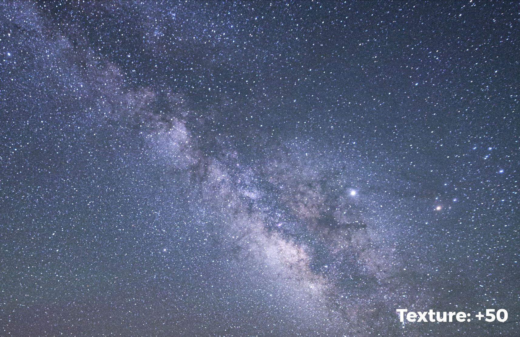
Lightroom’s new Texture slider.
Back in May, Adobe introduced a new slider to the Presence area within the Basic panel in Lightroom’s Develop module. This new tool was originally intended to be a “smoothing” slider that would soften skin texture somewhat more naturally than the Clarity slider does. But during development, the engineers found that while it was great at smoothing skin tones, it could also be used to add texture to our photographs.
Thus, the new Texture slider is aptly named. It really does enhance texture in our images! But as with all new photography tools, we wanted to push its limits and see what else it can do, particularly for night photography. As it turns out, when paired with the Dehaze slider, Texture can really enhance the look of our night photographs.
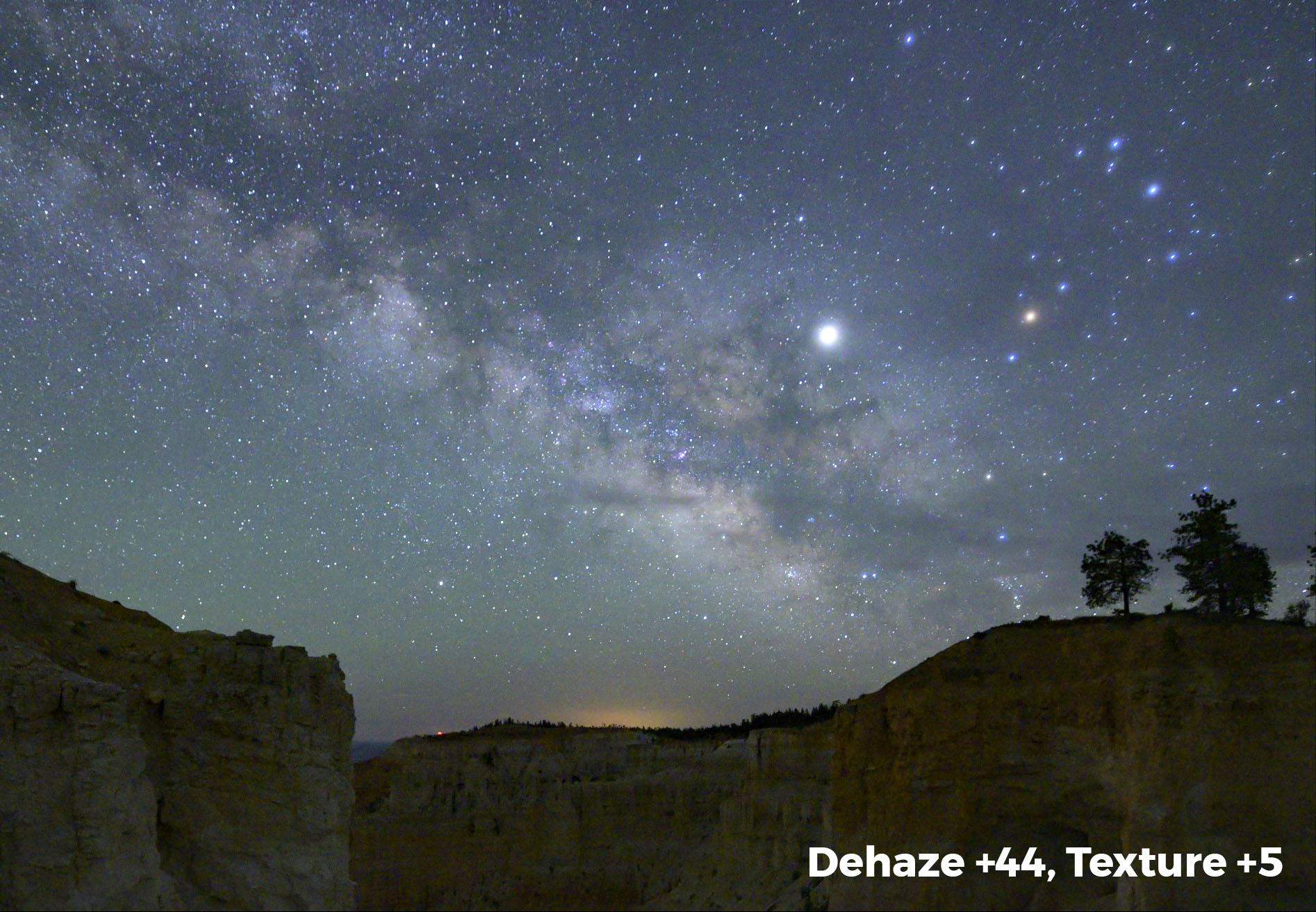
For those of you looking for a quick read, that about sums it up. By adding in a fair amount of Dehaze and a little Texture, your night skies will come alive! In the example below, Dehaze was set to +44 and Texture to +5. These are by no means default settings, as each camera produces different files and each scene requires its own approach. This does, however, give you starting point.
For those of you looking for a deeper understanding, read on.
A Deeper Understanding
The general effect of the Texture slider is somewhere between Clarity and Sharpening. To fully understand how this slider works, let’s take a look at all the sliders that enhance detail and contrast in our images: Sharpening, Texture, Clarity and Dehaze. We’ll begin with Sharpening.
Understanding Sharpening
Each of the aforementioned sliders, in essence, increases contrast. It’s the areas they increase contrast in that separates them from one another. Sharpening, on one end of the scale, adds contrast at the pixel level. Dehaze, at the other end, is much broader in its application of contrast. Let me show you what I mean.
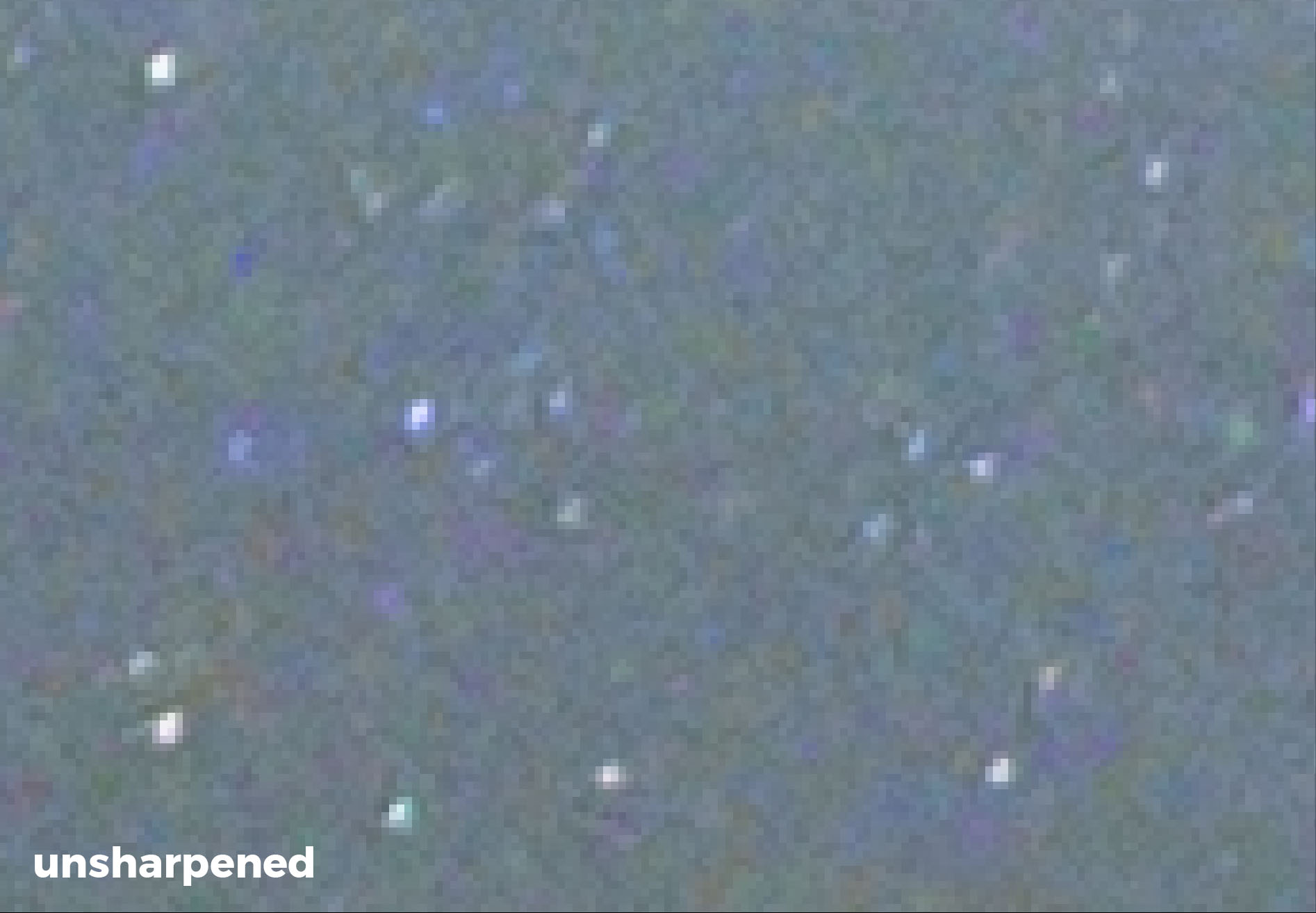
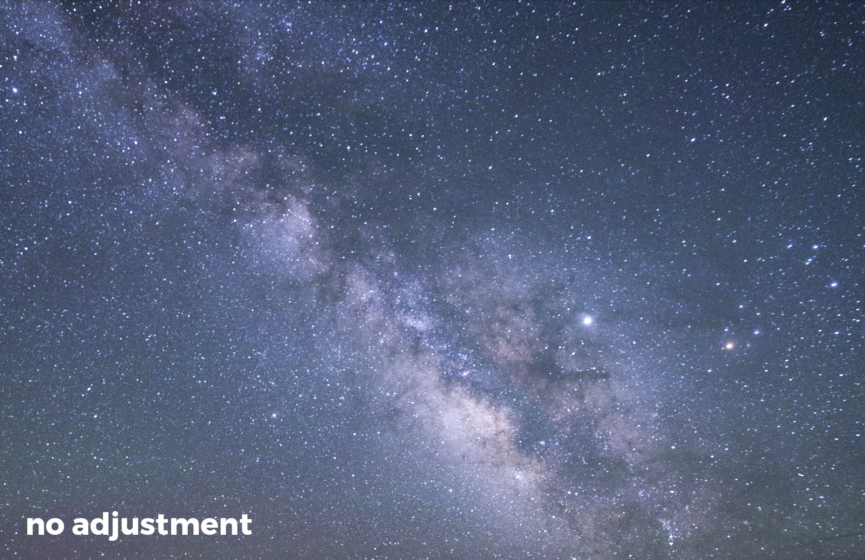
Sharpening increases apparent sharpness by finding an edge, and then darkening one side and lightening the other. This increases contrast around that edge, making it appear sharper. The images below show an unsharpened enlargement (11:1) of a night sky, and the same section after adding Sharpening. Notice how the stars appear to have a dark ring around them? This is the contrast being added by the sharpening slider.
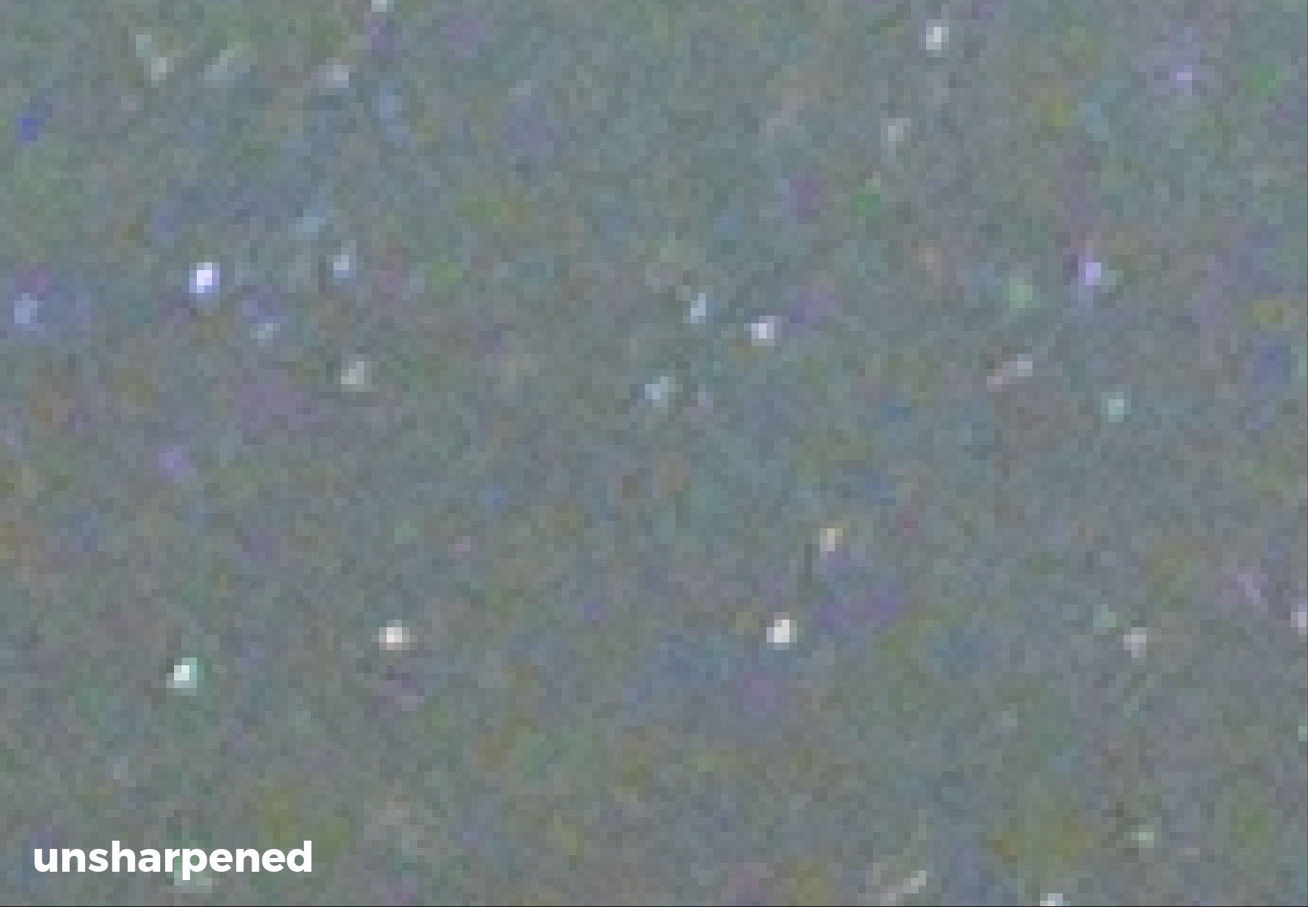
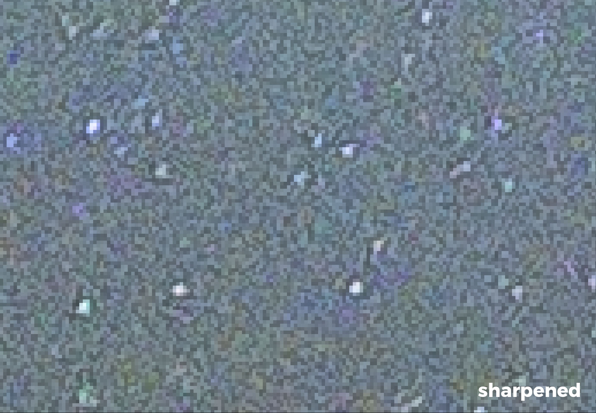
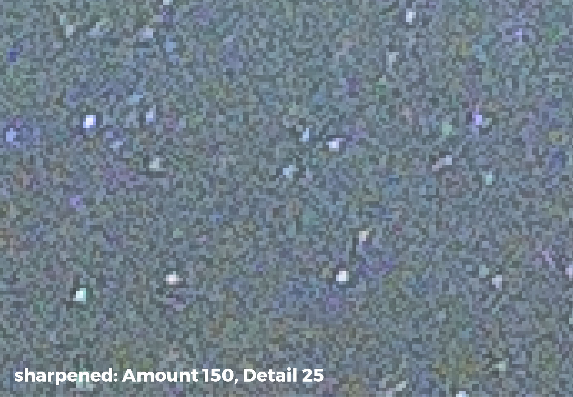
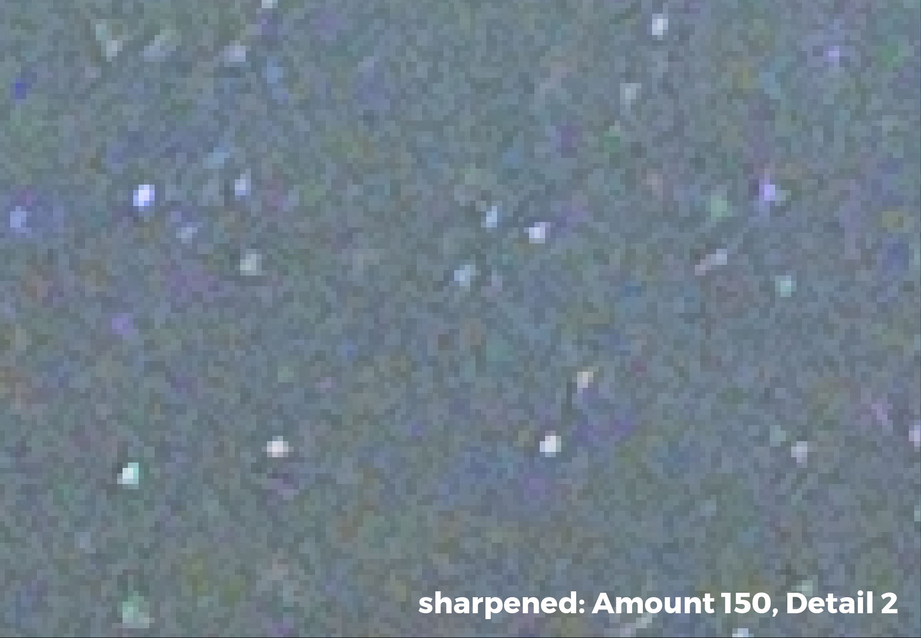
Also notice that even the pixels in the sky without stars have been sharpened. This look is what makes an over-sharpened image look “false.” Lowering the value of the Detail slider can correct this negative effect. The images below show the sky sharpened with Amount at 150 and Detail at 25, and the same image with the Detail slider lowered to 2.
Finally, let’s look at the real comparison. The images below are completely unsharpened and then sharpened with Amount at 150 and Detail at 3.
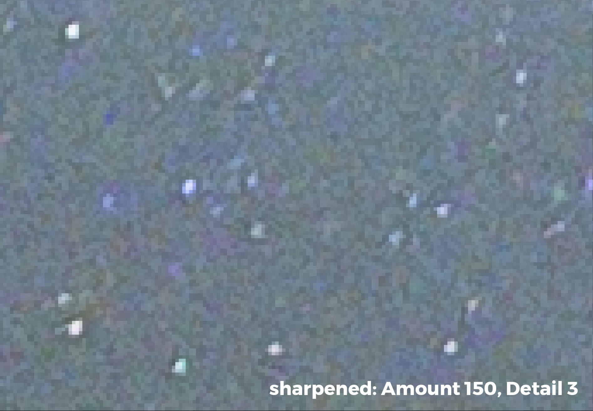
As you can see, the adjusted image has an increased apparent sharpness in the stars without appearing to be over-sharpened in the surrounding sky.
Of course, you would never want to sharpen your images at a magnification of 11:1. And the slider settings presented are not what I would necessarily suggest. These magnifications and settings were used to better help you understand the concept of sharpening. Sharpening should be done at magnifications of 1:1 or 1:2. Experiment with each magnification to suit your taste. Likewise, experiment with your sharpening sliders, keeping your Amount higher and Detail lower.
Note: The other sliders in the Sharpening box are Radius and Masking. The Radius slider controls how large the “halo” around the edge becomes. A higher Radius equals a thicker halo ring; a lower Radius setting creates a more natural look (a setting of 1.0 could be your benchmark). Adobe defines Masking as: “Controls an edge mask. With a setting of zero (0), everything in the image receives the same amount of sharpening. With a setting of 100, sharpening is mostly restricted to those areas near the strongest edges.” So increasing your Masking slider relegates the sharpening to only the areas with well-defined edges—which is typically the place we want the sharpening to effect.
Congratulations! You’ve made it through it a quick primer on Sharpening. The reason I dove a little deep here is that a basic understanding of Sharpening helps create a better understanding of the other contrast controls—Texture, Clarity and Dehaze.
Understanding Dehaze
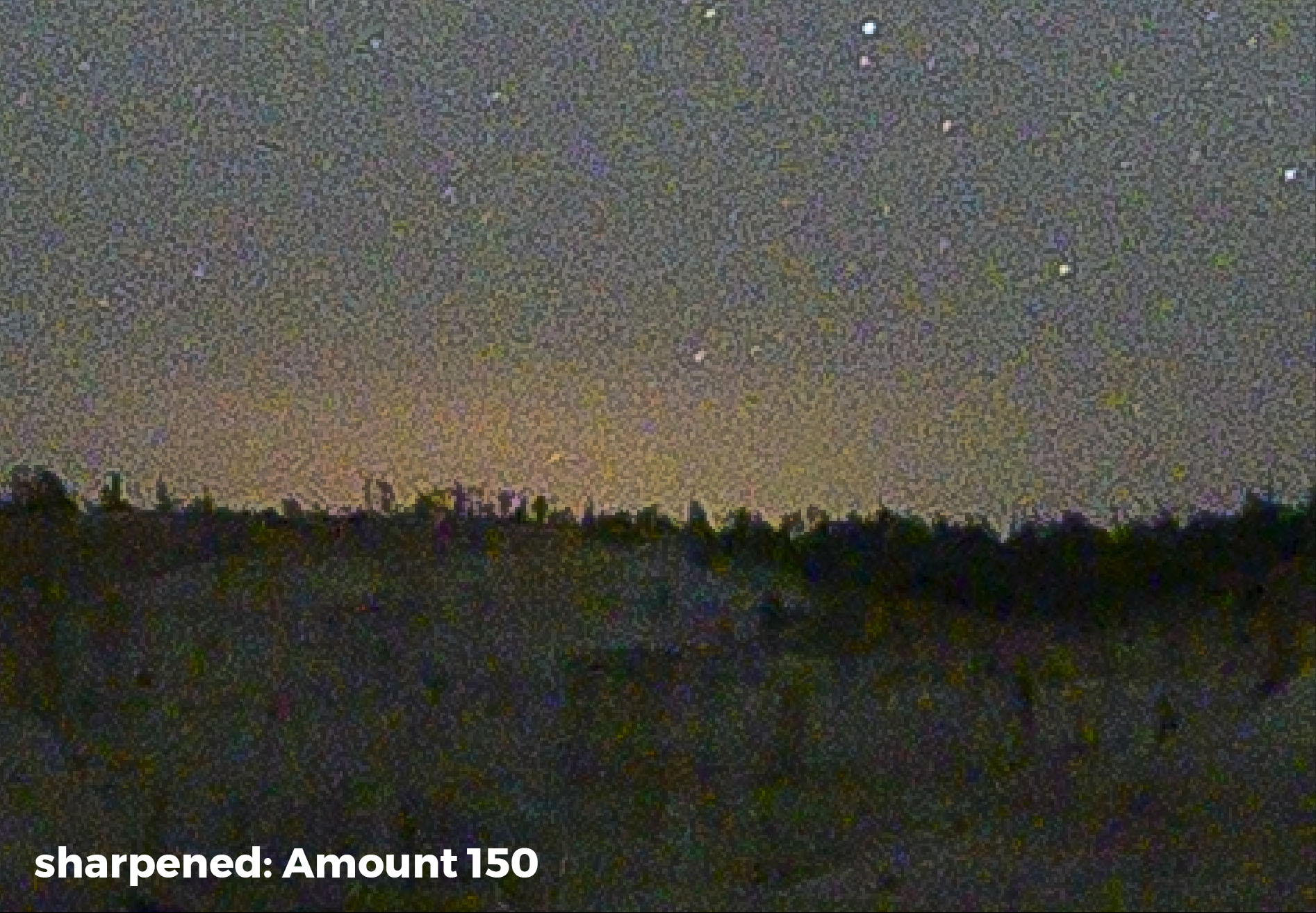
Now, let’s jump to the other end of the spectrum with Dehaze. While Sharpening adds contrast on the pixel level, Dehaze increases contrast across your image on a much broader scale. The following images are at a 4:1 magnification. We see a comparison of no contrast controls applied, versus the Amount slider in Sharpening increased to the maximum of 150, versus Dehaze set to +100. (Again, these adjustments are not recommendations, but rather exaggerations to show the effect.)
Contrast added with Sharpening.
Contrast added with Dehaze.
Below, let’s look at those two contrast adjustments side by side—Sharpening at 150 and Dehaze increased to the maximum of +100.
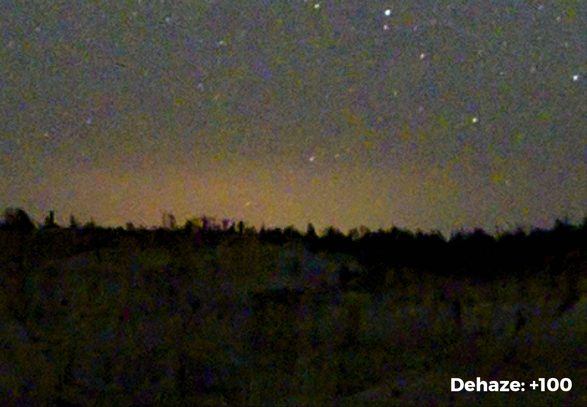
The Dehaze slider is actually increasing contrast between the sky glow and foreground. Compared to Sharpening, notice how Dehaze makes the foreground darker and the sky glow brighter. This makes the foreground and sky more separate from one another (i.e., there’s more contrast between them).
You can also see how Sharpening actually brightens the foreground and adds texture throughout. It does not, however, significantly separate the sky glow from the foreground.
Below is another example, comparing the image straight from the camera with a version with Dehaze set to +60.
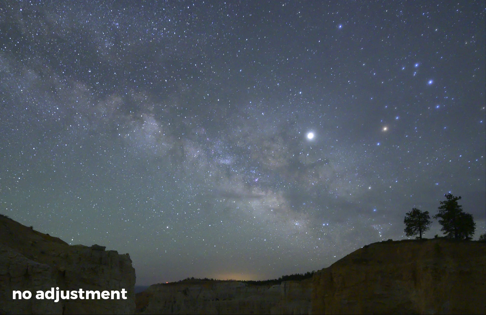
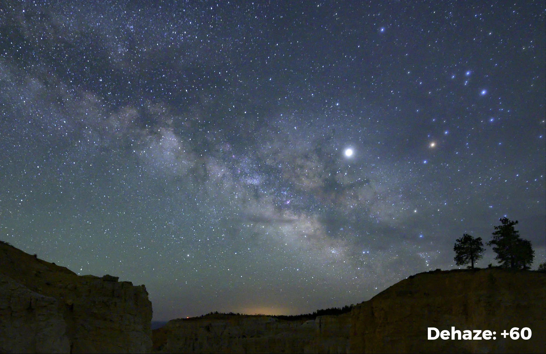
This really shows how Dehaze darkens the sky around the Milky Way. Again, this is a broader application of contrast as opposed to Sharpening’s more localized approach to separating individual stars from their surroundings. For our night skies, the Dehaze slider can be simply magic. (See more on this in my 2018 blog post “Dehaze: The Night Photographer's Secret Weapon.”)
Note: Along with an increase in contrast, the Dehaze slider also significantly increases contrast and somewhat darkens the whole image. After pumping up Dehaze, it’s not uncommon for me to decrease the blue saturation and increase Exposure.
So What About the Texture Slider?
The Texture and Clarity sliders fall between Sharpening and Dehaze. The breakdown of the different sliders looks like this:
Sharpening. Pixel-level addition to contrast around the edges. No real increase in saturation. Can increase grain and noise in the image.
Texture. Edge contrast added on a broader scale than Sharpening. Increases the apparent texture without the amplification of grain or noise that is sometimes accompanied with Sharpening. No noticeable saturation increase. The net effect is one of increased sharpness.
Clarity. Contrast added throughout the image on a broader scale than Texture. Looks more like an increase using the Dehaze slider but with slight sharping of the edges and no noticeable increase in saturation. The net effect is one of increased local contrast.
Dehaze. Adds contrast and saturation across a broader area of the image. Virtually no sharpening effect added. Separates especially well in brighter, low-contrast areas. This is why it works so well on our night skies.
Contrast. The broadest application of contrast. Also adds saturation. It does not take into account bright areas or dark areas, nor does it control edges. It’s the bludgeon of contrast controls with a very heavy-handed effect. Consider this to be an image-wide increase in contrast.
So the Texture slider is really like a less focused Sharpening slider. It creates edge sharpness without increasing noise and grain. You can see the effect here:
Used in combination with the Dehaze slider, Texture can produce night skies that are both crisp and colorful. However, like with the Sharpening slider, you should adjust with a soft hand. Kid gloves. A little goes a long way.
Putting it All Together
The following is a workflow that I used to process a recent image from our Bryce Canyon National Park workshop. Figure 1 shows the image captured with a Luxli Viola at camera left to illuminate the foreground. The Luxli output was balanced to complement the Milky Way in the background. The exposure was 15 seconds, f/2.8, ISO 6400.
Figure 1. Bryce Canyon National Park. Nikon Z 6, Nikon 14-24mm f/2.8 lens at 14mm, light painted with a Luxli Viola. 15 seconds, f/2.8, ISO 6400. Unprocessed.
Figure 2 shows the image after basic Lightroom adjustments—I decreased Blacks to -32 and increased Whites to +4.
Figure 2. Blacks -32, Whites +4.
Then, as we see in Figure 3, I added a local adjustment on the foreground using the Adjustment brush and increased the Texture to +45. This increased the sharpness and texture of the hoodoos in the foreground. (This is the type of application that Texture is actually designed for—adjusting actual texture in a surface.)
Figure 3. Local Adjustment of the foreground, Texture +45.
The last adjustment was to the sky only, increasing Dehaze to +30, Exposure to +35 and Texture to +3. Figure 4 shows the final image.
Figure 4. The final image with another local adjustment of the sky: Dehaze +30, Exposure +35,Texture +3.
Everyone will develop their own special recipe of slider settings for their night skies. And indeed these may even change from one scene to the next. The important thing to keep in mind is the effect of these settings. A better understanding of what each slider produces will arm you with the knowledge to craft a truly fine photograph.